

Mobile-First Web Development: The Complete Guide

mobile first web development

Mobile-first web development is the approach of designing and coding websites for the smallest screen first, then progressively enhancing the layout for larger screens. It produces better performance than desktop-first development, aligns with Google mobile-first indexing, and forces design decisions that prioritise the core user experience over decorative desktop enhancements. With over 60% of global web traffic now from mobile devices and Google ranking sites based primarily on their mobile version, mobile-first is the professional standard for all new web development in 2026.
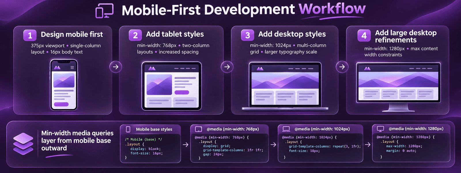
This guide covers the complete mobile-first development framework, the philosophical difference between mobile-first and desktop-first, the CSS methodology with min-width media queries, performance standards for mobile, touch design requirements, the correct approach to mobile typography and images, mobile navigation patterns, the testing process on real devices, and the specific mobile-first implementation in WordPress and Elementor. Whether you are evaluating whether your current site is truly mobile-first or implementing a new mobile-first build from scratch, this guide provides the complete technical and strategic framework.

Key Takeaways

  • Mobile devices account for over 60% of global web traffic in 2026 according to StatCounter. Google uses the mobile version of every site as the primary basis for indexing and ranking. A site that performs poorly on mobile is being evaluated and ranked primarily on its weaker version.
  • Mobile-first CSS uses min-width media queries, base styles apply to all screens including mobile, and min-width queries add complexity for larger screens. Desktop-first uses max-width queries to reduce complexity for mobile, forcing mobile devices to download full desktop CSS and override it. Mobile-first produces lighter, faster mobile pages.
  • Google research shows 53% of mobile visitors abandon pages taking over 3 seconds to load. Achieving under 2.5 seconds on mobile (Good LCP) requires managed hosting, WebP images, preloaded hero, and deferred JavaScript, not just responsive CSS. See our Core Web Vitals guide.
  • Touch targets, buttons, links, navigation items, form fields, must be minimum 44 by 44 CSS pixels per WCAG 2.1 accessibility guidelines. Touch targets below 44px cause misclicks, frustration, and accessibility failures. This is one of the most commonly violated mobile development requirements on professionally designed sites.
  • Mobile-first typography starts at 16px minimum body text size on the smallest screen. Font sizes below 16px on mobile require pinch-zooming, an accessibility failure and a conversion barrier. Use CSS clamp() for fluid type that scales smoothly from 16px on mobile to 20 to 24px on desktop without multiple breakpoints.
  • The primary purpose of Elementor responsive controls, the device toggle in the editor allowing independent styling per breakpoint, is to implement mobile-first designs without writing CSS. Set the mobile values first, then tablet and desktop values as enhancement layers. Most Elementor developers do this backwards.
  • Real device testing on iOS Safari (iPhone) and Android Chrome is mandatory for every mobile-first build. Chrome DevTools device emulation is useful during development but does not replicate iOS Safari rendering behaviour, real-device touch interactions, or actual network performance. Test on real devices before any site goes live.

Mobile-First Development

Mobile-First Websites Built to Rank and Convert on Every Device

Futuristic Marketing Services builds mobile-first websites with real device testing, Core Web Vitals engineering, and Google mobile-first indexing alignment as standard.

Start Your Mobile-First Project

Mobile-First vs Desktop-First: The Core Difference

Mobile-first and desktop-first are not just design preferences, they represent fundamentally different CSS architectures with different performance implications. Understanding the technical difference is essential for any developer implementing a truly mobile-first site rather than a responsive site that was adapted for mobile after desktop design was complete.
AspectMobile-FirstDesktop-First
CSS media query typemin-width, add complexity for larger screensmax-width, reduce complexity for smaller screens
Base CSS loadMobile-optimised, only base CSS loads on small screensDesktop CSS loads on all screens; mobile overrides add to this
Performance on mobileBetter, mobile devices download less CSSWorse, mobile downloads full desktop CSS then overrides it
Google alignmentAligned with mobile-first indexing, Google crawls the base CSS versionMisaligned, mobile overrides may not reflect what Google evaluates
Development disciplineForces content priority decisions upfrontEasier to start but creates adaptation challenges for mobile
Content hierarchyCore content defined first; enhancements added for larger screensFull desktop experience designed first; mobile is a reduced version
Professional standardYes, required for all new professional web developmentLegacy approach, acceptable only when maintaining existing desktop-first codebases

The Mobile-First CSS Pattern

Mobile-first CSS is written in this order: base styles (no media query) applied to all screens including mobile; then min-width: 480px styles for larger phones; then min-width: 768px for tablets; then min-width: 1024px for desktop; then min-width: 1280px for large desktop. Each layer adds complexity, more columns, larger type, additional decorative elements, rather than removing it. This produces a mobile experience that is the designed default, not a stripped-down afterthought.

Mobile Performance Standards

mobile-first site must meet specific performance standards on mobile devices, not just look correct on a small screen. The three Core Web Vitals metrics and the 3-second load time threshold define the performance floor for any professional mobile-first build.
Performance StandardTargetMeasurement ToolPrimary Fix if Failing
LCP (Largest Contentful Paint)Under 2.5 secondsGoogle PageSpeed Insights, mobile tabPreload hero image; convert to WebP; managed hosting with Redis caching
CLS (Cumulative Layout Shift)Under 0.1Google Search Console, Core Web VitalsAdd explicit width and height to all images; reserve space for dynamic content
INP (Interaction to Next Paint)Under 200 millisecondsPageSpeed Insights, mobile tabDefer third-party scripts; break up long JavaScript tasks
Mobile Lighthouse score70 or higher for Good CWV; 85+ for best practicePageSpeed Insights, mobile tabManaged hosting, WP Rocket, WebP images, deferred JS
Time to Interactive on 4GUnder 4 secondsWebPageTest, mobile 4G throttleReduce JavaScript bundle; defer non-critical resources
Tap target minimum size44 by 44 CSS pixelsChrome DevTools Lighthouse, AccessibilityIncrease padding on small interactive elements; minimum 48px recommended

Why Mobile Performance Requires More Than Responsive CSS

A site can be visually responsive on mobile, all elements fitting within the viewport, content readable, while still performing poorly on mobile. Visual responsiveness is achieved through CSS. Mobile performance requires: managed hosting with Redis caching for sub-200ms TTFB; WebP images sized for mobile viewports; LCP hero image preloaded in the page head; third-party scripts deferred until after page interaction; and JavaScript bundles optimised to minimise main thread blocking. These are development and infrastructure decisions, not design decisions. See our website speed guide and Core Web Vitals guide for the complete optimisation process.

Mobile Touch Design Requirements

Mobile-First Touch Design Principles

Touch target sizing

All interactive elements, buttons, links, navigation items, form inputs, must be minimum 44 by 44 CSS pixels per WCAG 2.1 guidelines. The recommended professional standard is 48px. Smaller targets cause misclicks, particularly for users over 45 who represent the primary purchasing demographic in most categories.

Thumb reach zones

On a standard smartphone held in one hand, the lower 60% of the screen is easily reachable with the thumb. Primary CTAs and navigation belong in this zone. Content requiring significant attention belongs higher. Bottom navigation bars (like native app tabs) place primary actions in the most accessible thumb zone.

Hover state replacement

Hover states (menus that open on hover, tooltips that display on hover) do not work on touchscreens. Every interaction that relies on hover must have a tap equivalent, dropdown menus triggered by tap, tooltips accessible via tap on an info icon, and no content exclusively revealed by hover.

Form optimisation for mobile

Form inputs must trigger the correct mobile keyboard: type='email' for email (triggers email keyboard with @ symbol); type='tel' for phone (triggers numeric keypad); type='number' for quantities. Add autocomplete attributes for name, email, and address fields. Minimum input height 44px. These changes reduce mobile form abandonment significantly.

Swipe and gesture patterns

Standard mobile gesture patterns, swipe to navigate image galleries, pull-to-refresh in native apps, pinch-to-zoom on maps, set user expectations. Implement swipe-to-navigate on image carousels and product image galleries. Do not override default browser scroll behaviour, fighting native scroll creates frustration.

Tap feedback and states

Every tap on a mobile device should produce immediate visual feedback, a colour change, a ripple effect, or a state change. Without feedback, users tap repeatedly (rage tapping) because they are uncertain whether their tap registered. CSS :active states provide basic tap feedback; more sophisticated feedback improves perceived performance.

Mobile-First Typography and Images

Typography and images require specific mobile-first treatment beyond simple size reduction. The goal is content that reads and renders correctly on small screens at mobile network speeds without requiring user action to resize or scroll horizontally.
ElementMobile-First StandardImplementation
Body font sizeMinimum 16px, preferably 17 to 18pxSet base font-size on :root or body without media query; scale up for larger screens with clamp() or min-width queries
Fluid headings with clamp()H1: 28 to 36px mobile, 48 to 64px desktop, scaling smoothlyfont-size: clamp(28px, 2rem + 2vw, 64px), one declaration handles all screen sizes without breakpoints
Line heightBody: 1.6 to 1.75 on mobile; Headings: 1.15 to 1.3Set without media query, these ratios work across all screen sizes
Images, srcsetProvide mobile-specific image sizes in srcset (375px, 750px, 1200px)
Images, explicit dimensionsAlways add width and height attributesPrevents CLS layout shift, browser reserves space before image loads. Required for Good Core Web Vitals.
Hero image, mobile variantProvide a portrait-cropped version of hero image for mobile viewports element with a separate mobile source, portrait crop shows the subject better on narrow screens

Mobile-First in WordPress and Elementor

WordPress and Elementor both support mobile-first development but require deliberate configuration, they do not enforce mobile-first by default. The Elementor editor has desktop-focused defaults; applying the correct mobile-first workflow produces significantly better results than the default approach most developers take.
In Elementor, switch to mobile view first (the smallest breakpoint) and design the layout from that starting point. Set all typography sizes in the mobile view as the base value. Add tablet and desktop overrides as enhancement layers, larger type, multi-column arrangements, additional visual elements. This reflects the correct mobile-first CSS philosophy in the visual builder environment.
For WordPress theme development using custom PHP themes, write all base CSS without media queries (this IS the mobile styles), then use min-width queries to add desktop enhancements. Avoid max-width queries entirely in a mobile-first theme. The theme.json file in block themes supports mobile-first design tokens for typography and spacing that cascade correctly across breakpoints.

Mobile-First Audit

Is Your Site Truly Mobile-First? Get a Professional Mobile Audit

Futuristic Marketing Services provides mobile-first development audits, Core Web Vitals assessment, touch target review, responsive CSS analysis, and real device testing across iOS and Android.

Request a Mobile Audit

Frequently Asked Questions About Mobile-First Web Development

What is mobile-first web development?

style="color:rgba(255,255,255,0.85);font-size:15px;line-height:1.8;">Mobile-first web development is the approach of designing and coding websites starting with the smallest screen, typically a 375px mobile viewport, then progressively enhancing the layout for larger screens using min-width CSS media queries. It is the opposite of the desktop-first approach, which designs for large screens first and then reduces for mobile. Mobile-first is the professional standard because it produces better mobile performance (mobile devices only load base CSS), aligns with Google mobile-first indexing, and forces design decisions that prioritise core content.

Why is mobile-first development important for SEO?

style="color:rgba(255,255,255,0.85);font-size:15px;line-height:1.8;">Google uses the mobile version of every website as the primary basis for indexing and ranking, a practice called mobile-first indexing. This means: the mobile version of a site is what Google primarily crawls, evaluates for content quality, and uses to determine rankings. A site with excellent desktop content but thin mobile content, poor mobile performance, or missing mobile structured data is being ranked on its weaker version. Core Web Vitals are measured from real mobile user data and are confirmed ranking signals.

What is the difference between mobile-first and responsive design?

style="color:rgba(255,255,255,0.85);font-size:15px;line-height:1.8;">Responsive design is the outcome, a site that adapts to any screen size using fluid grids, flexible images, and CSS media queries. Mobile-first is the development methodology that achieves this outcome starting from mobile. A site can be responsive (adapts to all screens) without being mobile-first in its CSS architecture (if it was built desktop-first and adapted down). The technical difference: mobile-first uses min-width media queries (add for larger screens); desktop-first uses max-width (reduce for smaller screens). Both produce visually responsive results, but mobile-first produces better performance on mobile. See our responsive web design guide.

What is min-width CSS and how does it relate to mobile-first?

style="color:rgba(255,255,255,0.85);font-size:15px;line-height:1.8;">Min-width CSS media queries apply styles when the viewport is at or wider than a specified value. In mobile-first development, the base CSS (no media query) styles everything for mobile. Then @media (min-width: 768px) adds tablet styles. Then @media (min-width: 1024px) adds desktop styles. Each layer adds to the previous, the mobile base is always loaded; additional styles layer on top for larger screens. This is the correct mobile-first pattern. Desktop-first uses max-width queries to subtract, desktop styles are the base, and max-width queries override them for smaller screens.

How do I test if my site is mobile-first?

style="color:rgba(255,255,255,0.85);font-size:15px;line-height:1.8;">Test your site mobile-first status: (1) Open Chrome DevTools (F12) and switch to the mobile device toolbar at 375px. Does the site look correct without any overflow, horizontal scrolling, or illegible text? (2) Run Google PageSpeed Insights on the mobile tab, does the site achieve 70 or higher Lighthouse? (3) Open the CSS source and look for media query patterns, are the majority min-width (mobile-first) or max-width (desktop-first)? (4) Check Google Search Console Mobile Usability report for any flagged issues. (5) Test on a real iPhone with Safari, emulation does not replicate all mobile behaviour.

What font size should I use for mobile-first design?

style="color:rgba(255,255,255,0.85);font-size:15px;line-height:1.8;">The minimum body font size for mobile-first design is 16px, preferably 17 to 18px for comfortable reading on small screens. Smaller sizes require users to pinch-zoom to read, which is both an accessibility failure (WCAG requires readable text without assistive technology) and a conversion barrier. Use CSS clamp() for fluid typography: font-size: clamp(16px, 1rem + 0.5vw, 20px) scales smoothly from 16px on smallest mobile to 20px on desktop without media queries. Heading sizes should be reduced for mobile, an H1 at 56px on desktop should be 32 to 40px on mobile to fit within the viewport without taking too many lines.

How does mobile-first development affect page performance?

style="color:rgba(255,255,255,0.85);font-size:15px;line-height:1.8;">Mobile-first development directly improves mobile page performance because the base CSS (no media query) is optimised for mobile, smaller, leaner, with only the styles needed for small screen rendering. Desktop-first development loads full desktop CSS on mobile devices and then overrides it, adding unnecessary CSS weight. Beyond CSS architecture, true mobile-first performance requires: managed hosting with sub-200ms TTFB; WebP images with mobile-specific srcset sizes; preloaded LCP hero image; and deferred third-party JavaScript. See our Core Web Vitals guide for the complete performance framework.

What is Elementor's approach to mobile-first design?

style="color:rgba(255,255,255,0.85);font-size:15px;line-height:1.8;">Elementor supports mobile-first design through its responsive controls, a device toggle in the editor sidebar that allows independent styling for desktop, tablet, and mobile breakpoints. The correct mobile-first workflow in Elementor: switch to mobile view first and set all base typography sizes, padding, and layout for mobile; then switch to tablet view and add layout enhancements; then switch to desktop view for the full design. Most Elementor developers work primarily in desktop view and then adapt for mobile, producing a desktop-first design that is adapted down, not a mobile-first design that is enhanced up.

How do I implement mobile-first images?

style="color:rgba(255,255,255,0.85);font-size:15px;line-height:1.8;">Mobile-first images require: (1) The srcset attribute providing multiple image sizes, the browser selects the correct size for the current viewport and pixel density. (2) The sizes attribute telling the browser the display width at each breakpoint, without it, the browser defaults to 100vw and often downloads larger images than necessary. (3) WebP format as the primary source (25 to 35% smaller than JPEG). (4) Explicit width and height on every img element to prevent layout shift (CLS). (5) loading=lazy on all below-fold images. (6) A portrait-cropped mobile variant for hero images, landscape heroes often show nothing meaningful at 375px width. See our responsive design guide.

What is a mobile-first navigation pattern?

style="color:rgba(255,255,255,0.85);font-size:15px;line-height:1.8;">Mobile-first navigation patterns differ from desktop navigation because horizontal nav bars with multiple items and dropdown menus do not work on small screens. Mobile-first navigation options: hamburger menu (three-line icon revealing full-screen or off-canvas overlay menu, the universal standard; 48px minimum touch target for the icon); bottom navigation bar (3 to 5 primary destinations fixed to viewport bottom, aligns with natural thumb reach zones; increasingly used in mobile-first web design following native app patterns); priority plus pattern (most important items visible, remaining items in a More dropdown). Design the mobile navigation pattern first, then design how it transforms for desktop, not the reverse.

Does a mobile-first site need separate mobile and desktop versions?

style="color:rgba(255,255,255,0.85);font-size:15px;line-height:1.8;">No, a mobile-first site uses a single codebase that adapts to all screen sizes through CSS. Maintaining separate mobile and desktop sites (the m.site.com pattern) creates: duplicate content issues for SEO; double the maintenance overhead; risk of mobile and desktop versions getting out of sync; and a worse user experience for users on mid-size devices like tablets. Google explicitly recommends against separate mobile sites and in favour of responsive (mobile-first) design. See our responsive web design guide for the single-codebase approach.

Futuristic Marketing Services

Mobile-First Development That Passes Every Standard

Futuristic Marketing Services builds mobile-first websites with real device testing, Core Web Vitals engineering, WCAG-compliant touch targets, and Google mobile-first indexing alignment, so your site performs where your audience is.

Build Your Mobile-First Site


Conclusion: Mobile-First as the Development Foundation

Mobile-first web development is not a feature or an option, it is the professional baseline for all new web development in 2026. With over 60% of web traffic from mobile, Google ranking based on mobile version quality, and Core Web Vitals measured from real mobile users, building for mobile first is not about serving a secondary audience, it is about building for the primary one.
The technical implementation is straightforward: min-width media queries; base styles optimised for mobile; progressive enhancement for larger screens; managed hosting for mobile performance; WebP images with srcset; 44px minimum touch targets; 16px minimum body text; real device testing on iOS Safari and Android Chrome before launch. Together these practices produce sites that rank, perform, and convert on the devices that represent the majority of visits.
Share this post :
Picture of Devyansh Tripathi
Devyansh Tripathi

Devyansh Tripathi is a digital marketing strategist with over 5 years of hands-on experience in helping brands achieve growth through tailored, data-driven marketing solutions. With a deep understanding of SEO, content strategy, and social media dynamics, Devyansh specializes in creating results-oriented campaigns that drive both brand awareness and conversion.

All Posts