
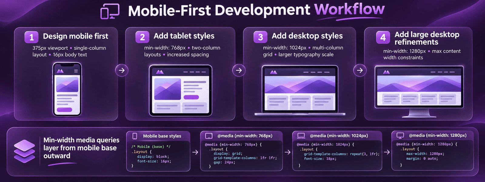
Mobile-first web development is the approach of designing and coding websites for the smallest screen first, then progressively enhancing the layout for larger screens. It produces better performance than desktop-first development, aligns with Google mobile-first indexing, and forces design decisions that prioritise the core user experience over decorative desktop enhancements. With over 60% of global web traffic now from mobile devices and Google ranking sites based primarily on their mobile version, mobile-first is the professional standard for all new web development in 2026.
Key Takeaways
- Mobile devices account for over 60% of global web traffic in 2026 according to StatCounter. Google uses the mobile version of every site as the primary basis for indexing and ranking. A site that performs poorly on mobile is being evaluated and ranked primarily on its weaker version.
- Mobile-first CSS uses min-width media queries, base styles apply to all screens including mobile, and min-width queries add complexity for larger screens. Desktop-first uses max-width queries to reduce complexity for mobile, forcing mobile devices to download full desktop CSS and override it. Mobile-first produces lighter, faster mobile pages.
- Google research shows 53% of mobile visitors abandon pages taking over 3 seconds to load. Achieving under 2.5 seconds on mobile (Good LCP) requires managed hosting, WebP images, preloaded hero, and deferred JavaScript, not just responsive CSS. See our Core Web Vitals guide.
- Touch targets, buttons, links, navigation items, form fields, must be minimum 44 by 44 CSS pixels per WCAG 2.1 accessibility guidelines. Touch targets below 44px cause misclicks, frustration, and accessibility failures. This is one of the most commonly violated mobile development requirements on professionally designed sites.
- Mobile-first typography starts at 16px minimum body text size on the smallest screen. Font sizes below 16px on mobile require pinch-zooming, an accessibility failure and a conversion barrier. Use CSS clamp() for fluid type that scales smoothly from 16px on mobile to 20 to 24px on desktop without multiple breakpoints.
- The primary purpose of Elementor responsive controls, the device toggle in the editor allowing independent styling per breakpoint, is to implement mobile-first designs without writing CSS. Set the mobile values first, then tablet and desktop values as enhancement layers. Most Elementor developers do this backwards.
- Real device testing on iOS Safari (iPhone) and Android Chrome is mandatory for every mobile-first build. Chrome DevTools device emulation is useful during development but does not replicate iOS Safari rendering behaviour, real-device touch interactions, or actual network performance. Test on real devices before any site goes live.
Mobile-First Development
Mobile-First Websites Built to Rank and Convert on Every Device
Futuristic Marketing Services builds mobile-first websites with real device testing, Core Web Vitals engineering, and Google mobile-first indexing alignment as standard.
Start Your Mobile-First ProjectMobile-First vs Desktop-First: The Core Difference
| Aspect | Mobile-First | Desktop-First |
|---|---|---|
| CSS media query type | min-width, add complexity for larger screens | max-width, reduce complexity for smaller screens |
| Base CSS load | Mobile-optimised, only base CSS loads on small screens | Desktop CSS loads on all screens; mobile overrides add to this |
| Performance on mobile | Better, mobile devices download less CSS | Worse, mobile downloads full desktop CSS then overrides it |
| Google alignment | Aligned with mobile-first indexing, Google crawls the base CSS version | Misaligned, mobile overrides may not reflect what Google evaluates |
| Development discipline | Forces content priority decisions upfront | Easier to start but creates adaptation challenges for mobile |
| Content hierarchy | Core content defined first; enhancements added for larger screens | Full desktop experience designed first; mobile is a reduced version |
| Professional standard | Yes, required for all new professional web development | Legacy approach, acceptable only when maintaining existing desktop-first codebases |
The Mobile-First CSS Pattern
Mobile Performance Standards
| Performance Standard | Target | Measurement Tool | Primary Fix if Failing |
|---|---|---|---|
| LCP (Largest Contentful Paint) | Under 2.5 seconds | Google PageSpeed Insights, mobile tab | Preload hero image; convert to WebP; managed hosting with Redis caching |
| CLS (Cumulative Layout Shift) | Under 0.1 | Google Search Console, Core Web Vitals | Add explicit width and height to all images; reserve space for dynamic content |
| INP (Interaction to Next Paint) | Under 200 milliseconds | PageSpeed Insights, mobile tab | Defer third-party scripts; break up long JavaScript tasks |
| Mobile Lighthouse score | 70 or higher for Good CWV; 85+ for best practice | PageSpeed Insights, mobile tab | Managed hosting, WP Rocket, WebP images, deferred JS |
| Time to Interactive on 4G | Under 4 seconds | WebPageTest, mobile 4G throttle | Reduce JavaScript bundle; defer non-critical resources |
| Tap target minimum size | 44 by 44 CSS pixels | Chrome DevTools Lighthouse, Accessibility | Increase padding on small interactive elements; minimum 48px recommended |
Why Mobile Performance Requires More Than Responsive CSS
Mobile Touch Design Requirements
Mobile-First Touch Design Principles
Touch target sizing
All interactive elements, buttons, links, navigation items, form inputs, must be minimum 44 by 44 CSS pixels per WCAG 2.1 guidelines. The recommended professional standard is 48px. Smaller targets cause misclicks, particularly for users over 45 who represent the primary purchasing demographic in most categories.
Thumb reach zones
On a standard smartphone held in one hand, the lower 60% of the screen is easily reachable with the thumb. Primary CTAs and navigation belong in this zone. Content requiring significant attention belongs higher. Bottom navigation bars (like native app tabs) place primary actions in the most accessible thumb zone.
Hover state replacement
Hover states (menus that open on hover, tooltips that display on hover) do not work on touchscreens. Every interaction that relies on hover must have a tap equivalent, dropdown menus triggered by tap, tooltips accessible via tap on an info icon, and no content exclusively revealed by hover.
Form optimisation for mobile
Form inputs must trigger the correct mobile keyboard: type='email' for email (triggers email keyboard with @ symbol); type='tel' for phone (triggers numeric keypad); type='number' for quantities. Add autocomplete attributes for name, email, and address fields. Minimum input height 44px. These changes reduce mobile form abandonment significantly.
Swipe and gesture patterns
Standard mobile gesture patterns, swipe to navigate image galleries, pull-to-refresh in native apps, pinch-to-zoom on maps, set user expectations. Implement swipe-to-navigate on image carousels and product image galleries. Do not override default browser scroll behaviour, fighting native scroll creates frustration.
Tap feedback and states
Every tap on a mobile device should produce immediate visual feedback, a colour change, a ripple effect, or a state change. Without feedback, users tap repeatedly (rage tapping) because they are uncertain whether their tap registered. CSS :active states provide basic tap feedback; more sophisticated feedback improves perceived performance.
Mobile-First Typography and Images
| Element | Mobile-First Standard | Implementation |
|---|---|---|
| Body font size | Minimum 16px, preferably 17 to 18px | Set base font-size on :root or body without media query; scale up for larger screens with clamp() or min-width queries |
| Fluid headings with clamp() | H1: 28 to 36px mobile, 48 to 64px desktop, scaling smoothly | font-size: clamp(28px, 2rem + 2vw, 64px), one declaration handles all screen sizes without breakpoints |
| Line height | Body: 1.6 to 1.75 on mobile; Headings: 1.15 to 1.3 | Set without media query, these ratios work across all screen sizes |
| Images, srcset | Provide mobile-specific image sizes in srcset (375px, 750px, 1200px) |  |
| Images, explicit dimensions | Always add width and height attributes | Prevents CLS layout shift, browser reserves space before image loads. Required for Good Core Web Vitals. |
| Hero image, mobile variant | Provide a portrait-cropped version of hero image for mobile viewports |
Mobile-First in WordPress and Elementor
Mobile-First Audit
Is Your Site Truly Mobile-First? Get a Professional Mobile Audit
Futuristic Marketing Services provides mobile-first development audits, Core Web Vitals assessment, touch target review, responsive CSS analysis, and real device testing across iOS and Android.
Request a Mobile AuditFrequently Asked Questions About Mobile-First Web Development
What is mobile-first web development?
Why is mobile-first development important for SEO?
What is the difference between mobile-first and responsive design?
What is min-width CSS and how does it relate to mobile-first?
How do I test if my site is mobile-first?
What font size should I use for mobile-first design?
How does mobile-first development affect page performance?
What is Elementor's approach to mobile-first design?
How do I implement mobile-first images?
What is a mobile-first navigation pattern?
Does a mobile-first site need separate mobile and desktop versions?
Futuristic Marketing Services
Mobile-First Development That Passes Every Standard
Futuristic Marketing Services builds mobile-first websites with real device testing, Core Web Vitals engineering, WCAG-compliant touch targets, and Google mobile-first indexing alignment, so your site performs where your audience is.
Build Your Mobile-First Site