The hero banner is the full-width visual element at the top of a homepage or landing page that every visitor sees before any other content. It is the first impression your website makes, formed in approximately 50 milliseconds, faster than conscious thought can evaluate what the visitor is looking at. In that fraction of a second, the hero banner either earns the visitor’s attention and guides them toward a conversion, or loses them to the back button. No other design element on the website operates under this level of commercial pressure.
Key Takeaways
- The hero banner earns or loses a visitor in 50 milliseconds, before they have consciously evaluated any information, making visual quality and first-impression clarity the two most commercially critical design requirements
- Hero section optimisation produces an average 38% conversion lift across 500+ A/B tests (GoStellar), the highest ROI design investment available on most business websites
- The 5-element anatomy of every high-converting hero banner: headline, sub-headline, hero visual, CTA button, and trust signal, each element has specific design requirements that determine its contribution to the overall conversion rate
- The headline is the most important element, it must communicate the specific outcome the visitor will achieve, not the brand's name or a vague aspiration
- LCP (Largest Contentful Paint) is most often the hero image, unoptimised hero images that load slowly harm both conversion rates and Google search rankings through Core Web Vitals scoring
- Mobile hero design requires a dedicated design file, not a scaled-down desktop version, the portrait orientation of mobile screens requires fundamentally different layout decisions than landscape desktop compositions
Need a Hero Banner That Converts Your Homepage Visitors?
Futuristic Marketing Services designs high-converting hero banners for Indian businesses, the headline, the visual, the CTA, and the complete mobile and desktop specifications delivered ready to publish.
Get a Free Hero Banner Consultation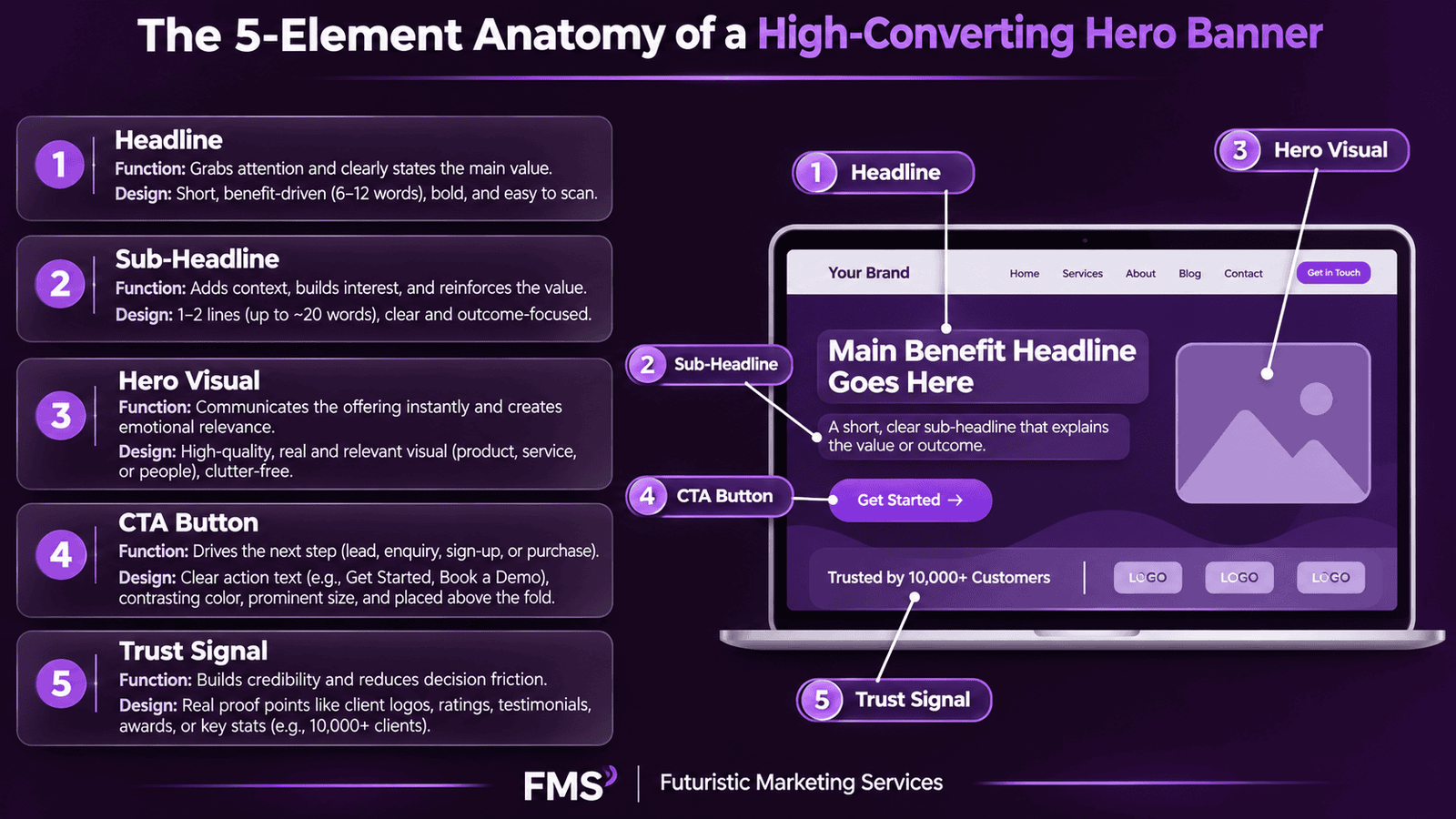
The 5-Element Anatomy of a High-Converting Hero Banner
| Element | Function | Design Requirement | Common Failure Mode |
|---|---|---|---|
| 1. Headline | Communicates the core value proposition, the specific outcome the visitor achieves by working with this business | Specific, benefit-led, under 10 words; Bold or ExtraBold weight; largest typographic element on the page | Vague, aspirational copy that describes the brand's identity rather than the customer's outcome ("We Build Dreams" instead of "Websites That Generate Enquiries") |
| 2. Sub-Headline | Adds specificity and context to the headline, answers "How?" or "For whom?" or "What specifically?" | One sentence, maximum 20 words; clearly visually subordinate to headline; must add distinct new information | Repeating the headline in different words; generic statements that apply to any business in any industry |
| 3. Hero Visual | Creates emotional resonance, communicates credibility, and serves as the primary stop-scroll element that earns the visitor's attention | High quality (no pixelation, no generic stock photography); directly relevant to the headline's promise; creates the emotional state the visitor should feel | Generic stock photography of people shaking hands, pointing at laptops, or standing in generic office environments |
| 4. CTA Button | Converts accumulated attention and interest into a specific, measurable action, the only element that directly produces a commercial result | High-contrast colour against background; imperative verb opening; specific outcome stated; minimum 44×44px touch target on mobile | Generic copy ("Submit", "Click Here", "Learn More") that does not specify what the click produces; poor colour contrast that makes the button visually subordinate to the surrounding design |
| 5. Trust Signal | Reduces the perceived risk of taking the CTA action by providing social proof, authority signals, or credibility indicators that make the conversion feel safe | Specific and verifiable: client logos, a specific result ("Generated 2,400 leads for 50+ Indian SMEs"), number of years in business, industry certifications | Vague trust signals ("We are trusted by thousands") that cannot be verified; absent trust signals that leave the visitor with no credibility evidence at the decision point |
Headline Design: The Most Important Words on Your Website
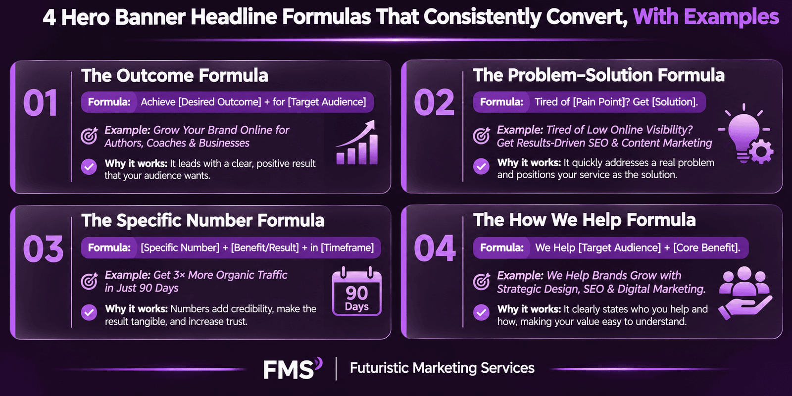
The Four Headline Formulas That Consistently Perform
| Formula | Structure | Example (Marketing Services Context) | Why It Works |
|---|---|---|---|
| Outcome Formula | [Specific Result] for [Specific Audience] | More Leads, Less Ad Spend, For Indian SMEs | Immediately identifies both what is delivered and who it is for; the visitor self-qualifies in the first read |
| Problem Solution Formula | Stop [Frustration]. Start [Desired State]. | Stop Wasting Budget on Ads That Do Not Convert | Identifies a specific pain the visitor already experiences, creating immediate relevance before the solution is introduced |
| Specific Number Formula | [Number] [Specific Result] in [Timeframe] | 2,400 Leads Generated for 50+ Indian Businesses | Specific numbers are intrinsically more credible than general claims; the number implies a trackable, verifiable result rather than a marketing claim |
| How We Help Formula | We help [Audience] achieve [Result] without [Friction] | We Help Indian SMEs Get Found Online Without Guessing | The "without [friction]" element directly addresses the objection that the visitor is most likely to have about pursuing the result |
Headline Formatting for Maximum Impact
The Hero Visual: Photography, Video, and Illustration
Photography: The Highest-Trust Visual Medium
Video: Maximum Engagement at a Performance Cost
Illustration and Custom Graphics
Visual Hierarchy in the Hero Section
The Four Hierarchy Tools
The Reading Path for a High-Converting Hero
CTA Button Design Specifications for Hero Banners
| CTA Variable | Best Practice | Common Mistake | Testing Priority |
|---|---|---|---|
| Button Colour | Brand accent colour that contrasts strongly with both the hero background and the headline text colour; must be immediately visible without scanning | Using the same colour family as the background; using the primary brand colour when it does not contrast with the hero colour scheme | High, typical improvement 20–35% CTR; test a complementary colour against the brand accent |
| Button Copy | Imperative verb + specific outcome: "Get My Free Quote", "Start My Free Trial", "Book Your Strategy Call" | "Submit", "Click Here", "Learn More", "Get Started", none specify what the click produces | Highest, copy specificity is the single most consistent conversion driver in CTA testing |
| Button Size | Desktop: minimum 180×50px with 16–18px Bold text; Mobile: minimum 44×44px touch target per Apple HIG and Google Material Design guidelines | Buttons too small to tap reliably on mobile; buttons too large that dominate the composition and feel aggressive | Medium, primarily a mobile conversion fix; test size after colour and copy are optimised |
| Button Position | Below the sub-headline, at the end of the natural reading path; left-aligned or centred depending on the overall hero layout; never above the headline | Placing CTA at the top of the text block before trust is established; multiple CTAs competing for attention in the same hero | Medium, test single vs dual CTA; test below-headline vs below-trust-signal positioning |
Trust Signal Types and Their Placement
| Trust Signal Type | Example | Best Placement in Hero | Effectiveness Ranking |
|---|---|---|---|
| Specific Result Stat | "50+ Indian businesses. 2,400+ leads generated." | Below CTA button or beside CTA in a micro-text line | Highest, specific, verifiable, immediately relevant |
| Client Logo Strip | 5–8 recognisable client logos with "Trusted by" label | Below the CTA section, at the bottom of the hero | High, strong for B2B; requires recognisable logos to be effective |
| Star Rating | "4.9/5, Based on 147 Google Reviews" | Below CTA button; star icon beside number for visual shorthand | High, universally understood; highly effective in B2C and local service contexts |
| Award or Certification | Google Partner badge, industry award, certification mark | Near logo or at bottom of hero; small but visible | Medium, effective when the certifying body is recognised by the target audience |
| Years in Business | "Serving Indian businesses since 2015" | Within the sub-headline or as a micro-text below the CTA | Medium, provides longevity signal; more effective for older businesses |
Loading Speed: The Technical Variable That Negates Great Design
- Serve in WebP format: WebP provides 25–35% smaller file sizes than JPEG at equivalent quality; every CMS that supports modern web standards (WordPress, Shopify, Squarespace) can serve WebP automatically with the correct plugin or setting
- Compress to under 200KB for mobile: use Google PageSpeed Insights to identify whether your hero image is contributing to a failing LCP score; the tool provides the specific compression improvement needed
- Serve different image sizes to different viewports: use the HTML <picture> element or responsive image srcset attributes to serve a 400KB desktop image to desktop users and a 150KB mobile image to mobile users; serving a desktop-sized image to a mobile visitor is one of the most common and most damaging performance errors
- Add <link rel="preload"> for the hero image: this tells the browser to begin loading the hero image before it has fully parsed the rest of the page, significantly reducing LCP on most pages
- Use lazy loading for all images below the fold: add loading="lazy" to all img tags below the fold; never add this to the hero image, as lazy loading the LCP element dramatically increases LCP
Mobile Hero Banner Design
| Mobile Hero Element | Desktop Specification | Mobile Specification | Mobile-Specific Rule |
|---|---|---|---|
| Canvas dimensions | 1920×600–1080px (landscape) | 375–768px wide × 500–800px tall (portrait) | Design a dedicated mobile hero at portrait proportions; never use a landscape desktop hero scaled to 375px width |
| Layout orientation | Horizontal: text left, visual right (or vice versa) | Vertical stack: visual top, headline, sub-headline, CTA stacked downward | Horizontal desktop layouts must reflow to vertical on mobile; elements that cannot stack must be simplified to work in a single column |
| Headline font size | 48–80px | 28–44px; line breaks must be controlled manually | Verify line breaks at 375px width; a headline that reads well at 768px may have awkward word-wrapping at 375px |
| CTA button | Minimum 180×50px; left-aligned or centred | Full-width button (100% of container width); minimum 56px height; centred text | Full-width mobile CTA buttons consistently outperform narrow buttons on mobile because they are easier to tap with a thumb on any grip position |
| Hero image file size | Under 400KB in WebP format | Under 150KB in WebP format; serve via srcset or responsive image | Serving a desktop-sized hero image to a mobile visitor on a 4G connection is the most common and most impactful LCP failure in Indian website performance audits |
A/B Testing the Hero Banner: The Tests That Move Conversion Rates
- Headline value proposition test: test two fundamentally different angles on the value proposition, one outcome-focused ("More Enquiries From Your Website") versus one problem-focused ("Stop Losing Leads to Competitors"), with identical visual, sub-headline, and CTA; this reveals whether the audience is more motivated by gain or by avoiding loss, which informs all future messaging strategy
- Hero visual test: test a genuine team/founder photograph against a product shot or illustration; the winning visual type reveals whether the audience is buying the people or the product, which has major implications for all brand content beyond the hero
- CTA copy test: test a specific outcome CTA ("Get My Free 30-Minute Strategy Call") against a more generic equivalent ("Book a Consultation"); specific copy almost always wins but the size of the improvement varies significantly and reveals how much the generic copy was costing in conversion
- Trust signal test: test a version with a prominent trust signal (client count, result statistic, star rating) against a version without; the improvement reveals the audience's level of initial scepticism and how much social proof needs to be provided before they will act
Need a Hero Banner Redesign That Converts More Visitors?
Futuristic Marketing Services redesigns hero banners for Indian businesses, the five-element anatomy applied correctly, headline formulas tested against your specific audience, mobile and desktop versions at the correct specifications, and A/B testing setup included.
Start Your Hero Banner ProjectFrequently Asked Questions
Q. What should a hero banner say?
Q. What size should a hero banner be?
Q.Should the hero banner be an image, video, or slideshow?
Q. How does the hero banner affect SEO?
Q. How many CTAs should a hero banner have?
Build a Hero Banner That Earns Every First Impression
Futuristic Marketing Services designs hero banners for Indian businesses, all five elements applied correctly, mobile and desktop at the right specifications, performance-optimised for Core Web Vitals, and built for systematic A/B testing from launch day.
See Our Website Design Services