Key Takeaways
- Visual content generates 94% more views than text-only content (HubSpot), social media design quality is a direct commercial lever, not an aesthetic preference
- Consistent brand presentation across all social platforms increases revenue by 23% (Lucidpress), a documented brand design system is the highest-ROI design investment for most Indian businesses
- Over 96% of social media access in India is via mobile (IAMAI), every design must be tested on a physical mobile device before publishing
- The 6 core principles: brand consistency, mobile-first, visual hierarchy, accessibility, simplicity, and platform-specific optimisation
- The 9:16 vertical format is the most commercially important specification in 2026, it is the native format for Instagram Reels, Facebook Reels, TikTok, YouTube Shorts, and Stories across all platforms
- Every social media design must achieve a minimum 4.5:1 contrast ratio between text and background (WCAG AA), lower contrast text is illegible on mobile in Indian outdoor lighting conditions
Need a Complete Social Media Design System for Your Brand?
Futuristic Marketing Services designs social media visual systems for Indian businesses, brand guidelines, content templates for every format, platform-specific layouts, and the design system that ensures every post builds recognition and drives results.
Get a Free Social Media Design Consultation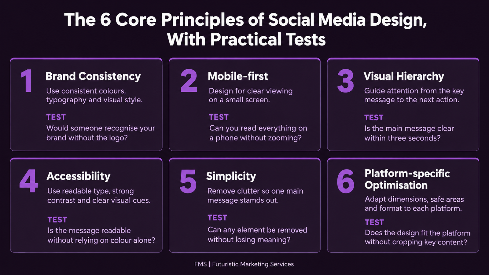
The 6 Core Principles of Social Media Design
The Mobile-First Design Requirements
Mobile-first design is not about scaling down desktop designs, it means designing with the mobile screen as the primary canvas, then adapting upward. Given that 96%+ of Indian social media access is mobile, a design that works only on desktop is a design that fails for almost the entire audience.
| Requirement | Specification | Why It Matters | Common Failure |
|---|---|---|---|
| Minimum headline font size | 80px at 1080px design width (displays ≈30px on mobile) | Below 30px displayed is at the minimum comfortable reading size for most users | Text looks readable at desktop scale, illegible on mobile |
| Minimum body font size | 40px at 1080px design width (displays ≈15px on mobile) | Body text below 40px design scale is illegible at mobile display size | Designer tests at 100% zoom on a 27" monitor; never checks mobile |
| Contrast ratio | Minimum 4.5:1 (WCAG AA); 7:1 preferred for social media text on imagery | Low contrast text disappears at small display sizes and in bright ambient light | White text placed directly on mid-tone photography without overlay |
| Safe zone compliance | Stories/Reels: all critical content within central 1080×1420px; avoid top/bottom 250px | Platform UI elements (profile handle, engagement buttons) overlay content outside safe zones | Logo or CTA placed in bottom 250px, hidden by engagement buttons |
| Primary content position | Most important element within central 60% of composition | The thumb zone on mobile is the centre of the screen; primary content must be thumb-accessible | Key headline placed near edge of composition, outside natural thumb zone |
The 7 Social Media Content Formats and Their Design Requirements
<strong>Format 3: Short-Form Video (Reels/TikTok).</strong> The highest-reach format in 2026. Design natively in 9:16 at 1080×1920px. Hook in the first 1–3 seconds. Captions mandatory, 85% of mobile video is watched without sound. Safe zone: central 1080×1420px area.
<strong>Format 4: Stories.</strong> Full-screen, disappears after 24 hours. Same 9:16 specifications as Reels. Ideal for time-sensitive content and direct-response CTAs. Interactive elements (polls, questions, sliders) can be added in-app.
<strong>Format 5: Document/Carousel (LinkedIn).</strong> PDF uploaded to LinkedIn displays as a swipeable carousel, the highest-engagement format on LinkedIn for educational content. Design at 1080×1080px per slide as a PDF. One section per slide; first slide drives the click.
Platform-by-Platform Design Guide
| Platform | Primary Dimensions | Visual Register | Key Design Consideration | Highest-Engagement Format |
|---|---|---|---|---|
| Feed: 1080×1350px (4:5); Reels/Stories: 1080×1920px (9:16) | Highest visual quality expectation; aesthetic standard is the highest of any platform | Profile grid coherence: 9 most recent posts must form a visually coherent portfolio; Reels cover design is permanent in the grid | Reels (reach); Educational carousels (saves and engagement) | |
| Feed: 1200×1200px (1:1) or 1200×630px; Stories/Reels: 1080×1920px | Mixed register; demographic skews older than Instagram; social proof and peer content perform strongly | Link preview image optimisation (1200×630px Open Graph image); Facebook Groups content has different design considerations than Page content | Reels (algorithmic priority); Native video (highest organic reach of non-Reel formats) | |
| Feed: 1200×627px landscape or 1080×1080px square; Article header: 1920×1080px | Professional register; significant desktop usage; data and thought leadership content performs above average | Both desktop and mobile must be tested; the desktop display at larger sizes means typography can be slightly smaller than for purely mobile platforms | Document carousels (PDF); native video; data-led single images | |
| TikTok | 1080×1920px (9:16); 5–90 seconds recommended | Entertainment-first; authenticity over production polish; native content consistently outperforms branded creative | Safe zone: avoid top 130px (username/follow) and bottom 210px (captions/buttons); hook must land in first 0.3 seconds | Short-form vertical video (the only format); native aesthetic UGC-style |
| Standard pin: 1000×1500px (2:3); Infographic pin: up to 1000×3000px | Aspirational and inspirational; longest content lifespan of any social platform (months to years) | Masonry grid: taller pins occupy more visual space and receive more clicks; text overlay at top third of pin performs best | Tall infographic pins; how-to step guides; product inspiration boards |
Building a Social Media Brand Design System
A brand design system for social media is the documented set of visual standards that ensure every piece of content is immediately identifiable as the brand without requiring a creative decision from scratch each time. Without a design system, social media content either requires a designer for every post or degrades into visual inconsistency that erodes brand recognition.
The minimum viable social media design system for an Indian business includes six elements:
- Exact colour palette with HEX codes: primary, secondary, accent, and neutral colours documented with exact HEX values, never use approximate colours; the 30 seconds to enter a precise HEX value is the most commercially valuable 30 seconds in the design process
- Typography specification: the exact font name, weight, and minimum size for headlines, body text, and captions; for the complete typography framework, see our typography in design guide
- Logo usage rules: the approved logo versions, minimum size (typically 80px wide), clear space, and approved background colours for social media contexts
- Content templates: 4–6 Canva or Figma templates for the brand's most common post types (promotional, educational, testimonial, announcement, behind-the-scenes) at the correct dimensions for each target platform
- Imagery style guide: preferred photography style (lighting, subject matter, colour temperature, level of staging) and prohibited image types, this prevents the visual incoherence that occurs when random stock photography is mixed with branded content
- Brand voice summary: 3 key voice attributes with do/don't examples that ensure all caption text feels like the same brand regardless of who writes it
Typography for Social Media
Typography in social media must function at scroll speed, readable in under one second before the viewer has consciously decided to stop. This imposes constraints that differ from print or web typography. The key social media typography rules:
- Maximum 2 typefaces per design, one for headlines, one for body/captions; more typefaces create visual noise and undermine brand consistency
- Bold or ExtraBold weight for any text on imagery, Regular and Light weights are not legible at small mobile display sizes in varied ambient light
- Minimum 80px headline at 1080px design width, this displays at approximately 30px on a 375px mobile screen, which is the minimum readable size
- Always treat text over photography, add a semi-transparent dark overlay (minimum rgba(0,0,0,0.5)), use a solid colour text panel, or apply a drop shadow; never place text directly on a photographic background without contrast treatment
Colour Strategy for Social Media
Colour strategy for social media operates at two levels: brand consistency (using the brand’s documented colour palette consistently to build recognition) and visual performance (ensuring the post stands out in the specific feed context where it will appear). These levels can be in tension, the brand’s colour may be similar to the dominant palette of the target platform’s competitive feed context.
Social Media Design Workflow
A documented design workflow reduces production time, improves consistency, and prevents the quality failures that result from rushed, undirected creative work. The 6-step workflow for every social media post:
<strong>Step 1: Write the single message.</strong> Before opening any design tool, write the one sentence the post must communicate. This sentence is the design brief. Every subsequent design decision is evaluated against it.
<strong>Step 2: Select the format and platform.</strong> Determine the correct dimensions and format for the target platform and content type. Open the appropriate template from the brand’s template library.
<strong>Step 3: Place the primary element first.</strong> The design element that communicates the primary message most effectively (the headline, the key visual, the central statistic) is placed first. All other elements are placed in subordinate positions.
<strong>Step 4: Apply brand identity.</strong> Apply brand colours (exact HEX values), brand typography (correct typeface and weight), and brand logo in the approved position. The design should look recognisably on-brand before any content-specific elements are added.
<strong>Step 5: Test on mobile.</strong> Export the design and view it on a physical mobile device. Is every text element legible? Is the primary message immediately clear? Is there any content outside the safe zone? Is the contrast ratio sufficient? Fix any failure before proceeding.
<strong>Step 6: Write the caption and schedule.</strong> The caption’s first line must be a hook that reinforces the post’s primary message, it is what appears above the “More” truncation on Instagram and Facebook. Schedule at the platform’s optimal posting time for the brand’s specific audience.
Need Social Media Content That Builds Brand Recognition and Drives Results?
Futuristic Marketing Services creates social media design systems and ongoing content for Indian businesses, brand design system, template library, platform-specific content, and monthly content production that keeps the brand consistently visible.
Start Your Social Media Design ProjectFrequently Asked Questions
What is social media design?
What are the most important social media image dimensions for 2026?
How do I maintain brand consistency across social media platforms?
What font size should I use for social media posts?
How does social media design affect the algorithm?
What are the most common social media design mistakes?
Build a Social Media Visual Identity That Compounds With Every Post
Futuristic Marketing Services designs complete social media design systems for Indian businesses, the brand guidelines, the template library, and the monthly content production that makes every post an investment in brand recognition.
See Our Social Media Design Services