
Website UX Audit: What It Is, What It Finds, and What It Costs

website ux audit

A website UX audit is a structured evaluation of how real users experience a website, identifying the navigation failures, content clarity problems, conversion barriers, and mobile usability issues that reduce enquiries, purchases, and sign-ups. It combines quantitative data (heatmaps, session recordings, analytics funnel analysis) with qualitative evaluation (expert heuristic review, user testing observation) to produce a prioritised list of specific, evidenced UX improvements. The output is not a design opinion, it is a data-backed remediation plan with measurable commercial impact.

This guide covers what a professional UX audit includes and how each component works, the tools used (heatmaps, session recordings, exit intent surveys, and analytics), the most common UX failures found across business websites, the conversion rate impact of fixing each failure type, eCommerce-specific UX audit requirements, how to commission a UX audit and what to expect as a deliverable, and how a UX audit relates to broader conversion rate optimisation and technical SEO audit programmes.

Key Takeaways

  • A UX audit is not a visual design critique, it is a structured, data-backed investigation of why visitors are not completing the actions the site is designed for. According to Nielsen Norman Group, usability testing with just 5 users uncovers 85% of the most critical UX problems. A professional UX audit replaces opinion with evidence.
  • Microsoft Clarity (free) and Hotjar provide heatmaps and session recordings that show exactly where visitors click, how far they scroll, and where they abandon, without requiring user interviews or formal testing. These tools are the foundation of any modern UX audit.
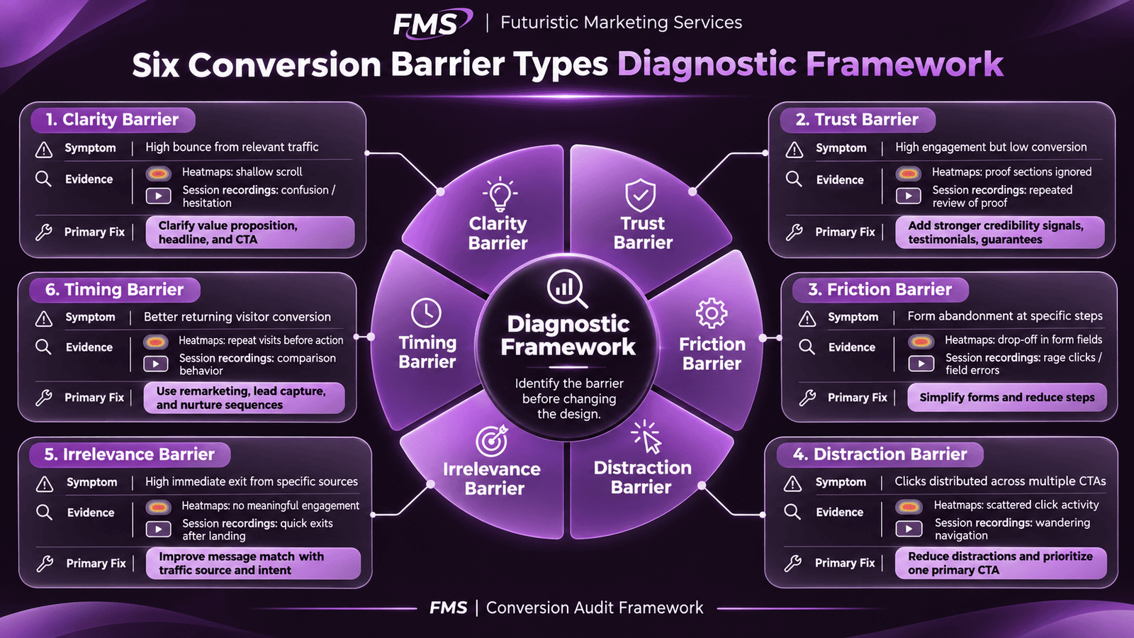
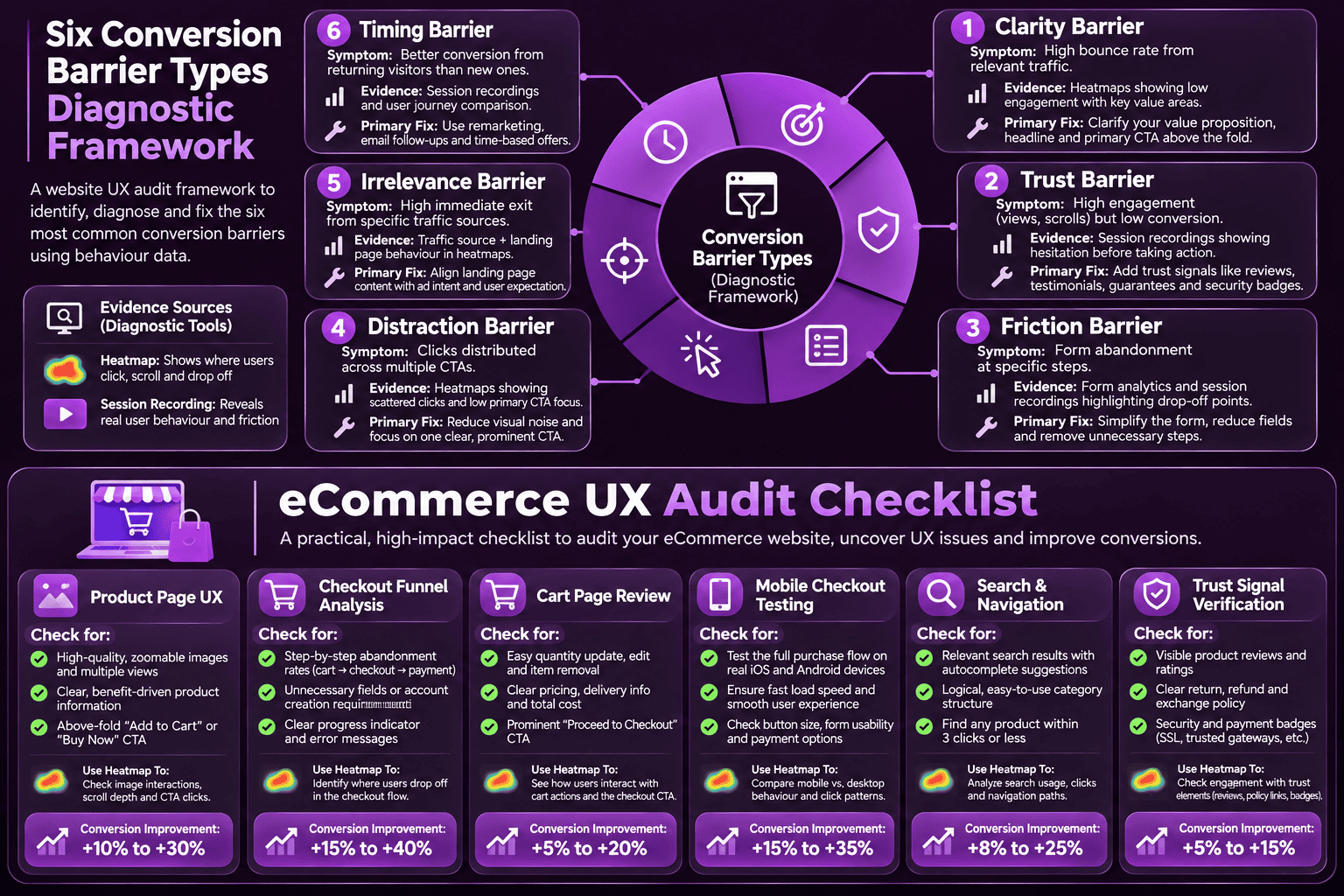
  • The six universal UX failure types, clarity, trust, friction, distraction, irrelevance, and timing, account for the overwhelming majority of conversion barriers found in UX audits. Identifying which type dominates on each key page determines the correct type of fix. See our conversion rate optimisation guide for the complete framework.
  • Mobile UX failures are disproportionately impactful because over 60% of traffic comes from mobile and mobile users abandon more readily. Common mobile-specific UX failures: CTA below the fold; touch targets below 44px; form fields without correct input types; horizontal scroll on narrow viewports. A UX audit must evaluate mobile separately from desktop.
  • Baymard Institute research shows 68 to 70% of eCommerce carts are abandoned. The primary checkout UX failures are forced account creation (responsible for 26% of abandonments), unexpected shipping costs at checkout (49%), and overly complex checkout forms. Each has a specific, implementable fix.
  • The scroll map finding that 50% of visitors leave a page before scrolling past a certain point is one of the most commercially significant UX audit outputs, because any CTA or trust signal below the 50% scroll line is invisible to half the audience. Moving key elements above this line consistently improves conversion rate.
  • A UX audit deliverable must include specific, prioritised recommendations with the evidence behind each, not generic best-practice advice. "Add social proof to the homepage" is not a UX audit recommendation. "Session recordings show that 63% of visitors who reach the hero scroll immediately without interacting, add a review count and rating adjacent to the primary CTA above the fold" is.

Website UX Audit

Data-Backed UX Audit With Specific, Prioritised Recommendations

Futuristic Marketing Services provides professional website UX audits, heatmap analysis, session recording review, funnel diagnostics, and a prioritised improvement roadmap with commercial impact estimates.

Request a UX Audit

What a Professional UX Audit Includes

A professional UX audit uses multiple data sources to build a complete picture of how users experience the site. Relying on any single data source produces incomplete findings, quantitative data identifies where problems exist; qualitative data explains why. Both are required for evidence-backed recommendations.
Audit ComponentWhat It RevealsTools UsedTime Required
Heatmap analysisWhere visitors click, where they move their mouse, and which elements attract or repel attention on key pagesMicrosoft Clarity (free) or Hotjar2 to 4 weeks data collection; 3 to 5 hours analysis
Session recording reviewWhat real visitors actually do on the site, where they click, scroll, hesitate, and abandon, in video replayMicrosoft Clarity or Hotjar, review 10 to 20 recordings per key page4 to 8 hours per key page type
Analytics funnel analysisWhere visitors drop off in the conversion funnel, which specific steps lose the most users and how conversion rates compare by traffic source and deviceGoogle Analytics 4, Funnel Exploration report2 to 4 hours setup and analysis
Expert heuristic reviewEvaluation of the site against established UX principles, navigation, content clarity, error prevention, consistency, accessibilityUX specialist manual review, Jakob Nielsen 10 heuristics and WCAG guidelines4 to 8 hours per site type
Exit intent and on-page surveysThe visitor's own explanation of why they did not convert, captures the perspective that no analytics tool can provideHotjar surveys or Typeform exit overlays2 to 4 weeks data collection; 2 to 3 hours analysis
Mobile-specific UX reviewTouch target sizes, CTA visibility above the fold at 375px, form input types, horizontal overflow, mobile navigation usabilityChrome DevTools device toolbar; real iOS and Android devices2 to 4 hours per key user journey
Core Web Vitals and performance impactHow page speed affects UX, bounce rate at different load times, abandonment patterns on slow pages, mobile performance gapsGoogle PageSpeed Insights; Google Search Console Core Web Vitals1 to 2 hours

The UX Audit Deliverable

A professional UX audit deliverable contains: a page-by-page findings summary with screenshots and annotated evidence; the six-type conversion barrier classification for each identified issue; a prioritised remediation list ranked by commercial impact (not ease of implementation); specific design and copy recommendations for each finding; and estimated conversion rate improvement range for each fix. The deliverable should be specific enough that a developer or designer can implement each recommendation without further clarification from the auditor.

The Six Conversion Barrier Types

Every UX failure that prevents a motivated visitor from converting falls into one of six categories. Identifying which type dominates on each key page determines the correct category of fix, which is more commercially valuable than identifying individual tactical fixes without a structural framework.
Barrier TypeDefinitionHow Heatmaps and Recordings Reveal ItPrimary Fix
ClarityThe visitor cannot quickly understand what is being offered, who it is for, and what happens when they actHigh immediate bounce rate; scrolling rapidly and leaving; clicking navigation to try other pagesRewrite headline to state specific benefit and audience; simplify above-fold to one primary message
TrustThe visitor is interested but does not yet believe the business can deliver the promiseStrong engagement (scrolling, reading) but low conversion; clicking About page or looking for reviewsAdd specific social proof adjacent to CTA; display credentials and verifiable outcomes
FrictionThe conversion process is too complex, too long, or too effortful for the visitor to completeForm abandonment at specific fields; mobile checkout dropping off on payment entryReduce form fields to minimum viable; correct input types; add progress indicators
DistractionCompeting CTAs, navigation escape routes, or irrelevant content divert attention from the primary goalClicks distributed across multiple CTAs; visitors leaving via header navigation from key landing pagesRemove navigation from high-value conversion pages; reduce to one primary CTA
IrrelevanceThe page does not match what the visitor expected when they arrived, from the ad, email, or search resultHigh immediate exit rate (under 5 seconds) from specific traffic sources; paid traffic performing poorlyImplement message match; create traffic-source-specific landing pages
TimingThe visitor is interested but not ready to convert, they need more information or a lower-commitment first stepGood initial engagement; returning visitors converting at higher rate than first visitsOffer lower-commitment micro conversion (guide, newsletter); implement email nurture for non-converters

eCommerce UX Audit: Additional Requirements

eCommerce sites require a UX audit scope that extends beyond standard website evaluation to cover the complete purchase journey, from product discovery through to checkout completion and post-purchase experience. The highest-value eCommerce UX findings are almost always in the checkout flow, where small friction increases cause large abandonment rate increases.

eCommerce UX Audit Priority Areas

Product page UX

Product images (zoom capability, lifestyle images, multiple angles); variant selection (size, colour, is the unavailable variant clearly indicated?); add-to-cart button position and visibility above fold on mobile; reviews prominence; delivery and returns information visibility without scrolling to footer.

Checkout funnel analysis

Step-by-step funnel from Add to Cart through each checkout step to Purchase Confirmation. Identify the step with the highest abandonment, this is the primary optimisation target. According to Baymard Institute, forced account creation and unexpected shipping costs are the two most common high-abandonment causes.

Cart page review

Is the cart clearly accessible from every page? Can customers edit quantity and remove items easily? Are cross-sell suggestions relevant or distracting? Is the proceed to checkout CTA the dominant element on the page?

Mobile checkout testing

The mobile checkout is the most friction-intensive user journey on any eCommerce site. Test on a real iPhone (iOS Safari) and real Android (Chrome): does the email field trigger the email keyboard? Does the card number field trigger the numeric keyboard? Is the payment button above the fold? Are error messages clear and specific? See our mobile-first development guide.

Search and navigation

Can visitors find products they are looking for in under 3 clicks from the homepage? Is the search function returning relevant results for common product queries? Are category and filter pages structured to support browsing behaviour?

Trust and credibility signals

Are review counts and star ratings visible above the fold on product pages? Is the returns policy accessible before purchase (not just in the footer)? Are security badges genuine and accurately described? Are delivery timeframes specific and visible near the add-to-cart button?

Common UX Findings and Their Commercial Impact

Common FindingConversion ImpactTypical FixExpected Improvement
CTA below the fold on mobile50% of mobile visitors never see the primary CTAMove CTA above fold at 375px; add sticky CTA bar on long pages15 to 35% mobile conversion rate increase
Generic or unclear headlineHigh immediate bounce, visitors cannot determine relevance in 5 secondsRewrite to state specific benefit and audience20 to 60% reduction in bounce from relevant traffic
Missing social proof near CTATrust barrier, visitors motivated to convert but not confidentAdd star rating with review count adjacent to primary CTA button10 to 30% conversion rate increase
Form requires too many fieldsEach additional required field reduces completion by 5 to 15%Remove all non-essential fields; defer collection to post-conversion15 to 40% form completion improvement
No mobile-optimised form inputsMobile keyboard not triggering correctly, frustration and abandonmentAdd correct type attributes (email, tel, number) and autocomplete10 to 25% mobile form completion improvement
Forced checkout account creation26% of all cart abandonments per BaymardImplement guest checkout as primary path; offer account creation post-purchase15 to 35% checkout completion improvement
Unexpected shipping cost in checkout49% of cart abandonments triggered by shipping cost surpriseDisplay shipping costs on product page and cart; show free threshold10 to 25% cart-to-checkout conversion improvement
No trust signal at payment stageFinal-moment hesitation from security anxietyAdd SSL badge, accepted payment logos, and return policy summary at payment5 to 15% payment completion improvement

Conversion Optimisation

Identify and Fix the UX Issues Costing You Conversions

Futuristic Marketing Services pairs the UX audit findings with a conversion rate optimisation programme, testing fixes, measuring impact, and compounding improvements month over month.

Start Your UX Improvement Programme

Frequently Asked Questions About Website UX Audits

What is a website UX audit?

style="color:rgba(255,255,255,0.85);font-size:15px;line-height:1.8;">A website UX audit is a structured investigation of how real visitors experience a website, identifying the specific usability problems, content clarity failures, conversion barriers, and mobile issues that reduce commercial performance. It combines quantitative data (heatmaps, session recordings, analytics funnels) with qualitative evaluation (expert heuristic review, user testing) to produce a prioritised, evidence-backed improvement plan. A UX audit is not a visual design opinion, every finding must be supported by specific data showing that real visitors are being affected. See our conversion rate optimisation guide for the broader optimisation context.

How is a UX audit different from a technical SEO audit?

style="color:rgba(255,255,255,0.85);font-size:15px;line-height:1.8;">A technical SEO audit evaluates the site infrastructure that determines whether Google can crawl, index, and rank the site, robots.txt, canonical tags, Core Web Vitals, structured data. A UX audit evaluates how visitors experience the site once they arrive, clarity of messaging, conversion barriers, navigation usability, and mobile experience. Both are required for complete commercial performance: an SEO audit improves traffic; a UX audit improves what happens to that traffic. The two programmes are complementary and often conducted together for maximum impact.

What tools are used in a UX audit?

style="color:rgba(255,255,255,0.85);font-size:15px;line-height:1.8;">A professional UX audit uses: Microsoft Clarity (free) or Hotjar for heatmaps and session recordings; Google Analytics 4 for funnel analysis and traffic source performance; Google Search Console for organic performance data; Hotjar or Typeform for exit intent and on-page surveys; Chrome DevTools for mobile UX evaluation; and Google PageSpeed Insights for Core Web Vitals performance. A UX audit relying only on expert opinion without these data sources is a heuristic review, not a full UX audit.

How long does a website UX audit take?

style="color:rgba(255,255,255,0.85);font-size:15px;line-height:1.8;">A standard business website UX audit takes 2 to 4 weeks for data collection (heatmaps and session recordings need real traffic to generate meaningful data) plus 2 to 5 days for analysis and report production. Total elapsed time is typically 3 to 5 weeks. An eCommerce UX audit covering the full purchase journey takes 4 to 6 weeks. A rapid expert heuristic review (without data collection) can be completed in 2 to 3 days but produces lower-confidence findings because it is not validated by actual visitor behaviour data. The heatmap and recording data collection period cannot be shortened, it requires real traffic.

How much does a website UX audit cost?

style="color:rgba(255,255,255,0.85);font-size:15px;line-height:1.8;">UK UX audit costs: a basic heuristic review (expert evaluation without data collection) costs £500 to £2,000. A full UX audit with heatmaps, session recordings, analytics funnel analysis, and a detailed prioritised report costs £2,000 to £8,000 for a standard business site. An eCommerce UX audit covering the complete purchase journey costs £3,000 to £12,000. A UX audit plus conversion rate optimisation programme implementation costs £5,000 to £25,000 depending on the number and complexity of fixes. The ROI is typically high: a 20% conversion rate improvement on a site generating £20,000 in monthly revenue produces £4,000 additional revenue per month.

What is a heatmap and how does it help a UX audit?

style="color:rgba(255,255,255,0.85);font-size:15px;line-height:1.8;">A heatmap is a visualisation of where visitors click, move their mouse, and how far they scroll on any given page. Click maps show which elements attract clicks, including rage clicking (rapid repeated clicks signalling frustration) and dead-click patterns (clicking non-interactive elements expecting them to respond). Scroll maps show how far down the page the average visitor scrolls, the 50% scroll line is the point at which half the audience has left; anything below it is invisible to half the visitors. Microsoft Clarity provides free heatmaps and session recordings for any WordPress or standard website, install it on all key landing pages and collect data for 2 to 4 weeks before analysis.

What is session recording analysis?

style="color:rgba(255,255,255,0.85);font-size:15px;line-height:1.8;">Session recordings are anonymised video replays of real visitor sessions, showing exactly where each visitor clicked, scrolled, hesitated, and left. Reviewing 10 to 20 session recordings per key page type consistently reveals more actionable UX insight than a week of analytics analysis, because you see exactly what each visitor does rather than aggregated statistics. Use Microsoft Clarity or Hotjar to collect session recordings. Filter specifically for mobile sessions and for sessions that abandoned at key conversion points, these sessions reveal the specific barriers preventing conversion most directly.

What are the most common UX problems found in audits?

style="color:rgba(255,255,255,0.85);font-size:15px;line-height:1.8;">The most common UX findings across business websites: CTA not visible above the fold on mobile (affects over 60% of traffic); generic or unclear headline that fails the 5-second test; missing social proof adjacent to the primary CTA; too many required form fields; no mobile-optimised form inputs (wrong keyboard types triggering); and navigation escape routes on key landing pages that allow visitors to leave without converting. For eCommerce specifically: forced account creation before checkout; unexpected shipping costs appearing only in the checkout; and product pages missing reviews above the fold. See our conversion rate optimisation guide for the full barrier framework.

How do I measure the success of a UX audit?

style="color:rgba(255,255,255,0.85);font-size:15px;line-height:1.8;">UX audit success is measured by conversion rate improvement on the pages and journeys audited. Establish the baseline conversion rate (form submissions per visit, add-to-cart rate, checkout completion rate) before implementing any changes. Measure the same metrics 30 and 60 days after implementation. For changes with enough traffic, implement as A/B tests to isolate the specific contribution of each fix. The most important single metric is the commercial outcome, leads generated, revenue produced, or cost per conversion, not the conversion rate in isolation. A 20% conversion rate improvement producing £2,000 additional monthly revenue is the business case for the UX audit investment.

Should I do a UX audit before or after a website redesign?

style="color:rgba(255,255,255,0.85);font-size:15px;line-height:1.8;">Before a redesign, a UX audit on the existing site reveals which elements are working (and should be preserved or improved), which are failing (and should be fixed in the redesign), and which conversion principles the new design must implement. A redesign without a UX audit discards what works along with what fails, frequently producing a more visually impressive site that converts at a lower rate than the old one. A UX audit before redesign is the most cost-effective investment available: the findings directly inform the redesign brief and prevent the most common redesign failures. See our web development services guide for the redesign context.

What is the difference between a UX audit and usability testing?

style="color:rgba(255,255,255,0.85);font-size:15px;line-height:1.8;">Usability testing involves observing real users attempting to complete tasks on the site, watching where they get confused, make errors, or give up. It requires recruiting representative users, moderating test sessions, and analysing qualitative observations. According to Nielsen Norman Group, testing with 5 users reveals 85% of the most critical usability problems. A UX audit is broader, it combines heuristic expert review, analytics data, heatmaps, session recordings, and may include usability testing as one component. Usability testing produces richer qualitative insight; a full UX audit provides both quantitative data and qualitative evaluation across more surface area.

What should a UX audit report include?

style="color:rgba(255,255,255,0.85);font-size:15px;line-height:1.8;">A professional UX audit report must include: an executive summary with the most important findings and estimated commercial impact; a page-by-page findings section with screenshots and specific evidence (heatmap images, analytics data, recording timestamps); the conversion barrier classification for each finding; a prioritised remediation list ranked by commercial impact; specific, implementable recommendations (not generic best-practice advice); and estimated conversion rate improvement range for each fix. The report should be actionable without further clarification, a designer or developer must be able to implement each recommendation directly from the report. See our conversion rate optimisation guide for the implementation framework.

Futuristic Marketing Services

Find Out What Is Preventing Visitors From Converting

Futuristic Marketing Services provides data-backed UX audits, heatmap analysis, session recording review, funnel diagnostics, and a specific prioritised improvement roadmap that pays for itself in the first conversion rate improvement.

Commission Your UX Audit


Conclusion: UX Audit as Commercial Diagnosis

A website UX audit is the commercial equivalent of a business health check, it reveals the specific, evidenced reasons why the site is not performing at its potential, and produces a prioritised plan for addressing them. The investment is consistent: a 15 to 25% conversion rate improvement on most business sites produces monthly revenue uplift that exceeds the audit cost within the first quarter of implementation.
The value of a UX audit is in the specificity of its findings. Generic UX advice (add social proof, simplify forms, improve mobile) is available without commissioning an audit. What an audit provides that no general advice can is: the specific evidence that these particular problems exist on this specific site; how severe each problem is based on the proportion of visitors it affects; and a prioritised sequence for addressing them based on commercial impact. See our conversion rate optimisation guide for the implementation framework that turns audit findings into measured improvements.
For the technical SEO context that determines whether a site's traffic is sufficient to audit effectively: technical SEO audit | website architecture SEO | Core Web Vitals optimisation.
Share this post :
Picture of Devyansh Tripathi
Devyansh Tripathi

Devyansh Tripathi is a digital marketing strategist with over 5 years of hands-on experience in helping brands achieve growth through tailored, data-driven marketing solutions. With a deep understanding of SEO, content strategy, and social media dynamics, Devyansh specializes in creating results-oriented campaigns that drive both brand awareness and conversion.

All Posts