

Website Design Guide: How to Create a High-Converting Business Website

website design guide

A website design guide answers a deceptively simple question: what makes one website convert visitors into customers while an almost identical competitor website loses them? The answer is not the colour scheme, not the number of pages, and not the amount of content. The answer is a specific set of design decisions, about visual hierarchy, loading speed, navigation structure, CTA placement, and trust signal positioning, that determine whether a visitor who arrives with genuine commercial interest takes the action the business wants them to take or leaves without engaging.

According to Sweor's web design research, 57% of users will not recommend a business with a poor mobile design, and users form a visual judgement of a website in 50 milliseconds. According to Nielsen Norman Group's reading pattern research, users scan rather than read websites, which means the visual hierarchy that determines what they see and process first is more commercially important than the quality of the written content it frames. According to Baymard Institute's UX research, the average cart abandonment rate across e-commerce is 69.8%, the majority caused by design and UX failures, not pricing or product.
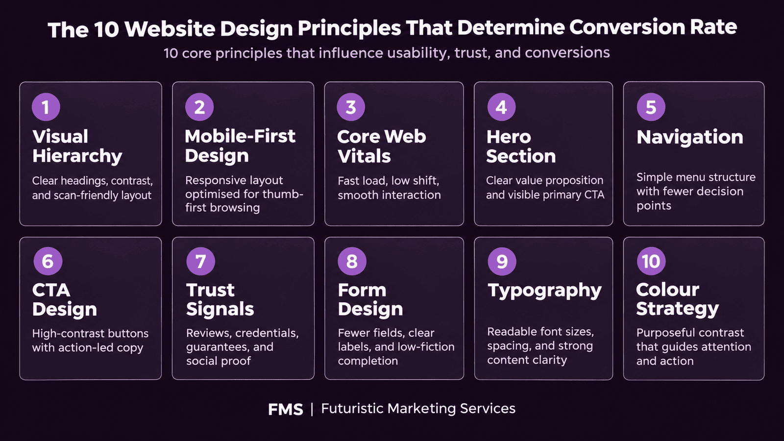
This guide covers the ten design principles that determine conversion rate: visual hierarchy, mobile-first design, loading speed, hero section anatomy, navigation design, CTA design, trust signal placement, form design, typography for readability, and colour for conversion. Each principle includes specific, actionable specifications rather than general advice. For the complete SEO-focused design framework, see our website design for SEO guide. For the complete UX checklist, see our website UX design checklist.

Key Takeaways

  • Users form a visual judgement of a website in 50 milliseconds, before any content is consciously evaluated, making the visual hierarchy and first-impression design quality the most commercially critical design decision on any website
  • 57% of users will not recommend a business with poor mobile design (Sweor), mobile-first design is not optional for any Indian business where the majority of visitors arrive on smartphones
  • Core Web Vitals scores, LCP under 2.5 seconds, INP under 200 milliseconds, CLS under 0.1, are direct Google ranking signals; websites that fail these thresholds are penalised in search results regardless of content quality
  • The hero section is the highest-leverage single design zone on any homepage, 5 specific elements must be present and correctly hierarchised for the hero to convert first-time visitors
  • Navigation must contain a maximum of 5–6 top-level items with visitor-language labels; navigation complexity above this threshold increases cognitive load and reduces the proportion of visitors who take a desired action
  • The CTA button is the single highest-return design optimisation target, colour, copy specificity, size, and placement each independently affect conversion rate and must be tested systematically
  • Trust signals reduce perceived purchase risk; the most effective are specific and verifiable, client count, result statistic, named testimonial with photo, rather than generic claims

Need a High-Converting Website Designed for Your Business?

Futuristic Marketing Services designs high-converting business websites for Indian businesses, every principle in this guide applied correctly, mobile-first, Core Web Vitals optimised, and built to generate enquiries from day one.

Get a Free Website Design Consultation
Principle 1: Visual Hierarchy, Guiding Every Visitor's Eye

Visual hierarchy is the design system that determines the sequence in which a visitor's eye moves through a page. According to Nielsen Norman Group, users scan web pages in F-shaped or Z-shaped patterns, concentrating attention on the upper-left area and the first line of text and images in each section. A website without deliberate visual hierarchy presents equal visual weight to all elements, producing a scanning pattern without a clear commercial destination, the visitor's eye moves without settling, processes no specific message clearly, and leaves without taking an action.

The Hierarchy Tools

Four design tools create visual hierarchy on web pages. Size is the most powerful: a headline at 64px and a sub-headline at 20px creates an unambiguous hierarchy. Colour contrast is second: elements with high contrast against their background are processed before elements with low contrast. Position is third: upper-page and left-frame elements (for left-to-right reading audiences) are seen before lower and right-frame elements. Whitespace is fourth: elements surrounded by generous whitespace receive more attention than elements surrounded by competing content at equal size.

Mobile-First Visual Hierarchy

Mobile screens present a single-column layout that forces a linear reading sequence from top to bottom. Visual hierarchy on mobile is determined primarily by position and size, there is no left-right layout axis to exploit. Every mobile design decision must be evaluated by asking: is the most commercially important element at the top of this single-column layout? Is it large enough to be seen without zooming? For the complete mobile-first design framework, see our mobile-first web design guide.

Principle 2: Mobile-First Design, Building for the Majority

Over 60% of website traffic in India arrives on mobile devices across most business categories, with higher proportions in consumer and local service verticals. Mobile-first design means building the mobile version of every page first and verifying it communicates effectively at 375px width before adapting it for desktop. The alternative, designing for desktop and then adapting for mobile, consistently produces mobile experiences that work poorly because desktop design decisions (horizontal layouts, small hover-state interactions, multi-column grids) require fundamental restructuring rather than simple scaling for mobile.
Design Element Desktop Specification Mobile Specification Mobile Design Rule
Layout columns 2–4 column grids Single column stack All multi-column desktop layouts must reflow to single column on mobile; never use horizontal scroll on mobile
Body text size 16–18px 16px minimum Never below 16px on mobile; text smaller than this requires pinch-to-zoom which kills engagement
Touch targets No minimum (mouse interaction) 44×44px minimum (Apple HIG / Google Material) All buttons, links, and interactive elements must meet minimum touch target to prevent tap errors on mobile
Navigation Horizontal top navigation bar Hamburger menu or bottom navigation bar Hamburger menus must open with a full-screen or large panel overlay; small dropdown menus are difficult to use accurately on mobile
CTA buttons Fixed width (200–280px) Full-width (100% container) for primary CTAs Full-width mobile CTA buttons are accessible from any thumb position and consistently outperform narrow buttons in mobile conversion testing

Principle 3: Core Web Vitals, The Performance Foundation

Core Web Vitals are three performance metrics that Google uses as direct ranking signals. Websites that fail these thresholds receive search ranking penalties regardless of content quality, backlink profile, or keyword optimisation. Every website design decision that affects page load speed, visual stability, or interaction responsiveness has direct implications for both search rankings and conversion rates. For the complete Core Web Vitals technical guide, see our Core Web Vitals guide.

Core Web Vitals Targets

The three metrics and their passing thresholds are: Largest Contentful Paint (LCP) under 2.5 seconds, measures how quickly the largest visible content element (typically the hero image) loads; Interaction to Next Paint (INP) under 200 milliseconds, measures how quickly the page responds to user interactions such as button clicks and form inputs; and Cumulative Layout Shift (CLS) under 0.1, measures visual stability, penalising pages where elements shift position unexpectedly as the page loads.

Quick Speed Wins for Any Website

The four highest-impact speed improvements for most business websites: serve all images in WebP format rather than JPEG or PNG (25–35% file size reduction at equal quality); add explicit width and height attributes to all images to prevent layout shift (eliminates CLS); serve different image sizes to different screen widths using the HTML srcset attribute (prevents desktop-sized images loading on mobile); and add rel="preload" to the hero image link tag (significantly reduces LCP by prioritising the most important asset).

Principle 4: The Five Elements of a High-Converting Hero Section

The hero section is the above-the-fold area that every visitor sees before scrolling. It is the highest-leverage design zone on any homepage, every visitor passes through it, and it determines the first-impression trajectory that shapes every subsequent interaction with the page. A hero section that fails to communicate the value proposition clearly and immediately produces high bounce rates regardless of the quality of the content below the fold.
The five elements that must be present and correctly hierarchised in every high-converting hero section: (1) a specific, benefit-led headline that communicates the primary outcome the visitor achieves by working with the business; (2) a supporting sub-headline that adds specificity, who the offer is for, how it is delivered, or what makes it distinctive; (3) a high-quality visual that creates emotional resonance and builds brand trust at the pre-attentive visual level; (4) a high-contrast CTA button with specific, outcome-oriented copy; and (5) a verifiable trust signal such as a client count, result statistic, or star rating that reduces the perceived risk of taking the CTA action.
For the complete hero section design guide including the four headline formulas, photography versus video decisions, and the A/B tests that increase hero conversion rates, see our hero banner design guide.

Principle 5: Navigation Design Principles

Navigation is the wayfinding system that tells visitors what the website contains and how to get to the specific content they are looking for. Poor navigation design forces visitors to expend cognitive effort figuring out where to go, which reduces the proportion of visitors who reach high-value destination pages such as service pages, pricing pages, and contact forms. Good navigation design makes the path to every important page obvious and frictionless.
Navigation Principle Correct Implementation Common Mistake
Item count Maximum 5–6 top-level navigation items; group related pages under dropdowns rather than listing all pages at the top level 8–12 top-level items that overwhelm visitors with choice and force them to read every label before choosing a direction
Label language Visitor-language labels that describe what the visitor wants ("Services", "Pricing", "Contact") rather than internal jargon ("Solutions Portfolio", "Engagement Options") Internal business terminology that forces visitors to guess what each category contains; creative naming that sacrifices clarity for personality
CTA in navigation Include a visually distinct primary CTA button in the navigation bar ("Get a Free Quote", "Contact Us") that stands out from the text-based navigation links Listing the contact page as a standard text navigation item identical in visual weight to "About" and "Blog"; this reduces the visibility of the highest-commercial-value page on the site
Persistence Sticky navigation that remains visible as the visitor scrolls; access to primary navigation should be available at all times without scrolling back to the top Navigation that disappears on scroll, forcing visitors who have read to the middle of a long page to scroll back to the top to navigate; increases friction and reduces page-to-page navigation

Principle 6: CTA Design Specifications

The CTA button is the only element on a website page with a direct, immediate commercial function. Every other design element exists to build the conditions in which a visitor will click this button. CTA design has a higher return on optimisation effort than any other single element because it directly determines whether accumulated page attention converts into a measurable commercial action.
The four CTA variables that independently affect conversion rate: colour (the button must contrast strongly with the surrounding background and with the overall page colour scheme, use the brand's accent colour, the colour that appears least frequently and creates the strongest visual alert); copy (specific outcome copy consistently outperforms generic copy: "Get My Free SEO Audit" outperforms "Contact Us" because it answers the visitor's primary question, what will I receive when I click?); size (minimum 200×52px on desktop; minimum full-width or 320×56px on mobile); and position (below the headline and trust signal, at the end of the natural reading path, not above the headline before trust has been established).

Principle 7: Trust Signal Types and Placement

Trust signals reduce the perceived risk of taking a commercial action. Every visitor who arrives on a business website with genuine purchase intent faces an implicit question: is this business credible enough to give my money or contact details to? Trust signals answer that question with evidence rather than claims. The most effective trust signals are specific and verifiable, they provide a fact that can be checked rather than a statement that can only be believed.
Trust Signal Type Specific Example Optimal Placement Effectiveness
Specific result statistic "Generated 2,400 leads for 50+ Indian businesses" Hero section below CTA; dedicated results strip below hero Highest, specific, verifiable, directly relevant
Client logo strip 5–8 recognisable client logos with "Trusted by" label Below hero section; above the fold on desktop if possible High, strong for B2B where logo recognition exists
Named testimonial with photo "[Name], [Title] at [Company]: specific result achieved" Adjacent to the CTA button nearest to the conversion zone High, photo increases credibility; name and title enable verification
Star rating with review count "4.9/5, Based on 147 Google Reviews" Hero section or navigation bar; immediately visible High for B2C and local services; strong in Indian market
Industry certification or award Google Partner badge, industry award mark Footer; near logo; within the relevant service section Medium, effective when the certifying body is recognised by the audience

Principle 8: Form Design Principles

Contact forms, lead capture forms, and checkout forms are the final conversion mechanism, the point at which a motivated visitor either completes the commercial action or abandons it. According to Baymard Institute, form design and checkout usability failures account for a significant proportion of the 69.8% average e-commerce cart abandonment rate. Form design failures are among the highest-impact conversion rate problems on most business websites because they occur at the moment of highest intent.
The five form design rules that reduce abandonment: ask for only the minimum information needed to begin a commercial relationship (name and email for lead capture; name, email, and phone for service enquiry); use a single-column layout for all form fields (two-column forms increase completion time and error rate on mobile); ensure all form field labels are visible above the field at all times (not inside the field as placeholder text that disappears on typing); include an explicit, specific submit button that states what happens when clicked ("Send My Enquiry" not "Submit"); and include one privacy reassurance statement ("We never share your details") adjacent to the submit button.

Principle 9: Typography for Readability and Commercial Clarity

Typography on a business website serves a commercial function rather than an aesthetic one. The font, size, weight, line height, and colour of body text determine whether visitors read the content that establishes the business's credibility, expertise, and offer, or whether visual difficulty causes them to scan past it without processing. For the complete typography framework covering font selection, hierarchy, and the specific decisions that affect readability, see our typography in design guide.
The four non-negotiable body text specifications for any business website: minimum 16px body text size (anything smaller requires mobile users to zoom, which terminates reading); minimum 1.5× line height (tightly packed lines reduce reading speed and comprehension regardless of font quality); maximum 65 to 75 characters per line on desktop (longer lines slow reading and reduce comprehension by requiring larger eye movements); and minimum 4.5:1 contrast ratio between text and background colour (the WCAG 2.1 accessibility standard that also represents the threshold below which readability degrades for all users, not only those with visual impairments).

Principle 10: Colour for Conversion

Colour on a business website performs three commercial functions: establishing brand identity and recognition, creating visual hierarchy that directs the visitor's eye, and communicating the emotional tone that makes the visitor feel the appropriate way about taking the desired commercial action. For the complete colour psychology framework and the specific colour decisions that affect conversion, see our colour theory in design guide.
The two colour rules with the greatest direct impact on conversion rate: the CTA button must use the brand's accent colour, the colour that appears least frequently in the palette and therefore creates the strongest visual alert when used for the button; and the background-to-text contrast must meet the 4.5:1 WCAG standard across all pages, because contrast failures reduce readability for all users and disproportionately reduce conversion from mobile users on lower-brightness screens.

Apply Every Principle in This Guide With a Professional Website Design

Futuristic Marketing Services designs high-converting business websites for Indian businesses, all 10 principles applied correctly, mobile-first, Core Web Vitals optimised, and structured to generate enquiries from launch day.

Start Your Website Design Project

Frequently Asked Questions

What makes a good website design?

A good business website design combines clear visual hierarchy (the visitor's eye is guided to the most commercially important elements first), mobile-first layout (the majority of Indian web traffic is mobile and the design must perform at 375px width), fast loading speed (LCP under 2.5 seconds per Google's Core Web Vitals), a hero section that communicates the primary value proposition immediately without requiring the visitor to scroll, navigation with visitor-language labels and a maximum of 5–6 top-level items, specific CTA buttons in high-contrast accent colours, verifiable trust signals, and accessible typography with minimum 16px body text and 4.5:1 contrast ratio.

How do I make my website convert more visitors into customers?

The highest-return conversion optimisation improvements for most business websites, in order of typical impact: improve the hero headline specificity (replace vague brand statements with specific outcome promises), add a high-contrast CTA button with specific copy below the hero headline, add verifiable trust signals adjacent to the primary CTA, reduce form field count to the minimum needed for initial contact, ensure the website passes Core Web Vitals (especially LCP under 2.5 seconds on mobile), and verify that the navigation includes a visually distinct CTA button. These six changes applied together consistently produce conversion rate improvements of 30–100% on poorly optimised websites, based on data from conversion optimisation practitioners. For the landing page-specific framework, see our landing page design best practices guide.

What is the difference between website design and website development?

Website design covers the visual and user experience decisions: layout, colour, typography, imagery, hierarchy, and the arrangement of page elements that determine how a visitor navigates and converts. Website development covers the technical implementation: writing the code (HTML, CSS, JavaScript) that makes the design function in a browser, integrating databases and backend systems, and optimising performance. A well-designed website that is poorly developed loads slowly, breaks on specific browsers, and fails Core Web Vitals despite good visual design. A well-developed website with poor design loads quickly but fails to communicate the brand's value and convert visitors. Professional website projects typically involve both design and development expertise from a professional website designing company.

How long does it take to design a business website?

A complete business website design project, from brief to launch, typically takes 4 to 12 weeks depending on the number of pages, the complexity of the design requirements, the responsiveness of the client in providing content and feedback, and whether the website requires custom functionality beyond standard CMS templates. The timeline breaks down approximately as: brand discovery and wireframing (1–2 weeks), visual design (1–3 weeks), design review and revision (1–2 weeks), development (1–4 weeks depending on complexity), content integration and testing (1 week), and pre-launch review (1–3 days). Websites built on established CMS platforms (WordPress with a good theme) move faster than fully custom-built websites.

What is Core Web Vitals and why does it affect my website?

Core Web Vitals are three performance metrics Google uses as direct search ranking signals: LCP (Largest Contentful Paint, measuring how quickly the main content loads, threshold: under 2.5 seconds), INP (Interaction to Next Paint, measuring how quickly the page responds to user interactions, threshold: under 200 milliseconds), and CLS (Cumulative Layout Shift, measuring whether page elements move unexpectedly as the page loads, threshold: under 0.1). Websites that fail these thresholds receive a Google ranking penalty that reduces organic search visibility regardless of content quality or backlink strength. Most Indian business websites built before extensive Core Web Vitals guidance was published fail the LCP threshold due to unoptimised hero images and uncompressed assets. For the complete technical guide, see our Core Web Vitals guide.

Get a Website That Converts, Designed to Every Principle in This Guide

Futuristic Marketing Services designs high-converting business websites for Indian businesses, visual hierarchy, mobile-first, Core Web Vitals optimised, and structured to turn first-time visitors into qualified enquiries.

See Our Website Design Services


Share this post :
Picture of Devyansh Tripathi
Devyansh Tripathi

Devyansh Tripathi is a digital marketing strategist with over 5 years of hands-on experience in helping brands achieve growth through tailored, data-driven marketing solutions. With a deep understanding of SEO, content strategy, and social media dynamics, Devyansh specializes in creating results-oriented campaigns that drive both brand awareness and conversion.

All Posts