In 2026, social media ad creative is no longer a supporting variable in campaign performance, it is the primary variable. According to <a href=”https://www.nielsen.com/insights/2017/the-secret-to-advertising-growth/” target=”_blank” rel=”noopener”>Nielsen’s advertising effectiveness research</a>, creative quality accounts for 56% of digital ad sales lift, more than targeting, placement, bidding strategy, and any other campaign variable combined. According to <a href=”https://www.flighted.co/blog/7-meta-ads-creative-strategies-that-work” target=”_blank” rel=”noopener”>Flighted’s Meta creative analysis</a>, on platforms like Meta, creative now functions as the primary targeting mechanism, the algorithm uses the creative asset itself to find the audience most likely to respond to it, rather than relying solely on the audience parameters the advertiser sets.
Key Takeaways
- Creative quality accounts for 56% of digital ad sales lift, more than targeting, placement, and bidding combined (Nielsen); in 2026, ad design is the primary campaign performance lever
- The Hook-Body-CTA framework is the universal structural model for social media ads, the hook stops the scroll in 0.5–3 seconds; the body builds desire and credibility; the CTA converts attention into action
- 85% of social media video is watched without sound, every ad must communicate its complete message through visuals and on-screen text without requiring audio
- UGC-style (user-generated content) ads produce 4x higher CTR and 50% lower cost per click than traditionally produced brand creative on Meta (Aspire)
- The algorithm needs creative diversity, Meta's algorithm requires 15–50+ active creative variants to optimise properly; running 1–3 creatives limits algorithmic optimisation potential
- The single most impactful technical specification: post all Stories and Reels content in native 9:16 vertical format (1080×1920px), landscape content in vertical placements is the most commercially costly technical error in social media advertising
Need High-Converting Ad Creative Designed for Your Campaigns?
Futuristic Marketing Services designs social media ad creative for Indian businesses, hook-first, format-correct, brand-consistent, and built to deliver results from the first impression to the final CTA.
Get a Free Ad Creative ConsultationWhy Creative Quality Drives 70–80% of Ad Performance in 2026
| Performance Variable | Share of Ad Performance | What It Controls | Advertiser Controllability |
|---|---|---|---|
| Creative Quality | 56% (Nielsen) | The hook that stops the scroll; the visual hierarchy that builds desire; the CTA that converts attention into action; the message relevance to the target audience | Full control, the only campaign element the advertiser fully designs and produces |
| Audience Targeting | Decreasing share, now largely AI-automated on Meta and Google | Who sees the ad; their demographics, interests, and behaviours | Increasingly limited, AI-driven Advantage+ targeting automates most targeting decisions; audience signals guide but do not restrict |
| Media Placement | Moderate share, AI optimises placement automatically in Performance Max and Advantage+ | Where the ad appears: Feed, Reels, Stories, Search, YouTube, Display | Moderate, advertisers can select placements but AI increasingly overrides placement restrictions in favour of performance |
| Bidding Strategy | Lowest direct share, AI bidding (Smart Bidding, Advantage+ Budget) outperforms manual bidding in most contexts | What is paid per impression, click, or conversion; budget allocation across campaigns | Low, automated bidding consistently outperforms manual bidding for most advertisers; the strategic decision is campaign objective, not bid amount |
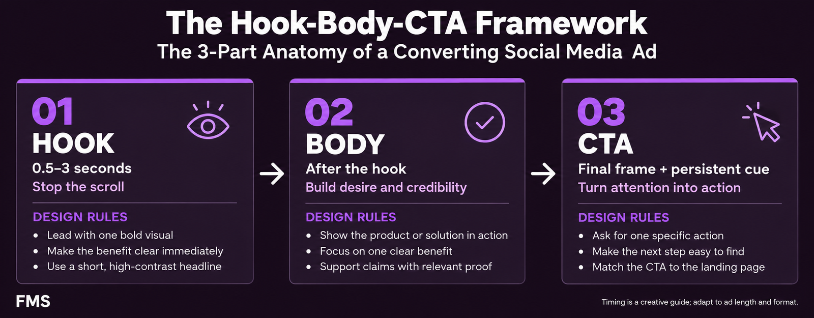
The Hook-Body-CTA Framework: The Anatomy of a Converting Ad
The Hook: 0.5–3 Seconds
- Lead with the audience's problem, not the brand's solution: "Getting clicks on your Facebook ads but zero enquiries?" stops more scrolls than "Futuristic Marketing Services: Ad Creative That Converts", the audience is looking for themselves in the content before they are looking for a brand
- For video, the opening frame is the only frame that matters initially: 73% of video ads fail to retain attention past the 3-second mark, the opening frame must be designed as a standalone stop-scroll image, with the assumption that some viewers will see only this frame
- Test hooks independently of body and CTA: hook type is the highest-leverage creative variable; when A/B testing, isolate the hook as the only changed variable to identify which hook strategy works for the specific audience
The Body: 2–20 Seconds
- Present the most persuasive social proof as the first body element: a specific result from a specific client ("Priya's brand in Jaipur went from no enquiries to 23 in 30 days") is more persuasive at the body stage than any brand claim
- Show, do not tell: demonstrate the product or result visually rather than describing it verbally; a before/after image communicates a transformation more efficiently than a paragraph explaining the transformation
- One clear primary message per ad: the most common body design failure is trying to communicate too many benefits, the viewer who needs to process three claims simultaneously processes none of them convincingly
The CTA: The Final 20% of the Ad
- Match the CTA friction to the audience's funnel stage: cold traffic responds to low-friction CTAs ("Get a Free Quote", "See Our Work", "Download the Free Guide"); warm/retargeting traffic responds to higher-commitment CTAs ("Book Your Consultation", "Start Your Project Today")
- The CTA must be the most visually prominent text element at the point where it appears: for static ads, the CTA button should contrast with the primary colour in the ad; for video, the CTA overlay at 80% completion and again at close should be larger and higher-contrast than any other on-screen text at that moment
- Use imperative action verbs that are specific to the offer: "Get Your Free Brand Audit" is more compelling than "Click Here" because it specifies the exact benefit the click produces and makes the next step feel immediately valuable
Visual Hierarchy That Converts: The Five-Element Sequence
| Hierarchy Level | Element | Visual Treatment | Function |
|---|---|---|---|
| Level 1 | Primary visual hook | Largest element, highest contrast, most visually distinctive; occupies the dominant area of the composition | Stops the scroll; captures pre-attentive attention before any deliberate reading occurs |
| Level 2 | Hook headline | Largest typographic element; Bold or ExtraBold weight; high contrast against background; clearly subordinate in size to the primary visual | Converts the visual stop into attentive engagement by naming the problem, opportunity, or promise |
| Level 3 | Social proof or benefit statement | Medium typographic weight; clearly smaller than the headline; visually quiet enough not to compete with Level 1 and 2 | Provides the credibility evidence that makes the headline's claim believable; builds desire |
| Level 4 | Brand identity element | Logo at consistent position and minimum size; brand colour applied throughout the composition; visually present but not competing with Levels 1–3 | Attributes the ad to the brand; builds recognition for future impressions; contributes to cross-channel brand consistency |
| Level 5 | CTA | High-contrast button or text; action verb in imperative; positioned at the end of the visual reading sequence; colour that contrasts with the primary brand colour | Directs the viewer's accumulated attention toward the specific next action; converts desire into click |
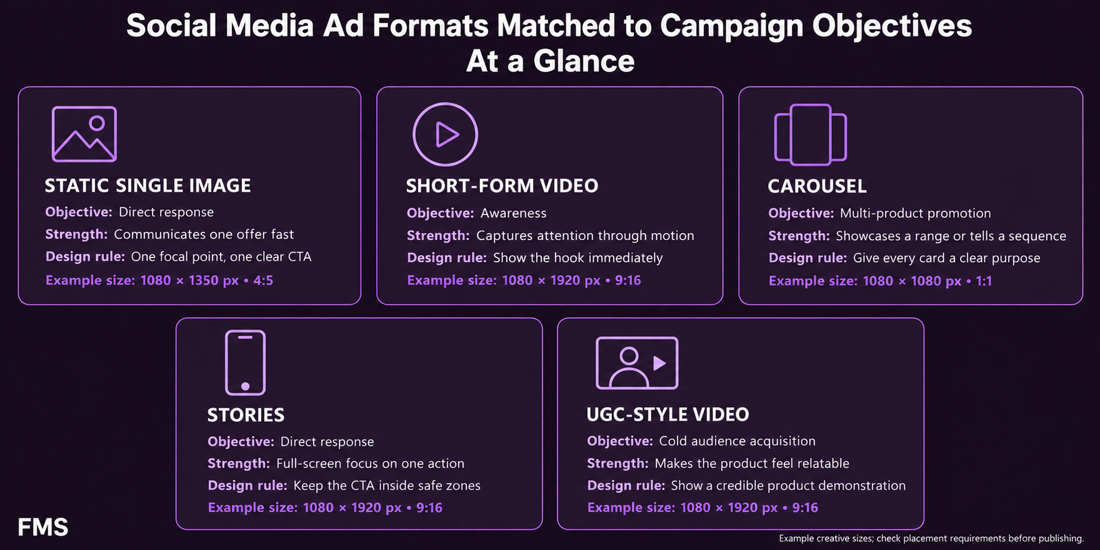
Ad Format Strategy: Matching the Right Format to the Right Goal
| Format | Best Objectives | Primary Strength | Key Design Rule | Dimensions |
|---|---|---|---|---|
| Static Single Image | Lead generation, direct response, retargeting, product promotion | Instant load; single clear message; highest creative velocity (most variants per budget) | One primary visual, one primary message, one clear CTA; keep image text under 20% coverage for Meta | 1080×1080px (1:1) or 1080×1350px (4:5) |
| Short-Form Video (Under 30s) | Awareness, consideration, Reels/TikTok reach | Highest reach potential; motion captures attention; emotional storytelling in compressed format | Hook in first 1–3 seconds; captions mandatory (85% viewed without sound); native 9:16 vertical for Reels/Stories | 1080×1920px (9:16) for Reels; 1080×1350px (4:5) for Feed video |
| Carousel | Product catalogue, multi-benefit services, sequential storytelling | Multiple products in one ad unit; extended engagement; per-product CTAs | First card must earn the swipe independently; consistent visual template across all cards; 3–5 cards optimal | 1080×1080px (1:1) per card; all cards same dimensions |
| Stories (Static or Video) | Direct response, time-sensitive offers, retargeting, brand awareness | Full-screen immersive; highest conversion rate per placement for well-designed creative; direct link-to-website CTA | Safe zone: central 1080×1420px only; hook in first 1 second; single clear CTA in the lower third | 1080×1920px (9:16) |
| UGC-Style Video | Cold audience acquisition, brand awareness, cost-efficient reach | 4x higher CTR than brand creative; 50% lower CPC (Aspire); bypasses skip reflex; authentic feel builds trust faster | Shot on mobile; authentic setting; spoken hook to camera in first 2 seconds; show the product in use | 1080×1920px (9:16) for vertical; 1080×1080px (1:1) as alternative |
Designing for Silence: The Mobile-First, Sound-Off Reality
- Open captions (baked-in text, not subtitle overlays): captions that are embedded directly into the video file at the design stage are more reliable than platform-generated captions and allow precise typographic control; use Bold sans-serif, minimum 40pt at 1080×1920px canvas; high-contrast background panel behind all captions
- Visual hook that works without text: the opening frame's visual element (a face expression, a product reveal, a transformation visual) must create enough curiosity to stop the scroll even if no caption is visible in the first 0.5 seconds
- Key claims as text overlays: every important claim in the spoken track should also appear as an on-screen text element, not because viewers will read everything, but because the most important 5–7 words from each claim should be visible even if the viewer is only casually scanning the video
- The sound-on bonus: design for complete sound-off effectiveness first; then add music and a compelling voiceover that rewards the viewers who do engage with sound, making the ad more emotionally engaging for the minority who hear it
Platform-by-Platform Technical Specifications
| Platform / Placement | Dimensions | Safe Zone | Key Design Rule |
|---|---|---|---|
| Meta Feed (FB + IG) | 1080×1080px (1:1) or 1080×1350px (4:5) | Avoid outer 40px on all sides | Image text under 20%; hook visible in first line of primary text before "See More" truncation |
| Instagram Reels + Stories | 1080×1920px (9:16) | Central 1080×1420px; avoid top 250px and bottom 250px | Hook within first 1 second; captions mandatory; native vertical content only, no landscape adaptation |
| Facebook Stories + Reels | 1080×1920px (9:16) | Central 1080×1420px; avoid top 250px and bottom 250px | Same safe zone rules as Instagram Reels; interactive Story elements (polls, sliders) available in-app |
| TikTok In-Feed | 1080×1920px (9:16); 5–60 seconds | Avoid top 130px (username) and bottom 210px (captions/buttons) | Hook within first 1–2 seconds; native content dramatically outperforms brand creative; captions essential |
| LinkedIn Feed | 1200×628px (landscape) or 1200×1200px (square) | Avoid outer 30px; first 2 lines of text visible before "See More" | Professional register; data and authority signals outperform emotional appeals; design for desktop AND mobile |
| Google Display | 300×250, 728×90, 320×50, 160×600, 300×600 | Keep all content 15px from all edges at each size | Design at all 5 standard sizes; single clear message; brand logo visible at smallest size; high-contrast CTA button |
Colour Psychology for Ad Creative
The Creative Testing System: From Single Ad to Performance Intelligence
The Most Common Ad Creative Design Mistakes
| Mistake | Commercial Cost | Correct Approach |
|---|---|---|
| Leading with the brand, not the customer's problem | The audience's first question when encountering any ad is "is this relevant to me?", leading with the brand name answers a question they were not asking | Open with the audience's situation, problem, or desired outcome; introduce the brand as the solution after relevance is established |
| No captions on video ads | The ad communicates nothing to 85% of its mobile audience who watch without sound | Add open captions to every video ad at the design stage; the caption system is as important as the script |
| Wrong format for the placement | A landscape video in a Stories placement displays with 70% black space; a portrait image in a Feed landscape placement is pillarboxed; both signal misaligned production quality | Always design at the native dimensions for each placement; never adapt from a non-native format |
| High image text coverage on Meta | Meta's delivery system reduces distribution and increases CPM for images with significant text coverage; the "text overlay test" no longer penalises, but high text coverage still reduces ad quality scores | Keep text on the image itself minimal; place copy-heavy messages in the primary text field, not on the image |
| Running the same creative indefinitely | Creative fatigue begins within 3–6 weeks for most campaigns at typical SME budget levels; CTR falls, CPM rises, ROAS declines | Monitor weekly frequency; retire any creative with 7-day frequency above 2.5–3.0 for cold audiences; maintain a pipeline of new creative variants |
Ready to Make Your Ad Creative the Strongest Element of Your Campaign?
Futuristic Marketing Services designs social media ad creative for Indian businesses, hook-first, format-correct, sound-off tested, brand-consistent, and built for systematic creative testing that compounds performance over time.
Start Your Ad Creative ProjectFrequently Asked Questions
What makes a social media ad effective in 2026?
What is the Hook-Body-CTA framework for so
Should I use static images or video for social media ads?
Why does UGC-style ad creative outperform branded creative?
How do I test ad creative effectively?
Design Ad Creative That Drives Results From the First Impression
Futuristic Marketing Services designs converting social media ad creative for Indian businesses, the strategic brief, the hook design, the format specifications, the sound-off design, and the testing system that compounds improvements over every campaign.
See Our Ad Creative Services