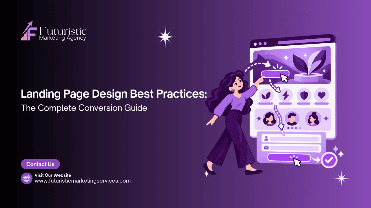
Landing Page Design Best Practices: The Complete Conversion Guide

landing page design

A landing page is a standalone web page designed for a single, specific commercial goal. Unlike a homepage that serves multiple audiences and multiple purposes simultaneously, a landing page has one job: convert a specific visitor arriving from a specific source, a paid ad, an email campaign, a social media post, into a measurable lead, sale, or sign-up. Every design decision on a landing page either supports that single goal or detracts from it.

According to HubSpot's landing page research, businesses with 10 to 15 landing pages generate 55% more leads than those with fewer than 10. According to WordStream's landing page analysis, removing navigation from a landing page increases conversion rates by up to 100% compared to equivalent pages with standard site navigation. According to Unbounce's industry benchmark data, the median landing page conversion rate across industries is 4.6%, while the top 25% of landing pages convert at 11.45% or higher, the gap between median and top-quartile performance is almost entirely explained by design and structural decisions rather than traffic quality.
This guide covers the complete set of landing page design best practices: single goal architecture, the above-the-fold zone anatomy, the four headline formulas that convert, form length optimisation, form design specifications, CTA design principles, trust signals specific to landing pages, the visual types that convert, mobile landing page design, and the A/B tests that produce the largest measurable conversion improvements. For the broader website design framework, see our website design guide. For the ad creative that drives traffic to landing pages, see our social media ad design guide.

Key Takeaways

  • Businesses with 10–15 landing pages generate 55% more leads than those with fewer than 10 (HubSpot), a separate landing page for each campaign, offer, or audience segment is a structural requirement, not a luxury
  • Removing navigation from landing pages increases conversion by up to 100% (WordStream), every link that leads visitors away from the landing page is a conversion exit that reduces the proportion who complete the intended action
  • The above-the-fold zone must communicate the complete value proposition, who this is for, what they get, and what to do next, without requiring any scrolling; 57% of page viewing time is spent above the fold (Nielsen Norman Group)
  • The top 25% of landing pages convert at 11.45% or higher versus the 4.6% median (Unbounce), the gap between average and excellent landing page performance is almost entirely structural and design-driven
  • Each additional form field reduces conversion rate; the minimum viable form for lead generation is first name and email only; phone number as a required field reduces form completion by 5–10% in most contexts
  • Message match, visual and copy continuity between the ad or email that brought the visitor and the landing page they arrive on, is the single most impactful structural improvement for most paid advertising landing pages

Need a High-Converting Landing Page for Your Campaign?

Futuristic Marketing Services designs conversion-optimised landing pages for Indian businesses, every best practice in this guide applied correctly, with mobile-first design and the message match between your ads and landing page that turns campaign traffic into leads.

Get a Free Landing Page Consultation
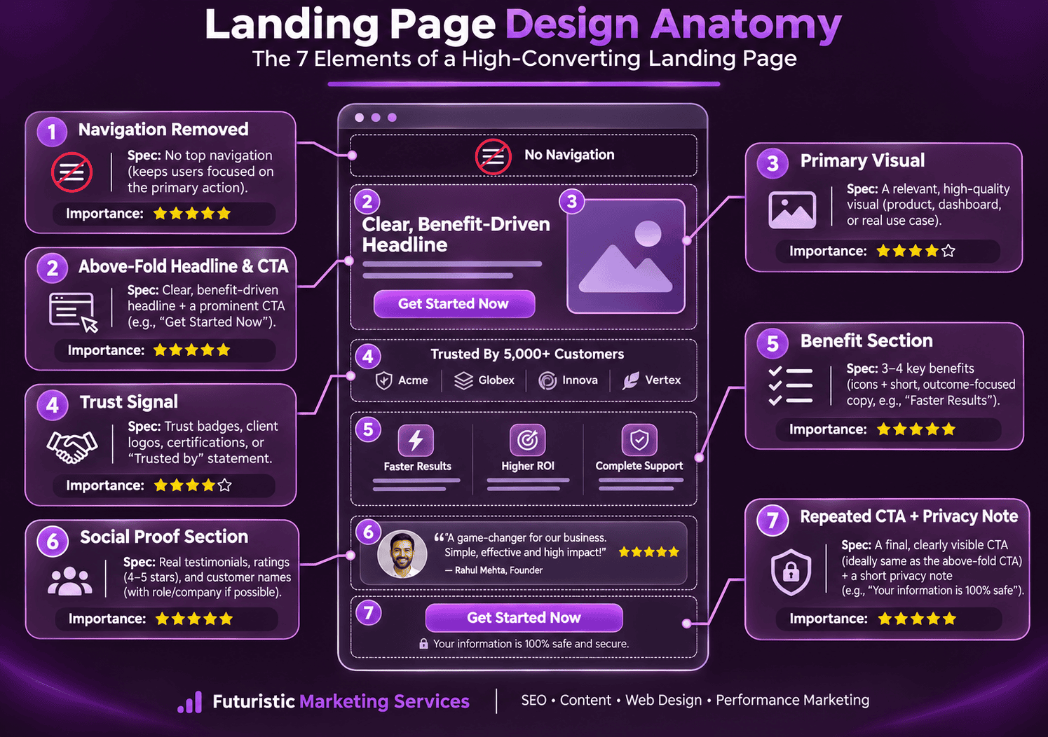
Best Practice 1: Single Goal Architecture, One Page, One Action

The defining structural principle of a high-converting landing page is single goal architecture: every element on the page exists either to build the case for one specific action or to remove friction from taking it. There are no secondary goals, no alternative navigation paths, and no competing CTAs. The visitor arrives with one option: take the intended action or leave.
This principle explains why landing pages consistently outperform homepages as conversion destinations for paid traffic. A homepage serves multiple audiences simultaneously, first-time visitors, returning customers, job seekers, press contacts, and potential partners, and therefore contains links and content relevant to all of them. A visitor arriving from a specific paid ad looking for a specific solution is distracted by this variety, presented with too many choices, and frequently leaves without converting even when their original intent was to act.

What to Remove from a Campaign Landing Page

The removal decisions that have the largest positive impact on landing page conversion rate: standard site navigation (every link in a navigation bar is a conversion exit point); footer navigation links (same principle, every link that leads away reduces the proportion who stay to convert); social media icons (social links open new browser tabs and rarely return the visitor to the landing page); blog article links and related content sections (informational content delays the conversion decision without advancing it); and any secondary CTA that competes with the primary conversion action.

Best Practice 2: The Above-the-Fold Zone, What Every Visitor Must See First

According to Nielsen Norman Group's scroll and attention research, users spend 57% of their total page viewing time above the fold. For campaign landing pages arriving from paid advertising, the proportion of visitors who never scroll below the fold is typically even higher, because paid traffic includes a larger proportion of non-buyers who are evaluating the offer quickly rather than researching in depth.

What the Above-the-Fold Zone Must Include

Five elements must be present in the above-the-fold zone of every high-converting landing page: a specific, benefit-led headline that matches the promise made in the ad or email that brought the visitor (the message match principle); a supporting sub-headline that adds one layer of specificity about who the offer is for or how it is delivered; a primary visual (product image, service result photograph, or founder portrait) that creates trust and emotional resonance at the pre-attentive visual level; the primary CTA button in high-contrast accent colour with specific outcome copy; and one trust signal positioned adjacent to the CTA that reduces the perceived risk of acting.

The Mobile Above-the-Fold Reality

On a 375px mobile screen with a typical browser chrome height, the visible above-the-fold zone is approximately 550 to 600 pixels tall in portrait orientation. On a 1440px desktop screen, it is typically 700 to 800 pixels tall depending on the header height. A landing page that fits all five required above-the-fold elements on desktop may display only the headline and part of the hero image on mobile before the fold, leaving the CTA below the fold and requiring visitors to scroll before they can take an action. Mobile above-the-fold design must be verified at actual mobile viewport dimensions, not approximated from the desktop design. For the complete mobile-first design framework, see our mobile-first web design guide.

Best Practice 3: Landing Page Headline Formulas That Convert

The headline is the most commercially important text element on any landing page. It is the first piece of content a visitor processes consciously after the pre-attentive visual impression, and it determines whether they continue evaluating the offer or leave immediately. A headline that is unclear, generic, or misaligned with the visitor's expectation produces high bounce rates from otherwise high-quality traffic.
Formula Structure Example Best For
Outcome Formula [Specific Result] for [Specific Audience] [Optional: Without Common Frustration] More Enquiries From Your Website, Without Increasing Your Ad Spend Service pages and professional service landing pages where the outcome is more motivating than the process
Problem Formula Stop [Specific Pain]. Start [Desired State]. Stop Wasting Money on Ads That Don't Convert Problem-aware audiences who already know they have the problem and are looking for a solution
Number Formula [Specific Number] [Result] in [Timeframe], [Social Proof] 2,400 Qualified Leads Generated for 50+ Indian Businesses Landing pages for high-credibility offers where specific proof of results is the primary conversion driver
Question Formula Are You [Experiencing Problem]? Here's How to [Solution] Is Your Website Losing Leads? Here's How We Fix It in 30 Days Landing pages targeting a narrow, well-defined problem where the question creates instant self-identification

Best Practice 4: Form Design and Length Optimisation

The lead capture form is the literal conversion mechanism of a landing page, it is the point where a motivated visitor either becomes a measurable lead or abandons. According to Baymard Institute's form research, unnecessary form fields and poor form design are among the highest-impact sources of conversion abandonment on business websites.

The Form Length Decision

The relationship between form field count and conversion rate is consistently negative: each additional field reduces the proportion of visitors who complete the form. The minimum viable form for most lead generation landing pages is two fields: first name and email address. This combination captures sufficient information to begin a personalised follow-up sequence while imposing minimum completion friction.
Adding fields beyond the minimum should be justified by specific commercial reasons, not general "it would be nice to know" reasoning. Phone number as an optional field is acceptable; as a required field it reduces completion by 5 to 10% in most documented cases. Company name is justified for B2B landing pages where the company size or industry determines whether the lead is a good fit. Budget range is occasionally appropriate for high-ticket service landing pages where early qualification prevents wasted sales effort on mis-qualified leads.

Form Design Specifications

The technical form design specifications that reduce abandonment: use single-column form layout for all landing page forms, two-column form layouts increase completion time and error rate, particularly on mobile; ensure all field labels are visible above the field at all times and not inside the field as placeholder text that disappears when the visitor starts typing; use input type attributes that trigger the correct mobile keyboard (type="email" for email fields, type="tel" for phone fields) to reduce typing friction on mobile; make the submit button full-width on mobile (100% of the container) with a minimum 56px height; and include a single privacy reassurance statement directly below or adjacent to the submit button.

Best Practice 5: CTA Design Principles for Landing Pages

Landing page CTAs operate under the same design principles as website CTAs but with a critical additional requirement: the CTA must appear in the above-the-fold zone on both desktop and mobile without requiring scrolling, because a meaningful proportion of visitors who cannot immediately see the action they are meant to take will leave before scrolling to find it.
CTA Element Best Practice Common Mistake
Button copy Specific outcome in 4 words or fewer: "Get My Free Audit", "Start My Free Trial", "Claim My Discount" "Submit", "Click Here", "Send", "Get Started", none specify what happens on click
Button colour Brand accent colour that contrasts strongly with the page background and all surrounding elements Using the same colour as the page background or adjacent elements; the button must be unmissably visible
Button size Desktop: minimum 200×52px; Mobile: full-width (100% container) minimum 56px height Undersized buttons that require precise clicking on desktop and are difficult to tap accurately on mobile
Button position Visible above the fold on both desktop and mobile; repeated after every major content section on longer pages Single CTA at the bottom of a long page; requiring visitors to scroll through all content before they can take action
CTA count One primary CTA (strong button); one secondary CTA per major section (lower commitment option: "See Examples First") Multiple CTAs of equal visual weight competing for attention and creating decision paralysis

Best Practice 6: Trust Signals Specific to Landing Pages

Landing page visitors arrive from a single, specific source, a paid ad, an email, a social post, and often land on the page without prior familiarity with the brand. This context makes trust signals more commercially critical on landing pages than on general website pages, where visitors may have already encountered the brand through organic search or social media. The trust signals that work most effectively on landing pages are those that directly address the specific objection a visitor from the traffic source most likely has.
  • For paid search landing pages: the visitor is actively looking for a solution and comparing multiple providers; the most effective trust signal is a specific result that demonstrates the provider has achieved the outcome the visitor is seeking ("Generated 850 qualified leads for an Indore-based financial services firm in 90 days")
  • For social media ad landing pages: the visitor was interrupted in their feed by the ad and may not be familiar with the brand; the most effective trust signal is a named testimonial with a face photograph that makes the brand feel personal and real, combined with a star rating that provides instant social proof
  • For email campaign landing pages: the visitor is a warm lead or existing customer who has some brand familiarity; the most effective trust signal is a specific offer-related guarantee that reduces the remaining hesitation ("30-day results or full refund")
  • For retargeting landing pages: the visitor has already been to the website and has not converted; the most effective trust signal is a new piece of evidence they did not see on the first visit, a case study, a number of new clients served since their last visit, or a recently published testimonial

Best Practice 7: Visual Types That Convert on Landing Pages

The visual on a landing page is the most pre-attentively processed element, the one that is evaluated before any text is read. The visual must create the emotional tone appropriate for the conversion action, demonstrate relevance to the visitor's situation, and build initial credibility before the headline is processed.
Visual Type When It Converts Best What to Avoid
Founder or team photograph Service businesses where the relationship with the person delivering the service is a primary purchase driver; high-ticket professional services where personal trust reduces hesitation Generic or low-quality photography; photos that look like ID pictures rather than confident, approachable portraits
Product in use E-commerce and physical product landing pages; shows the product in a real-world context that helps the visitor visualise ownership Plain white-background product shots on landing pages (appropriate for product detail pages but too clinical for above-fold landing page context)
Before and after result Transformation-based services (marketing results, design work, weight management, home renovation); communicates the outcome visually in a way that no headline can replicate Exaggerated or unverifiable before/after comparisons that reduce trust rather than building it
Dashboard or results screenshot SaaS products and digital marketing services where the output is data-based; shows the specific type of result the visitor can expect to receive Screenshots that are too small to read on mobile; data that has been cherry-picked from an untypical case
Generic stock photography Never the best option on a landing page, generic stock photography communicates nothing distinctive about the specific brand or offer and actively reduces credibility Diverse business team in a generic meeting room; person pointing at laptop screen; handshake on white background, all widely recognised as placeholder imagery

Message Match: The Most Impactful Single Improvement

Message match is the degree of visual and copy continuity between the ad or email that brought the visitor to the landing page and the landing page itself. A visitor who clicked an Instagram ad with the headline "Get a Free SEO Audit for Your Website" expects to land on a page that immediately confirms "Free SEO Audit", in the headline, in the visual, and in the CTA copy. A landing page that shows a generic homepage hero about "Digital Marketing Services" creates a discontinuity between the ad promise and the page reality, producing what conversion optimisers call "scent loss", the visitor can no longer follow the trail from the ad promise to the fulfilment.
Message match failures are the most common and most commercially damaging landing page problem in paid advertising campaigns. Correcting message match, ensuring the landing page headline mirrors the ad headline, the CTA mirrors the ad CTA, and the visual reflects the ad visual, typically produces the largest single conversion rate improvement available without rebuilding the page. For the promotional design framework that creates message match between offer banners and landing pages, see our promotional banner design guide.

Need a Landing Page That Converts Your Paid Traffic Into Leads?

Futuristic Marketing Services designs conversion-optimised landing pages for Indian businesses, all best practices applied, mobile-first, with message match between your ads and landing page that turns campaign spend into qualified enquiries.

Start Your Landing Page Project

Frequently Asked Questions

What is a landing page and how is it different from a website page?

A landing page is a standalone web page with a single conversion goal, designed for visitors arriving from a specific source such as a paid ad, email campaign, or social media post. Unlike a website page that serves multiple purposes and includes standard site navigation, a landing page removes all navigation and competing links to focus the visitor's attention on one specific action: submitting a lead form, making a purchase, or registering for an event. The structural isolation of a landing page, removing every exit point except the intended conversion action, is the primary reason landing pages consistently outperform general website pages as destinations for paid advertising traffic.

What is a good landing page conversion rate?

According to Unbounce's industry benchmark data, the median landing page conversion rate across industries is 4.6%. The top quartile of landing pages converts at 11.45% or higher. B2B professional services landing pages typically convert at 2 to 5%; e-commerce product landing pages at 1 to 4%; lead generation landing pages for high-value services at 5 to 15% when well-optimised. A conversion rate significantly below the industry median indicates structural or design problems rather than traffic quality problems, high-converting landing pages at the top quartile typically have fewer form fields, clearer headlines, stronger trust signals, and better message match with their traffic sources than median-performing pages.

How long should a landing page be?

Landing page length should match the decision complexity of the conversion action. Low-commitment actions (email newsletter sign-up, free resource download, webinar registration) perform best on short pages where all necessary information fits above the fold, the visitor should be able to see the complete value proposition and CTA without scrolling. High-commitment actions (purchasing a premium service, booking a consultation for a high-ticket offer) require longer pages that address multiple objections, provide social proof from multiple angles, and progressively deepen the case for the conversion before presenting the CTA. The test: if removing a section of content does not reduce conversion rate in an A/B test, the section should be removed, every element of a landing page must justify its presence by contributing to conversion, not just to content comprehensiveness.

Should a landing page have navigation?

No. Navigation should be removed from campaign landing pages. According to WordStream's analysis, removing navigation from landing pages increases conversion by up to 100% compared to equivalent pages with standard site navigation. Every navigation link on a landing page is a conversion exit point, a route by which a visitor who was ready to convert instead clicks away to read a blog post, visit the About page, or browse a services overview. The only acceptable navigation element on a landing page is the brand logo (which may link to the homepage) and the CTA button. If the visitor specifically needs to check other pages before converting, the landing page's trust signals and copy are insufficient, and the solution is to improve those elements rather than to reintroduce navigation.

What is the most important element on a landing page?

The headline is the most important single element on any landing page because it determines whether the visitor continues evaluating the offer or bounces immediately. A landing page with a strong headline, a simple form, and a basic CTA will consistently outperform a landing page with a weak headline, a beautifully designed layout, and extensive trust signals, because visitors who bounce on the headline never evaluate any other element. The headline must communicate: who this is for (audience self-identification), what they will get (specific outcome), and why they should act now (urgency or differentiation). For a full website context including the hero banner, see our hero banner design guide.

Turn Your Campaign Traffic Into Qualified Leads With a Professional Landing Page

Futuristic Marketing Services designs conversion-optimised landing pages for Indian businesses, single goal architecture, message match, mobile-first design, and every best practice in this guide applied to turn paid traffic into qualified enquiries.

See Our Website Design Services

Share this post :
Picture of Devyansh Tripathi
Devyansh Tripathi

Devyansh Tripathi is a digital marketing strategist with over 5 years of hands-on experience in helping brands achieve growth through tailored, data-driven marketing solutions. With a deep understanding of SEO, content strategy, and social media dynamics, Devyansh specializes in creating results-oriented campaigns that drive both brand awareness and conversion.

All Posts