A website design guide answers a deceptively simple question: what makes one website convert visitors into customers while an almost identical competitor website loses them? The answer is not the colour scheme, not the number of pages, and not the amount of content. The answer is a specific set of design decisions, about visual hierarchy, loading speed, navigation structure, CTA placement, and trust signal positioning, that determine whether a visitor who arrives with genuine commercial interest takes the action the business wants them to take or leaves without engaging.
Key Takeaways
- Users form a visual judgement of a website in 50 milliseconds, before any content is consciously evaluated, making the visual hierarchy and first-impression design quality the most commercially critical design decision on any website
- 57% of users will not recommend a business with poor mobile design (Sweor), mobile-first design is not optional for any Indian business where the majority of visitors arrive on smartphones
- Core Web Vitals scores, LCP under 2.5 seconds, INP under 200 milliseconds, CLS under 0.1, are direct Google ranking signals; websites that fail these thresholds are penalised in search results regardless of content quality
- The hero section is the highest-leverage single design zone on any homepage, 5 specific elements must be present and correctly hierarchised for the hero to convert first-time visitors
- Navigation must contain a maximum of 5–6 top-level items with visitor-language labels; navigation complexity above this threshold increases cognitive load and reduces the proportion of visitors who take a desired action
- The CTA button is the single highest-return design optimisation target, colour, copy specificity, size, and placement each independently affect conversion rate and must be tested systematically
- Trust signals reduce perceived purchase risk; the most effective are specific and verifiable, client count, result statistic, named testimonial with photo, rather than generic claims
Need a High-Converting Website Designed for Your Business?
Futuristic Marketing Services designs high-converting business websites for Indian businesses, every principle in this guide applied correctly, mobile-first, Core Web Vitals optimised, and built to generate enquiries from day one.
Get a Free Website Design Consultation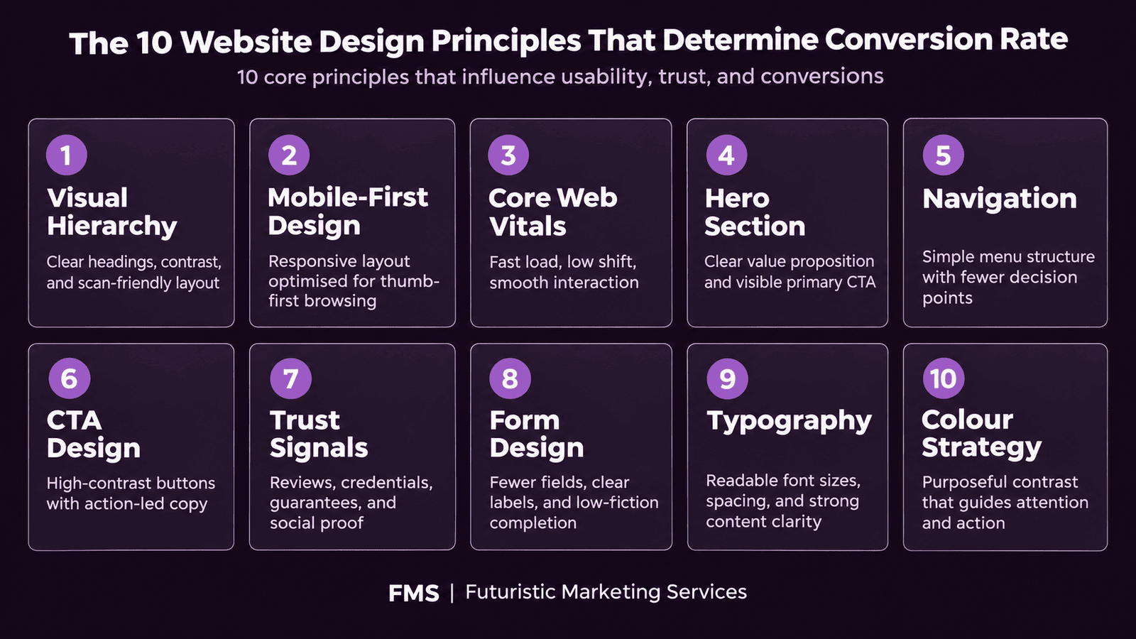
Principle 1: Visual Hierarchy, Guiding Every Visitor's Eye
The Hierarchy Tools
Mobile-First Visual Hierarchy
Principle 2: Mobile-First Design, Building for the Majority
| Design Element | Desktop Specification | Mobile Specification | Mobile Design Rule |
|---|---|---|---|
| Layout columns | 2–4 column grids | Single column stack | All multi-column desktop layouts must reflow to single column on mobile; never use horizontal scroll on mobile |
| Body text size | 16–18px | 16px minimum | Never below 16px on mobile; text smaller than this requires pinch-to-zoom which kills engagement |
| Touch targets | No minimum (mouse interaction) | 44×44px minimum (Apple HIG / Google Material) | All buttons, links, and interactive elements must meet minimum touch target to prevent tap errors on mobile |
| Navigation | Horizontal top navigation bar | Hamburger menu or bottom navigation bar | Hamburger menus must open with a full-screen or large panel overlay; small dropdown menus are difficult to use accurately on mobile |
| CTA buttons | Fixed width (200–280px) | Full-width (100% container) for primary CTAs | Full-width mobile CTA buttons are accessible from any thumb position and consistently outperform narrow buttons in mobile conversion testing |
Principle 3: Core Web Vitals, The Performance Foundation
Core Web Vitals Targets
Quick Speed Wins for Any Website
Principle 4: The Five Elements of a High-Converting Hero Section
Principle 5: Navigation Design Principles
| Navigation Principle | Correct Implementation | Common Mistake |
|---|---|---|
| Item count | Maximum 5–6 top-level navigation items; group related pages under dropdowns rather than listing all pages at the top level | 8–12 top-level items that overwhelm visitors with choice and force them to read every label before choosing a direction |
| Label language | Visitor-language labels that describe what the visitor wants ("Services", "Pricing", "Contact") rather than internal jargon ("Solutions Portfolio", "Engagement Options") | Internal business terminology that forces visitors to guess what each category contains; creative naming that sacrifices clarity for personality |
| CTA in navigation | Include a visually distinct primary CTA button in the navigation bar ("Get a Free Quote", "Contact Us") that stands out from the text-based navigation links | Listing the contact page as a standard text navigation item identical in visual weight to "About" and "Blog"; this reduces the visibility of the highest-commercial-value page on the site |
| Persistence | Sticky navigation that remains visible as the visitor scrolls; access to primary navigation should be available at all times without scrolling back to the top | Navigation that disappears on scroll, forcing visitors who have read to the middle of a long page to scroll back to the top to navigate; increases friction and reduces page-to-page navigation |
Principle 6: CTA Design Specifications
Principle 7: Trust Signal Types and Placement
| Trust Signal Type | Specific Example | Optimal Placement | Effectiveness |
|---|---|---|---|
| Specific result statistic | "Generated 2,400 leads for 50+ Indian businesses" | Hero section below CTA; dedicated results strip below hero | Highest, specific, verifiable, directly relevant |
| Client logo strip | 5–8 recognisable client logos with "Trusted by" label | Below hero section; above the fold on desktop if possible | High, strong for B2B where logo recognition exists |
| Named testimonial with photo | "[Name], [Title] at [Company]: specific result achieved" | Adjacent to the CTA button nearest to the conversion zone | High, photo increases credibility; name and title enable verification |
| Star rating with review count | "4.9/5, Based on 147 Google Reviews" | Hero section or navigation bar; immediately visible | High for B2C and local services; strong in Indian market |
| Industry certification or award | Google Partner badge, industry award mark | Footer; near logo; within the relevant service section | Medium, effective when the certifying body is recognised by the audience |
Principle 8: Form Design Principles
Principle 9: Typography for Readability and Commercial Clarity
Principle 10: Colour for Conversion
Apply Every Principle in This Guide With a Professional Website Design
Futuristic Marketing Services designs high-converting business websites for Indian businesses, all 10 principles applied correctly, mobile-first, Core Web Vitals optimised, and structured to generate enquiries from launch day.
Start Your Website Design ProjectFrequently Asked Questions
What makes a good website design?
How do I make my website convert more visitors into customers?
What is the difference between website design and website development?
How long does it take to design a business website?
What is Core Web Vitals and why does it affect my website?
Get a Website That Converts, Designed to Every Principle in This Guide
Futuristic Marketing Services designs high-converting business websites for Indian businesses, visual hierarchy, mobile-first, Core Web Vitals optimised, and structured to turn first-time visitors into qualified enquiries.
See Our Website Design Services