

A website UX audit is a structured evaluation of how real users experience a website, identifying the navigation failures, content clarity problems, conversion barriers, and mobile usability issues that reduce enquiries, purchases, and sign-ups. It combines quantitative data (heatmaps, session recordings, analytics funnel analysis) with qualitative evaluation (expert heuristic review, user testing observation) to produce a prioritised list of specific, evidenced UX improvements. The output is not a design opinion, it is a data-backed remediation plan with measurable commercial impact.
Key Takeaways
- A UX audit is not a visual design critique, it is a structured, data-backed investigation of why visitors are not completing the actions the site is designed for. According to Nielsen Norman Group, usability testing with just 5 users uncovers 85% of the most critical UX problems. A professional UX audit replaces opinion with evidence.
- Microsoft Clarity (free) and Hotjar provide heatmaps and session recordings that show exactly where visitors click, how far they scroll, and where they abandon, without requiring user interviews or formal testing. These tools are the foundation of any modern UX audit.
- The six universal UX failure types, clarity, trust, friction, distraction, irrelevance, and timing, account for the overwhelming majority of conversion barriers found in UX audits. Identifying which type dominates on each key page determines the correct type of fix. See our conversion rate optimisation guide for the complete framework.
- Mobile UX failures are disproportionately impactful because over 60% of traffic comes from mobile and mobile users abandon more readily. Common mobile-specific UX failures: CTA below the fold; touch targets below 44px; form fields without correct input types; horizontal scroll on narrow viewports. A UX audit must evaluate mobile separately from desktop.
- Baymard Institute research shows 68 to 70% of eCommerce carts are abandoned. The primary checkout UX failures are forced account creation (responsible for 26% of abandonments), unexpected shipping costs at checkout (49%), and overly complex checkout forms. Each has a specific, implementable fix.
- The scroll map finding that 50% of visitors leave a page before scrolling past a certain point is one of the most commercially significant UX audit outputs, because any CTA or trust signal below the 50% scroll line is invisible to half the audience. Moving key elements above this line consistently improves conversion rate.
- A UX audit deliverable must include specific, prioritised recommendations with the evidence behind each, not generic best-practice advice. "Add social proof to the homepage" is not a UX audit recommendation. "Session recordings show that 63% of visitors who reach the hero scroll immediately without interacting, add a review count and rating adjacent to the primary CTA above the fold" is.
Website UX Audit
Data-Backed UX Audit With Specific, Prioritised Recommendations
Futuristic Marketing Services provides professional website UX audits, heatmap analysis, session recording review, funnel diagnostics, and a prioritised improvement roadmap with commercial impact estimates.
Request a UX AuditWhat a Professional UX Audit Includes
| Audit Component | What It Reveals | Tools Used | Time Required |
|---|---|---|---|
| Heatmap analysis | Where visitors click, where they move their mouse, and which elements attract or repel attention on key pages | Microsoft Clarity (free) or Hotjar | 2 to 4 weeks data collection; 3 to 5 hours analysis |
| Session recording review | What real visitors actually do on the site, where they click, scroll, hesitate, and abandon, in video replay | Microsoft Clarity or Hotjar, review 10 to 20 recordings per key page | 4 to 8 hours per key page type |
| Analytics funnel analysis | Where visitors drop off in the conversion funnel, which specific steps lose the most users and how conversion rates compare by traffic source and device | Google Analytics 4, Funnel Exploration report | 2 to 4 hours setup and analysis |
| Expert heuristic review | Evaluation of the site against established UX principles, navigation, content clarity, error prevention, consistency, accessibility | UX specialist manual review, Jakob Nielsen 10 heuristics and WCAG guidelines | 4 to 8 hours per site type |
| Exit intent and on-page surveys | The visitor's own explanation of why they did not convert, captures the perspective that no analytics tool can provide | Hotjar surveys or Typeform exit overlays | 2 to 4 weeks data collection; 2 to 3 hours analysis |
| Mobile-specific UX review | Touch target sizes, CTA visibility above the fold at 375px, form input types, horizontal overflow, mobile navigation usability | Chrome DevTools device toolbar; real iOS and Android devices | 2 to 4 hours per key user journey |
| Core Web Vitals and performance impact | How page speed affects UX, bounce rate at different load times, abandonment patterns on slow pages, mobile performance gaps | Google PageSpeed Insights; Google Search Console Core Web Vitals | 1 to 2 hours |
The UX Audit Deliverable
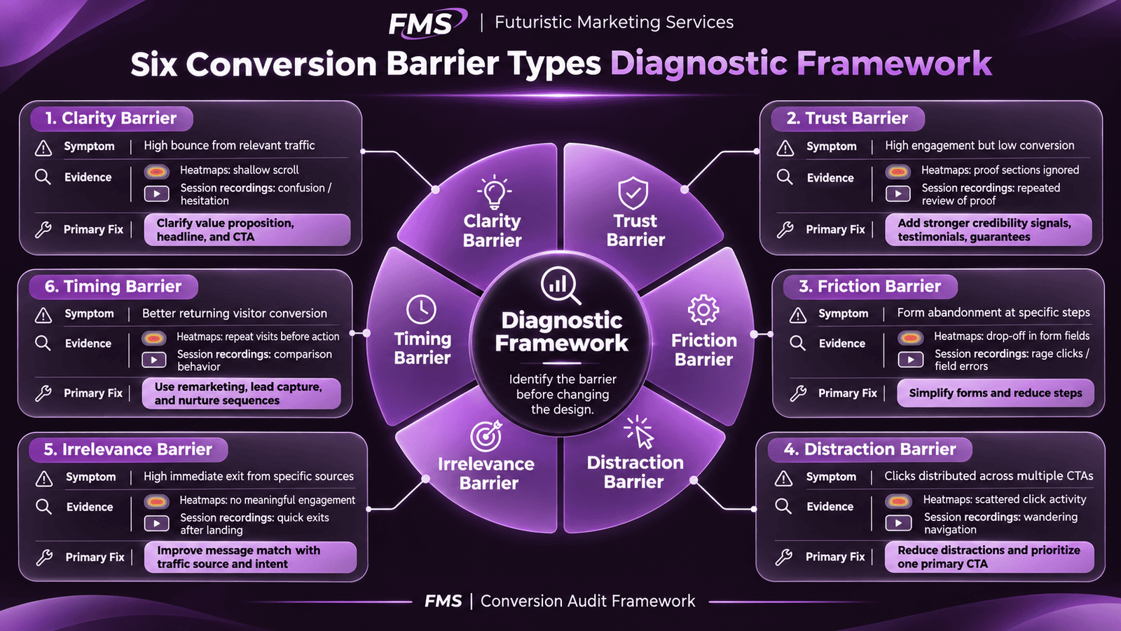
The Six Conversion Barrier Types
| Barrier Type | Definition | How Heatmaps and Recordings Reveal It | Primary Fix |
|---|---|---|---|
| Clarity | The visitor cannot quickly understand what is being offered, who it is for, and what happens when they act | High immediate bounce rate; scrolling rapidly and leaving; clicking navigation to try other pages | Rewrite headline to state specific benefit and audience; simplify above-fold to one primary message |
| Trust | The visitor is interested but does not yet believe the business can deliver the promise | Strong engagement (scrolling, reading) but low conversion; clicking About page or looking for reviews | Add specific social proof adjacent to CTA; display credentials and verifiable outcomes |
| Friction | The conversion process is too complex, too long, or too effortful for the visitor to complete | Form abandonment at specific fields; mobile checkout dropping off on payment entry | Reduce form fields to minimum viable; correct input types; add progress indicators |
| Distraction | Competing CTAs, navigation escape routes, or irrelevant content divert attention from the primary goal | Clicks distributed across multiple CTAs; visitors leaving via header navigation from key landing pages | Remove navigation from high-value conversion pages; reduce to one primary CTA |
| Irrelevance | The page does not match what the visitor expected when they arrived, from the ad, email, or search result | High immediate exit rate (under 5 seconds) from specific traffic sources; paid traffic performing poorly | Implement message match; create traffic-source-specific landing pages |
| Timing | The visitor is interested but not ready to convert, they need more information or a lower-commitment first step | Good initial engagement; returning visitors converting at higher rate than first visits | Offer lower-commitment micro conversion (guide, newsletter); implement email nurture for non-converters |
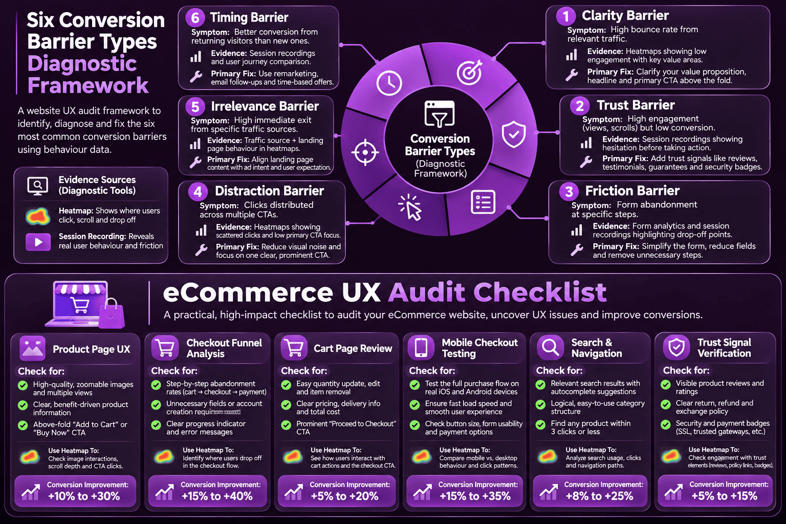
eCommerce UX Audit: Additional Requirements
eCommerce UX Audit Priority Areas
Product page UX
Product images (zoom capability, lifestyle images, multiple angles); variant selection (size, colour, is the unavailable variant clearly indicated?); add-to-cart button position and visibility above fold on mobile; reviews prominence; delivery and returns information visibility without scrolling to footer.
Checkout funnel analysis
Step-by-step funnel from Add to Cart through each checkout step to Purchase Confirmation. Identify the step with the highest abandonment, this is the primary optimisation target. According to Baymard Institute, forced account creation and unexpected shipping costs are the two most common high-abandonment causes.
Cart page review
Is the cart clearly accessible from every page? Can customers edit quantity and remove items easily? Are cross-sell suggestions relevant or distracting? Is the proceed to checkout CTA the dominant element on the page?
Mobile checkout testing
The mobile checkout is the most friction-intensive user journey on any eCommerce site. Test on a real iPhone (iOS Safari) and real Android (Chrome): does the email field trigger the email keyboard? Does the card number field trigger the numeric keyboard? Is the payment button above the fold? Are error messages clear and specific? See our mobile-first development guide.
Search and navigation
Can visitors find products they are looking for in under 3 clicks from the homepage? Is the search function returning relevant results for common product queries? Are category and filter pages structured to support browsing behaviour?
Trust and credibility signals
Are review counts and star ratings visible above the fold on product pages? Is the returns policy accessible before purchase (not just in the footer)? Are security badges genuine and accurately described? Are delivery timeframes specific and visible near the add-to-cart button?
Common UX Findings and Their Commercial Impact
| Common Finding | Conversion Impact | Typical Fix | Expected Improvement |
|---|---|---|---|
| CTA below the fold on mobile | 50% of mobile visitors never see the primary CTA | Move CTA above fold at 375px; add sticky CTA bar on long pages | 15 to 35% mobile conversion rate increase |
| Generic or unclear headline | High immediate bounce, visitors cannot determine relevance in 5 seconds | Rewrite to state specific benefit and audience | 20 to 60% reduction in bounce from relevant traffic |
| Missing social proof near CTA | Trust barrier, visitors motivated to convert but not confident | Add star rating with review count adjacent to primary CTA button | 10 to 30% conversion rate increase |
| Form requires too many fields | Each additional required field reduces completion by 5 to 15% | Remove all non-essential fields; defer collection to post-conversion | 15 to 40% form completion improvement |
| No mobile-optimised form inputs | Mobile keyboard not triggering correctly, frustration and abandonment | Add correct type attributes (email, tel, number) and autocomplete | 10 to 25% mobile form completion improvement |
| Forced checkout account creation | 26% of all cart abandonments per Baymard | Implement guest checkout as primary path; offer account creation post-purchase | 15 to 35% checkout completion improvement |
| Unexpected shipping cost in checkout | 49% of cart abandonments triggered by shipping cost surprise | Display shipping costs on product page and cart; show free threshold | 10 to 25% cart-to-checkout conversion improvement |
| No trust signal at payment stage | Final-moment hesitation from security anxiety | Add SSL badge, accepted payment logos, and return policy summary at payment | 5 to 15% payment completion improvement |
Conversion Optimisation
Identify and Fix the UX Issues Costing You Conversions
Futuristic Marketing Services pairs the UX audit findings with a conversion rate optimisation programme, testing fixes, measuring impact, and compounding improvements month over month.
Start Your UX Improvement ProgrammeFrequently Asked Questions About Website UX Audits
What is a website UX audit?
How is a UX audit different from a technical SEO audit?
What tools are used in a UX audit?
How long does a website UX audit take?
How much does a website UX audit cost?
What is a heatmap and how does it help a UX audit?
What is session recording analysis?
What are the most common UX problems found in audits?
How do I measure the success of a UX audit?
Should I do a UX audit before or after a website redesign?
What is the difference between a UX audit and usability testing?
What should a UX audit report include?
Futuristic Marketing Services
Find Out What Is Preventing Visitors From Converting
Futuristic Marketing Services provides data-backed UX audits, heatmap analysis, session recording review, funnel diagnostics, and a specific prioritised improvement roadmap that pays for itself in the first conversion rate improvement.
Commission Your UX Audit