Every high-performing YouTube thumbnail is built on three interdependent design decisions: font selection (which typeface communicates the right personality and remains legible at minimum display size), colour strategy (which colour combination creates the strongest contrast against competing thumbnails in the niche), and layout (which compositional structure delivers the message hierarchy in the 0.5-second decision window). These three pillars are so interconnected that an error in any one of them undermines the other two. A well-chosen font at the wrong size fails legibility. A strong colour contrast in a poor compositional layout fails hierarchy. A well-structured layout with a low-contrast colour scheme fails visibility.
Key Takeaways
- Fonts, colours, and layouts are interdependent, an error in any one of these three pillars undermines the effectiveness of the other two regardless of how well each is individually executed
- Only Bold, ExtraBold, and Black weight sans-serif fonts are suitable for YouTube thumbnails, Regular and Light weights lose legibility at 120px minimum display width
- The 12 highest-performing thumbnail fonts: Bebas Neue, Impact, Anton, Montserrat ExtraBold, Oswald Bold, Roboto Black, Bangers, Barlow Condensed ExtraBold, Inter Black, Nunito ExtraBold, Poppins Bold (India-optimised with Devanagari support), and Source Sans Pro Black
- The 60-30-10 colour rule produces the most reliable thumbnail colour balance: 60% dominant background colour, 30% subject or key visual colour, 10% high-contrast accent colour for text and highlights
- The Face Left Text Right layout is the most universally effective layout for personal brand channels because it mirrors the natural Western left-to-right reading direction
- A thumbnail design system (documented colour palette, 2 fonts, 3–5 layout templates) produces better average CTR than individually optimised thumbnails because it adds brand recognition to the click decision for returning audiences
Need a Complete Thumbnail Design System Built for Your Channel?
Futuristic Marketing Services builds thumbnail design systems for Indian YouTube creators, the font system, colour palette, layout templates, and brand guidelines that make every thumbnail faster to produce and more recognisable in the feed.
Get a Free Design System ConsultationWhy Font Choice Drives CTR: The Science of Thumbnail Typography
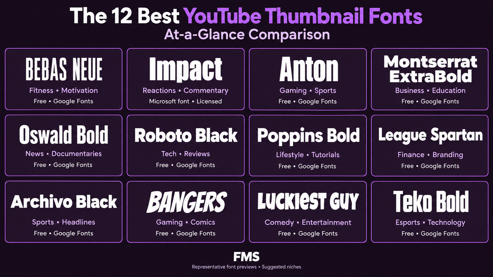
The 12 Best YouTube Thumbnail Fonts, Ranked and Compared
| Font | Style | Best Niches | Availability | Why It Works |
|---|---|---|---|---|
| Bebas Neue | All-caps bold condensed sans-serif | Gaming, tech, fitness, action, business | Free, Google Fonts, Canva | Maximum impact per pixel; the condensed all-caps format fits more words at larger size than any competing font; the most widely used thumbnail font on the platform |
| Impact | Ultra-bold condensed sans-serif; pre-digital meme font | Reactions, comedy, challenges, news commentary | Free, pre-installed on most systems | Maximum visual weight; the highest-contrast font available for text over photography; instantly recognisable as bold-claim content |
| Anton | Thick block sans-serif; slightly wider than Bebas Neue | Fitness, sports, motivation, general education | Free, Google Fonts, Canva | The wider letterforms provide slightly more visual warmth than Bebas Neue or Impact; excellent for motivational and educational content that needs authority without aggression |
| Montserrat ExtraBold | Geometric sans-serif; clean, modern, professional | Business, design, lifestyle, technology, premium services | Free, Google Fonts, Canva | The most versatile professional thumbnail font; the ExtraBold weight provides legibility at small sizes while the geometric construction communicates modern sophistication |
| Oswald Bold | Condensed sans-serif; between Bebas Neue and Montserrat | News, commentary, politics, general content | Free, Google Fonts, Canva | The editorial weight of Oswald communicates authority and newsworthy content; the condensed format allows longer hooks at larger sizes |
| Roboto Black | Humanist sans-serif at maximum weight; approachable but bold | Technology, productivity, general audiences, Indian digital brands | Free, Google Fonts, default on Android | The humanist construction communicates more warmth than geometric fonts; the Black weight provides legibility; the familiar form reduces visual processing friction for Indian audiences |
| Poppins Bold / ExtraBold | Geometric sans-serif with full Devanagari support | Indian creators requiring bilingual thumbnails (English + Hindi) | Free, Google Fonts, Canva | The most important font for Indian YouTube creators, the only widely available high-quality font that supports both Latin and Devanagari scripts in Bold weight, enabling consistent bilingual thumbnail design |
| Barlow Condensed ExtraBold | Condensed geometric sans-serif; less aggressive than Bebas | Lifestyle, travel, food, general consumer content | Free, Google Fonts | The lowercase form (unlike all-caps Bebas Neue) creates a slightly softer visual impact; effective for lifestyle niches where Bebas Neue or Impact feel too aggressive |
Font Sizing: The Technical Rules at 1280px Canvas Width
| Text Element | Minimum Size | Recommended Size | Notes |
|---|---|---|---|
| Primary headline (3–4 words) | 80pt | 100–140pt | The dominant visual element; must be legible as the first text element processed at all display sizes; larger is almost always better within the composition constraints |
| Primary headline (5–6 words) | 60pt | 80–100pt | Reduce word count rather than font size whenever possible; 6 words at 60pt approaches the legibility limit at 120px display width |
| Secondary text / label / subtitle | 24pt | 32–40pt | Must be clearly visually subordinate to the primary headline; below 24pt becomes illegible at 120px display; use sparingly, secondary text competes with the primary hook |
| Channel name / watermark | 16pt | 20–24pt | Brand element only; placed at a fixed position in every thumbnail (typically bottom-left or top-left); visually quiet but consistently present |
The Contrast Treatment Toolkit: Text Over Photography
- Semi-transparent background block: a rectangle filled with a solid or slightly opaque colour (rgba(0,0,0,0.65) minimum) placed behind the text creates a consistent high-contrast surface regardless of what photographic content is behind it; the most reliable and most widely used treatment
- Text stroke / outline: a 3–6 pixel outline in the complementary colour (white outline on dark text; black outline on light text) creates edge definition that maintains legibility even on complex backgrounds; visible at small display sizes; used extensively in gaming and entertainment thumbnails
- Drop shadow: a soft drop shadow (6–12px offset, 40–60% opacity) creates depth and separation from the background without the hard edge of an outline; effective for lifestyle and premium content where outlines would feel too aggressive
- Dedicated solid-colour panel: design the thumbnail with a dedicated area of solid brand colour that is entirely separate from the photographic content, and place all text within this zone; the cleanest and most professional approach but requires more deliberate compositional planning
- Background colour zone via subject cut-out: remove the background from a subject image (Canva's Background Remover or Adobe Photoshop's Remove Background), then place the cut-out subject against a solid brand colour background; this gives complete control over both foreground and background and is the approach that produces the highest visual consistency across a channel
The Font Pairing System for YouTube Thumbnails
| Primary Font (Headline) | Secondary Font (Supporting) | Pairing Logic | Best For |
|---|---|---|---|
| Bebas Neue | Montserrat Regular | Maximum contrast between the condensed all-caps headline and the open, geometric secondary text; the contrast creates immediate visual hierarchy | Gaming, tech, action, fitness, any high-energy niche |
| Anton | Roboto Medium | Block headline with humanist secondary text; Anton's authority is softened by Roboto's approachability in the secondary position | Education, tutorials, lifestyle, business coaching |
| Montserrat ExtraBold | Poppins Regular | Both geometric sans-serif; weight contrast creates hierarchy; the pairing has a cohesive modern feel appropriate for professional and business content | Business, design, professional services, Indian brands with Devanagari needs |
| Oswald Bold | Open Sans Regular | Editorial authority in the headline, high legibility and neutrality in the secondary position; an effective news/commentary pairing | News commentary, opinion content, current affairs, finance |
Colour Psychology for YouTube Thumbnails
| Colour | Psychological Effect | Click Trigger | Best Content Match |
|---|---|---|---|
| Red (#FF0000 family) | Urgency, passion, alertness, power; activates the visual alertness system | Creates a physiological alertness response; associated with urgency and importance | Gaming, sports, challenges, urgent topics, warnings, reactions, high-energy content |
| Orange (#FF6600 family) | Energy, enthusiasm, approachability; high-visibility without the danger association of red | High-energy warmth; communicates positivity and accessible expertise | How-to guides, productivity, personal development, food content |
| Yellow (#FFD700 family) | Optimism, attention, the highest visible colour wavelength in the human visual spectrum | Most visible colour in a dark-background niche context; strong Indian auspiciousness association | Finance, results-focused content, motivation, positive outcomes |
| Deep Purple (#6C2BD9 family) | Expertise, creativity, premium quality; communicates sophistication and authority | Stands out in business niches dominated by navy and grey; communicates premium positioning | Design, coaching, premium services, creative content, luxury lifestyle |
| Black / Near-Black | Authority, sophistication, premium quality; creates the strongest possible contrast for bright foreground elements | Stands out on YouTube's white light-mode interface; communicates confidence and authority | Technology, finance, luxury, advanced tutorials, professional expertise |
| Electric Blue (#0066FF family) | Trust, innovation, technology, digital-native confidence | High contrast against warm niche palettes; signals contemporary digital sophistication | Technology, software, startups, digital services |
The 8 Best Colour Combinations for YouTube Thumbnails
| Combination | Why It Works | Best Niches | Contrast Rating |
|---|---|---|---|
| Bright orange on black | Maximum contrast; warm energy against cold dark background; the most scroll-stopping complementary combination for dark-background platforms | Gaming, sports, action, tech | Exceptional, visible at all display sizes and in high ambient light |
| Yellow on deep navy | Yellow is the most visible colour in the visual spectrum; deep navy provides authority and depth; the combination communicates premium expertise | Finance, education, professional services, lifestyle | Excellent, highly visible and communicates credibility |
| White on deep violet / purple | Clean maximum legibility; deep purple communicates premium creative expertise; stands out in business niches dominated by blue and grey | Design, coaching, premium services, creative content | Very good, check specific purple shade against 7:1 minimum contrast standard |
| Red with white text and yellow accent | Three-colour complementary triangle; red urgency with yellow highlight draws the eye to the most important information element | Reactions, challenges, high-energy content, Indian consumer brands | Exceptional for high-energy niches; may feel aggressive in professional contexts |
| Black text on bright yellow | The highest-visibility combination available; pure functional contrast; yellow background stands out on YouTube's white interface | Motivation, personal development, news, any content where the message is more important than visual sophistication | Maximum, exceeds WCAG AAA 7:1 standard by a significant margin |
| White on forest green | Prosperity, natural authority, and trust signals; stands out in niches dominated by blue, red, and black; communicates reliability and expertise | Finance, health, education, sustainability content | Good to very good, depends on the specific green shade; verify contrast ratio |
| Electric blue on white | Clean, modern, and tech-forward; the blue-on-white combination communicates digital-native professionalism; stands out in dark-background tech niches | Technology, SaaS, software tutorials, digital marketing | Good, check specific blue shade; some blue hues fall below 4.5:1 on white |
| White on dark charcoal with colour accent | Sophisticated three-element system: charcoal background provides premium positioning, white provides legibility, a brand accent colour (orange, purple, yellow) provides visual interest and CTR activation | Professional services, premium content, any brand with established colour identity | Excellent for white text; the accent colour provides the CTR activation energy |
The 60-30-10 Colour Rule Applied to Thumbnails
- 60%, Dominant colour (background): this is the primary brand colour or the background colour that defines the thumbnail's overall visual identity; it occupies the majority of the frame and establishes the niche contrast and brand recognition signal
- 30%, Secondary colour (subject or key visual): this colour appears on the primary subject, the clothing of the presenter, the colour of the product, or the colour applied to the key graphic element; it creates visual separation between subject and background
- 10%, Accent colour (text and highlights): this is the smallest but often the most CTR-critical colour element; it appears on the text hook and on any graphic highlight element; it should be the highest-contrast colour in the composition, drawing the eye to the text after the face has captured initial attention
Colour-Coding Your Channel by Content Category
| Content Category | Suggested Background Colour | Text Colour | Example Headline Style |
|---|---|---|---|
| Tutorials / How-To | Deep navy #1E3A5F | White + orange accent | How To [Result] in [Time] |
| Opinion / Commentary | Warm black #1A1A1A | White + red accent | Why [Popular Belief] Is Wrong |
| Reviews / Comparisons | Forest green #14532D | White + yellow accent | [Option A] vs [Option B]: Honest Review |
| Case Studies / Results | Deep purple #4C1D95 | White + gold accent | How [Client Name] Got [Specific Result] |
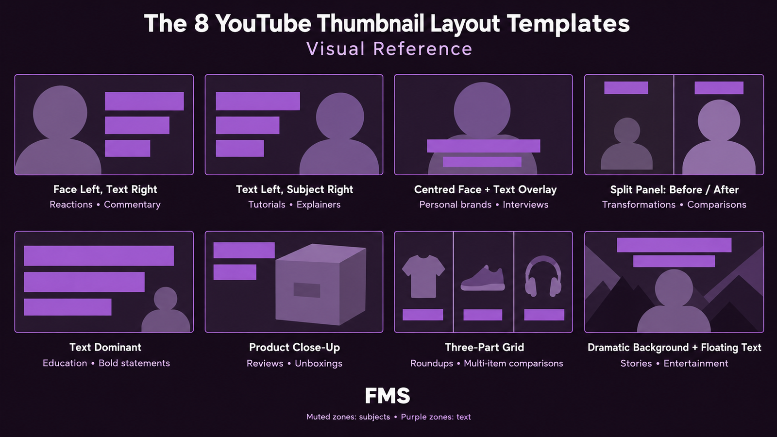
The 8 Proven YouTube Thumbnail Layout Templates
| Template | Layout Description | Compositional Logic | Best For |
|---|---|---|---|
| Face Left, Text Right | Face occupies left 50–60% of frame; bold text block fills the right 40–50% | Eye naturally moves left to right; face stops the scroll, text completes the hook | Personal brands, commentary, tutorials, most high-performing business content |
| Text Left, Subject Right | Bold headline text on the left 40–50%; subject (face, product, or graphic) on the right 50–60% | Text leads the reading sequence; the subject provides visual weight and stops the scroll | Educational content, how-to guides, news, business tutorials |
| Centred Face with Text Overlay | Close-up face centred in the frame; text overlaid above or below the face with a contrast panel | Face is the undisputed visual hero; text is secondary and adds the curiosity hook after face attention is captured | High-personality brands, reaction content, personal vlogs, emotional content |
| Split Panel (Before / After) | Left half shows the "before" state; right half shows the "after" state; optional divider and text label | Visual evidence of transformation without requiring text to explain it; the gap between the two states IS the curiosity gap | Design transformations, product comparisons, results-focused content, case studies |
| Text Dominant (No Face) | Large-scale typography fills the majority of the frame; minimal or no photographic elements | The text IS the visual hook; works when the hook text is so compelling that it requires no visual support to drive clicks | News commentary, strongly opinion-led content, finance, any niche where text authority outperforms visual novelty |
| Product / Subject Close-Up | A single object or product photographed at an unexpected angle or scale; text occupies a minor position | The unusual scale or angle of the object creates the pattern interrupt; the visual is so striking it stops the scroll without a face | Product reviews, unboxing content, tech comparisons, any content where the product is the visual hero |
| Three-Part Grid | Three equal or proportional panels; each panel shows one option, one result, or one step | The three-part structure immediately communicates a comparison or a list format; the Zeigarnik effect activates without any text being required | Comparison content, multi-option decisions, "3 Things" or "3 Ways" content types |
| Dramatic Background with Floating Text | A dramatic or aspirational scene (city skyline, dramatic landscape, striking environment) as the full-bleed background; large text overlaid with high contrast treatment | The background establishes the content's aspirational context; the text delivers the hook against this backdrop | Travel content, motivational/inspirational content, lifestyle, entrepreneurship success stories |
Building a Unified Thumbnail Design System
- Brand colour palette: 2–3 primary brand colours documented as exact HEX codes; these appear consistently across all thumbnails without exception; one dominant background colour, one secondary colour, one accent colour following the 60-30-10 rule
- Two core fonts: one primary headline font (Bold or ExtraBold weight, high visual impact) and one optional secondary font for supporting text; the same fonts applied at the same weights in every thumbnail
- 3–5 layout templates: pre-built in Canva, one per content category; each template has the colour system, fonts, and compositional structure locked in; only the face image and text content change for each new video
- Signature design element: a recurring visual detail that appears on every thumbnail, a specific graphic shape, a consistent arrow design, a brand-coloured stripe, or a consistent text treatment style; this becomes the channel's visual fingerprint
- Logo placement rule: a consistent position and size for the channel logo or watermark; typically bottom-left or top-left at 20–24pt equivalent; small enough not to compete with the primary visual but consistent enough to build channel attribution
Need a Thumbnail Design System Built to Your Brand?
Futuristic Marketing Services builds complete YouTube thumbnail design systems for Indian creators, brand colour palette, font selection and specification, 4 layout templates in Canva, and the brand guidelines document that ensures every future thumbnail is consistently on-brand.
Start Your Thumbnail System ProjectFrequently Asked Questions
What is the best font for YouTube thumbnails?
How big should the font be on a YouTube thumbnail?
What colours get the most clicks on YouTube thumbnails?
What layout should I use for a YouTube thumbnail with a face and text?
How many colours should I use in a YouTube thumbnail?
Should my thumbnail fonts match my channel logo font?
Get a Complete Font, Colour, and Layout System for Your Channel
Futuristic Marketing Services designs thumbnail brand systems for Indian YouTube creators, the font specification, colour palette with exact HEX codes, layout templates in Canva, and the documentation that makes every future thumbnail take 20 minutes instead of 2 hours.
See Our YouTube Design Services