Most YouTube creators focus on subscriber counts, view numbers, and watch time. These are all downstream consequences of one upstream metric that most creators underinvest in: click-through rate (CTR). Your CTR is the percentage of people who see your video thumbnail in the YouTube feed and decide to click. Without a click, nothing else happens, no views, no watch time, no subscribers. The thumbnail is the single most important creative asset in the entire YouTube content lifecycle, and it is the one most frequently designed as an afterthought.
Key Takeaways
- CTR is the single upstream metric that determines all downstream YouTube performance, without clicks, no other channel metric can improve
- The average YouTube CTR across all niches is 2–5% (Think with Google); channels that systematically apply the 6 design principles consistently achieve 6–10%+
- The click decision happens in under one second, thumbnails must communicate at the pre-attentive processing level, not the deliberate reading level
- The 5 psychological triggers: facial recognition priority, the curiosity gap, FOMO (fear of missing out), pattern interruption, and social proof and authority
- The 6 design principles: human face with strong expression, colour strategy that contrasts the niche palette, typography at the correct size and weight, visual hierarchy with one focal point, the curiosity gap technique, and brand consistency across the channel
- A/B test every video using YouTube's Test and Compare feature, creator intuition about which thumbnail will perform best is consistently less reliable than data from even 500 impressions
Need Thumbnails Designed to Maximise CTR for Your Channel?
Futuristic Marketing Services designs CTR-optimised YouTube thumbnails for Indian content creators and brands, the curiosity gap framework, competitive colour analysis, correct specifications, and brand-consistent visual systems.
Get a Free Thumbnail ConsultationWhat CTR Measures, and What It Does Not
| CTR Range | Performance Level | What It Signals | Recommended Action |
|---|---|---|---|
| Below 2% | Low, needs urgent attention | Thumbnail and title are failing to communicate the video's value to the audience seeing it | Redesign thumbnail immediately; apply the 6 design principles from this guide; A/B test 3 variants |
| 2–4% | Below average | Content is visible but thumbnail and title are not creating sufficient motivation to click | A/B test a new thumbnail focused on improving the curiosity gap; strengthen the emotional expression |
| 4–6% | Good, above platform average | Thumbnail and title are working together effectively; the video is reaching and converting its target audience | Maintain the strategy; continue testing incremental improvements; analyse which design elements are driving performance |
| 6–10% | Excellent | Strong thumbnail design combined with effective title and high audience-topic relevance | Systematise what is working; build a thumbnail template that replicates the winning elements consistently |
| Above 10% | Exceptional, rare at scale | Strong audience relationship, outstanding thumbnail design, and a topic with high current relevance to the target audience | Reverse-engineer the specific elements that are producing this performance and systematise them into a repeatable framework |
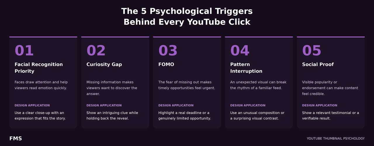
The 5 Psychological Triggers Behind the Click Decision
Design Principle 1, The Human Face With the Right Expression
- Close-up framing: the face should be framed at head-and-shoulders level at minimum; at half-face (eyes to chin) for maximum emotional impact; the face must occupy at least 25–35% of the thumbnail frame to be processed at small display sizes
- Strong, clearly legible emotion: neutral expressions significantly underperform expressive ones; the expression must read clearly at 120px display width, which requires exaggeration beyond what feels natural on camera, wide eyes, open mouth for surprise, furrowed brow for concern, genuine Duchenne smile for delight
- Background separation: the face must visually stand out from the background; use a solid colour background, a blurred background, or a cut-out with a contrasting background colour behind the subject
- Gaze direction: if the face is looking toward a text element in the thumbnail, the viewer's eyes involuntarily follow that gaze, use the gaze-following reflex to direct attention to the most important text element
Design Principle 2, Colour Strategy That Contrasts the Niche Palette
| Colour | CTR Psychology | Best Paired With | Best Content Categories |
|---|---|---|---|
| Bright Red | Urgency, alertness, action; activates the visual system's alertness response; the colour most associated with high-energy, high-stakes content | White text, yellow accents, black background elements | Urgent topics, warnings, high-energy tutorials, challenges, reactions |
| Vivid Orange | Energy, enthusiasm, warmth; high-visibility without the danger association of red; communicates approachable expertise | Black text, dark navy backgrounds, white text | Educational tips, how-to, productivity, positive results |
| Deep Purple / Violet | Expertise, creativity, premium quality; stands out in business and education niches dominated by navy and grey; communicates sophistication | White text, gold or orange accent elements | Design, business coaching, premium services, creative content |
| Electric Yellow | The highest-visibility colour in the human visual spectrum; optimism, attention, results; strong Indian cultural association with auspiciousness | Black text (mandatory for contrast), dark backgrounds | Finance, personal development, results-focused content, motivation |
| Dark Background (Black or Deep Navy) | Creates the strongest contrast for bright text and subject colours; communicates authority and premium quality; stands out on YouTube's white light-mode interface | Bright accent colours for text; high-contrast white or neon subject elements | Technology, finance, luxury, expertise positioning, advanced tutorials |
Design Principle 3, Typography That Communicates at 120px
- 3 to 5 words maximum: this is a legibility constraint, not a stylistic preference; at 120px display width, even bold text at the correct design size becomes illegible above 5–6 words; if the curiosity gap cannot be communicated in 5 words, redesign the approach
- Minimum 80pt at 1280px canvas width: for primary headline text; this reduces to approximately 7.5pt at 120px display, the absolute minimum legible size under any conditions; 120pt is preferred for 3-word hooks
- Bold sans-serif fonts only: Montserrat ExtraBold, Impact, Bebas Neue, Anton, Oswald Bold, these are the category leaders for CTR-optimised thumbnail typography; Regular and Light weights are not legible at minimum display size
- Always treat text over photography: never place text directly on a photographic background without contrast treatment; use a semi-transparent dark panel (rgba(0,0,0,0.65) minimum), a text outline, or a dedicated solid-colour text zone
- Text placement in upper or lower third: avoid placing text in the centre of the thumbnail where YouTube's play button overlay appears on hover in desktop view; keep text in the upper or lower third of the composition
Design Principle 4, Composition and Visual Hierarchy
- Stage 1, Subject (largest, most prominent): the face or key visual; this is the first element processed; it must be unambiguous and visually dominant; it stops the scroll and earns the 0.5-second evaluation window
- Stage 2, Text (bold, clearly readable): the hook or promise; this is what converts the stopped viewer into a clicker; it must create or amplify the curiosity gap activated by Stage 1
- Stage 3, Context (background, supporting visuals): the atmosphere and brand signals; these communicate credibility and niche relevance after the primary decision has been made
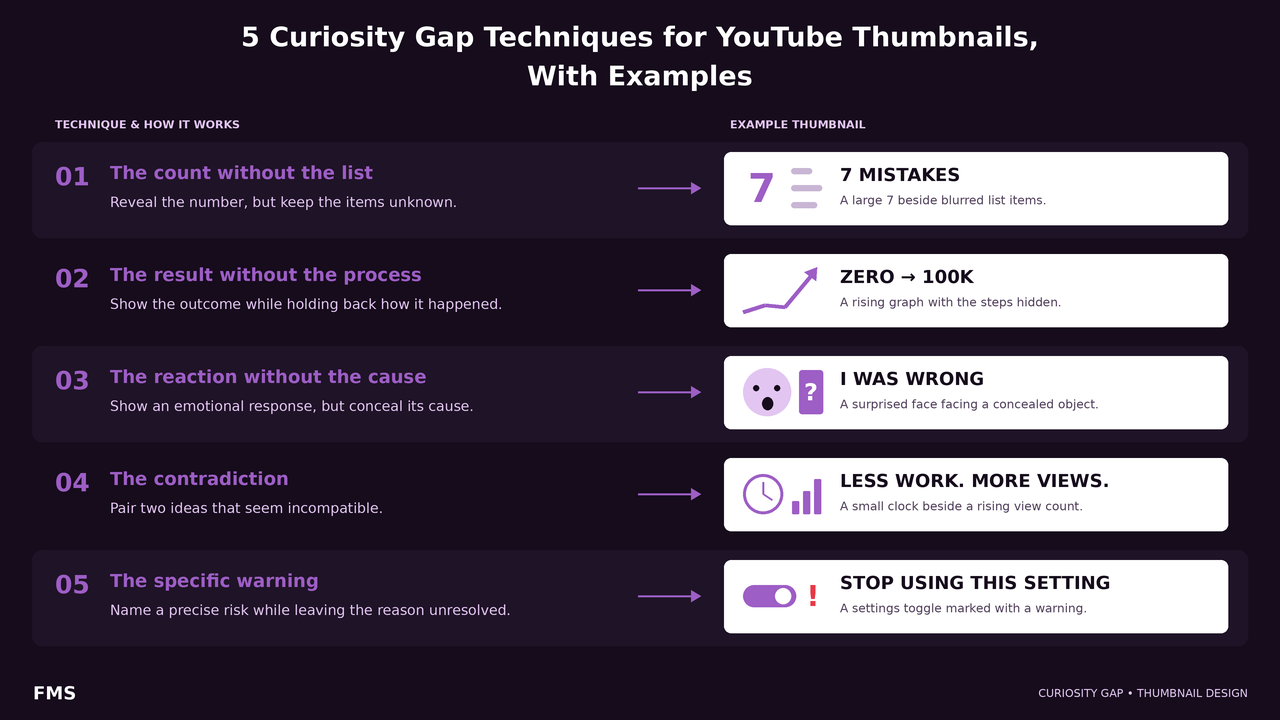
Design Principle 5, The Curiosity Gap Technique
| Technique | How It Works | Example (Indian Business Context) | CTR Driver |
|---|---|---|---|
| The Count Without the List | Show a specific number that promises a list of items the viewer wants, without showing the items themselves | [Face with surprised expression] + "7 Reasons" in large text | Zeigarnik effect: the brain compulsively wants to complete the unfinished list |
| The Result Without the Process | Show a dramatic transformation outcome without any hint of how it was achieved | [Before/after brand: amateurish left, premium right] + "Same Business" | The viewer can see the result is desirable; the method is the gap that requires clicking |
| The Reaction Without the Cause | Show a face expressing shock, disbelief, or amazement without any visual indication of what caused the reaction | [Face: extreme shock expression] + "I Can't Believe This" | Emotional contagion, the viewer is drawn to investigate the source of a strong emotion they observe |
| The Contradiction | Show something that appears paradoxical or directly contradicts a belief the audience holds | [Confident face] + "Your Logo Is Wrong", challenging the belief that having a logo is sufficient | Cognitive dissonance, the brain is compelled to resolve the contradiction between the claim and the existing belief |
| The Specific Warning | Imply that the viewer may be making a mistake they do not know about | [Concerned face] + "Stop Doing This", without specifying what | Loss aversion, not clicking means the mistake continues; clicking means the mistake can be avoided |
Design Principle 6, Brand Consistency Across the Channel
- Building a thumbnail brand system for CTR:
- Fixed colour palette: 2–3 brand colours that appear in every thumbnail; exact HEX codes documented and applied consistently; the colour system becomes the channel's visual signature
- Consistent font treatment: the same 1–2 fonts at the same weight across all thumbnails; font consistency creates a visual identity that is immediately associable with the channel
- Repeating compositional structure: the same general layout (face-left-text-right, or centred-face-bottom-text) applied consistently; the viewer's brain learns the channel's visual grammar and processes future thumbnails faster
- Template library: 2–4 pre-built thumbnail templates, one per content category; each new video selects the appropriate template and updates only the unique content (new face image, new text hook) without rebuilding the design from scratch
The Step-by-Step Thumbnail Design Workflow in Canva
- Pre-design (before opening Canva): Identify the primary psychological trigger for this specific video, face + curiosity gap, transformation visual, or pattern interrupt. Write the 3–5 word thumbnail text first, before designing. If using a face, take a dedicated thumbnail photo with an exaggerated expression appropriate to the trigger.
- Canvas setup: Create a new Canva design at exactly 1280×720px (or select "YouTube Thumbnail" from the template category). Apply the brand background colour as the base layer. Add a temporary rectangle in the bottom-right corner (approximately 160×40px) to represent the YouTube timestamp overlay zone, any critical content placed here will be obscured on the published thumbnail.
- Element placement: Add the face image and use Background Remover (Canva Pro) to isolate it against the brand background. Position the face at the left intersection point of the Rule of Thirds grid. Add the 3–5 word text hook in the upper or lower right, at minimum 80pt in the brand's Bold font. Apply the contrast treatment (solid colour panel or drop shadow) behind the text if it overlaps any photographic element.
- Test and export: Reduce the Canva canvas view to approximately 10% zoom, this simulates the 120px mobile display size. All text must remain legible at this scale. If any text element becomes unclear, increase the font size or reduce the word count. Export as PNG for text-heavy designs; as JPG at 90% quality for photographic thumbnails. Verify the file size is under 2MB before uploading to YouTube Studio.
A/B Testing Thumbnails: The Data-Driven Approach
Common Thumbnail Mistakes That Kill CTR
| Do This | Do Not Do This |
|---|---|
| Always create a dedicated custom thumbnail for every video | Use the auto-selected video frame as the thumbnail, YouTube's default selection is rarely the optimal CTR frame |
| Test your thumbnail at 10% zoom in Canva (120px simulation) before publishing | Evaluate the thumbnail only at full canvas size on a desktop monitor, this is not how 70%+ of viewers will see it |
| Use a strong, clearly legible emotional expression in close-up framing | Use a neutral or subtle expression, at 120px display size, a neutral expression is indistinguishable from no expression |
| Keep thumbnail text to 3–5 words at minimum 80pt at 1280px canvas width | Place small, thin-weight text in multiple lines, it will be illegible at minimum display size and produce no CTR lift |
| Design for colour contrast against the niche's competitive thumbnail palette | Use the same colour family as the 8 most popular channels in the niche, this produces a thumbnail that blends in rather than standing out |
| A/B test at least the first 10 videos using Test and Compare to build data-driven design intelligence | Design one thumbnail per video based on intuition alone, with no testing, this leaves significant CTR improvement undiscovered |
Need CTR-Optimised Thumbnails Designed for Your Channel?
Futuristic Marketing Services designs YouTube thumbnails with all 6 CTR principles applied, curiosity gap frameworks, competitive colour analysis, mobile-tested typography, and brand-consistent visual systems that compound into channel recognition.
Start Your Thumbnail Design ProjectCommon Thumbnail Mistakes That Kill CTR
What is a good YouTube thumbnail CTR?
How do I check my YouTube CTR?
Does the thumbnail or the title have more impact on CTR?
Should every YouTube thumbnail have a face in it?
How many words should a YouTube thumbnail have?
Can I change a thumbnail after publishing a video?
Build a Channel-Wide Thumbnail System That Compounds CTR Over Time
Futuristic Marketing Services designs YouTube thumbnail brand systems for Indian creators, the colour system, font system, compositional templates, and the creative brief process that makes every future thumbnail faster to produce and more consistently effective.
See Our YouTube Design Services