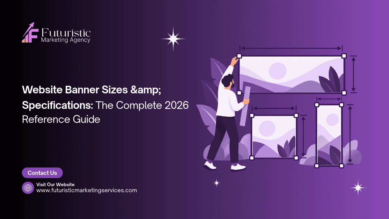
Uploading a banner image at the wrong size, in the wrong format, or at an unoptimised file weight produces one of three outcomes: visible distortion from incorrect aspect ratio rendering, quality degradation from insufficient resolution, or slow page load times that trigger Core Web Vitals failures and conversion rate decline. According to <a href=”https://shortpixel.com/blog/banner-sizes/” target=”_blank” rel=”noopener”>ShortPixel’s banner dimensions research</a>, banner size directly affects both how fast a page loads and how sharp the image renders across different device screens, two variables that have direct, measurable consequences for both user experience and search engine ranking.
Key Takeaways
- There is no single universal "correct" banner size, dimensions vary by placement context (hero, sidebar, in-content), target device (desktop, tablet, mobile), and the specific platform or CMS the website uses
- Always design at 2x resolution and export at 1x display size, designing at 1x produces blurry images on high-DPI (Retina) screens that represent the majority of mobile devices used in India
- The standard full-width desktop hero banner dimensions are 1920×600 to 1920×1080px; mobile hero banners require a dedicated portrait-format design at 800×1000 to 1200px
- WebP is the correct format for all website banner images, 25–35% smaller file sizes than JPEG at equivalent quality, directly improving Core Web Vitals LCP scores and page load speed
- Platform-specific sizes vary significantly: Shopify recommends 2048×1024px, Squarespace uses 2500×1500px, and WordPress has no fixed requirement but recommends 1920px wide minimum for full-width themes
- Google Display Network banner ads must meet strict file size limits (150KB maximum per static image) and the 5 highest-performing sizes cover 90%+ of available GDN inventory
Need Banners Designed at the Correct Specifications for Your Platform?
Futuristic Marketing Services designs website banners at the exact specifications required by your platform, Shopify, WordPress, Squarespace, or custom-built, in the correct file format, at the correct resolution, and optimised for Core Web Vitals.
Get a Free Banner Design Consultation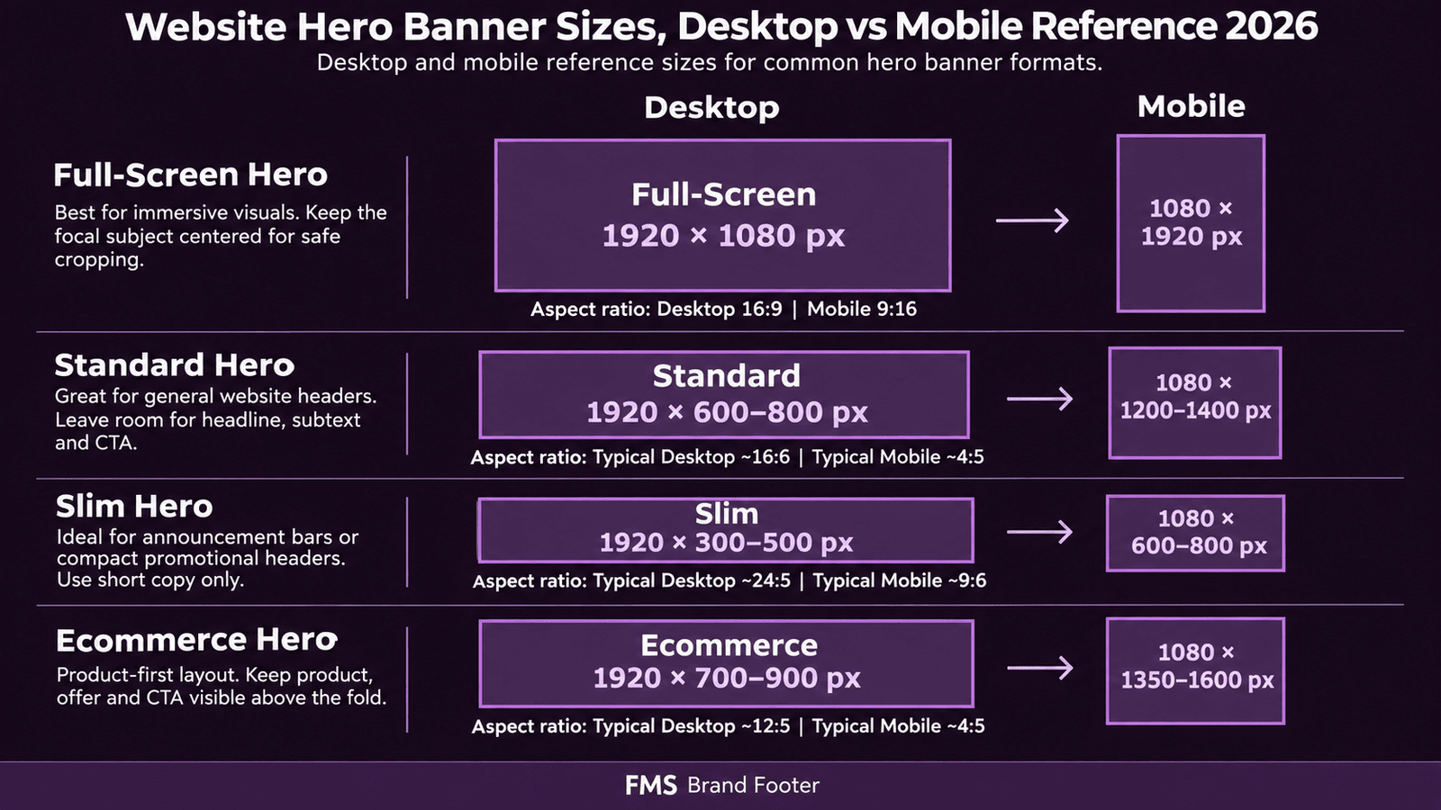
The Universal Banner Size Framework: How to Think About Dimensions
Design at 2x, Export at 1x
Always design banners at twice the intended display size (2x resolution) and export at the 1x display size. If a banner will display at 600px wide, design the canvas at 1200px wide. This ensures sharp rendering on high-DPI (Retina) screens, which represent the majority of modern smartphones, including virtually all iPhones and most premium Android devices used in India, without serving unnecessarily large file sizes to standard screens.
Responsive vs Fixed-Dimension Banners
Hero Banner Sizes: Desktop, Mobile, and Every Variation
| Hero Banner Type | Desktop Dimensions | Mobile Dimensions | Aspect Ratio | Best Use Case |
|---|---|---|---|---|
| Full-Screen / Cinematic Hero | 1920×1080px | 800×1200px (portrait) | 16:9 desktop; 2:3 mobile | Maximum visual impact; brand-building; luxury, lifestyle, hospitality, photography portfolio |
| Standard Full-Width Hero | 1920×600–800px | 375–768×500–700px | 3.2:1 to 2.4:1 desktop | Most common hero type; service businesses, B2B, SaaS, professional services; balances visual impact with content space |
| Slim / Header Hero | 1920×300–500px | 375×300–400px | 3.8:1 to 6.4:1 | Inner pages (About, Contact, Service pages); provides page identity without dominating the layout |
| E-Commerce Hero (Product Focus) | 1920×700–900px | 800×900–1000px | 2.1:1 to 2.7:1 desktop | E-commerce homepage; product launches; promotional campaign landing pages; provides space for product photography alongside headline and CTA |
| Landing Page Hero | 1920×700–1080px (varies by content above fold) | 375–768×600–900px | Determined by content requirements | PPC and paid campaign landing pages; all five hero elements must appear above the fold on both desktop and mobile |
Platform-Specific Hero Banner Sizes
Shopify Banner Size Guide
| Shopify Banner Type | Recommended Desktop Size | Mobile Size | Format | Max File Size |
|---|---|---|---|---|
| Homepage Hero (General) | 2048×1024px (2:1 ratio) | 1200×1600px (portrait) | JPG or WebP | Under 1MB (Shopify accepts up to 20MB but performance requires under 1MB) |
| Homepage Hero (Slim) | 1920×600px | 800×800px or 375×500px | JPG or WebP | Under 500KB |
| Collection Page Banner | 1920×400–600px | 800×400–500px | JPG or WebP | Under 400KB |
| Promotional / Sale Banner | 1920×500–700px | 800×600–800px | JPG or WebP | Under 400KB |
| Announcement Bar | No image required (CSS-styled text bar) | Same CSS bar, responsive | HTML/CSS | Not applicable |
Squarespace Banner Size Guide
| Squarespace Banner Type | Recommended Size | Format | Notes |
|---|---|---|---|
| Mega View Hero (Full Screen) | 2500×1500px minimum | JPG or PNG | Squarespace auto-scales images; uploading at this size ensures sharp rendering on all viewports including high-DPI displays up to 1920px |
| Standard Page Header | 1920×600–800px | JPG or PNG | For interior pages (About, Services, Blog index); Squarespace crops automatically so keep critical content in the central 80% |
| Banner Block (In-Page) | 1500×600px | JPG or PNG | In-page content banner within the Squarespace block editor; subject to the same central safe-zone rule |
| Gallery / Slideshow Images | 1500×1000px minimum (3:2 aspect ratio) | JPG or PNG | All gallery images should be the same aspect ratio to prevent inconsistent cropping across slides |
WordPress Banner Size Guide
| WordPress Banner Context | Recommended Size | Format | Notes |
|---|---|---|---|
| Full-Width Hero (No Sidebar) | 1920×600–1080px (varies by theme) | WebP with JPG fallback | WordPress has no fixed hero size requirement, the size is determined by the active theme's defined image zones; check the theme documentation for exact dimensions |
| Featured Image (Blog Post) | 1200×628px (1.91:1 ratio) recommended; check theme requirements | JPG or WebP | The 1200×628px size is also the Open Graph image standard, making it appropriate for social sharing previews |
| Header Image (Theme Header) | 1920×300–500px (varies by theme) | JPG or WebP | Many WordPress themes have a specific "Header Image" setting separate from the hero section; check Appearance → Customize → Header Image for the specific dimensions displayed |
| Elementor / Page Builder Hero | 1920px wide × height by content (typically 600–900px) | WebP with JPG fallback | Page builder heroes (Elementor, Divi, Beaver Builder) set the hero height by content rather than fixed pixel dimensions; upload at 1920px wide and the height will be determined by the section's padding and content |
| Sidebar Widget Banner | 300×250px (standard) or 300×600px (half page) | PNG or JPG | Sidebar banners in WordPress often use the same dimensions as Google Display Network banner ads; these dimensions are well-established and familiar to advertisers and designers |
Email Header Banner Sizes
| Email Banner Type | Dimensions | Format | Key Notes |
|---|---|---|---|
| Email Header / Hero | 600×200–300px (design at 1200×400–600px for 2x) | JPG or PNG (WebP not universally supported in email clients) | Email clients cap display width at 600px; images wider than 600px will be scaled down automatically; design the banner for this 600px context |
| Email Promotional Banner | 600×150–250px | JPG or PNG | Many email clients block images by default, all critical information must also appear as HTML text, not only within the image |
| Email Footer Banner | 600×100–150px | PNG or JPG | Often used for brand logo strip, social media icons, or compliance text; keep file size under 50KB for fast email loading |
Google Display Network Ad Sizes
| Size | Name | Priority Tier | Max File Size | Device Context |
|---|---|---|---|---|
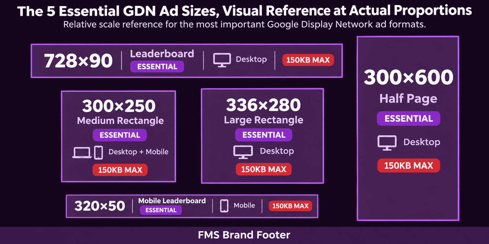
| 300×250 | Medium Rectangle | Essential (highest volume) | 150KB | Desktop and mobile; most widely available placement on the GDN |
| 728×90 | Leaderboard | Essential | 150KB | Desktop only; top-of-page placement; high-visibility premium position |
| 300×600 | Half Page | Essential | 150KB | Desktop; large sidebar placement; highest screen coverage of the standard sizes |
| 336×280 | Large Rectangle | Essential | 150KB | Desktop and mobile; high volume on Indian news and content sites |
| 320×50 | Mobile Leaderboard | Essential | 150KB | Mobile only; top/bottom of mobile web pages and within app content |
| 160×600 | Wide Skyscraper | Secondary | 150KB | Desktop; tall narrow sidebar placement alongside reading content |
| 970×90 | Large Leaderboard | Secondary | 150KB | Desktop; wide top-of-page placement on high-traffic sites |
| 320×100 | Large Mobile Banner | Secondary | 150KB | Mobile only; double height of Mobile Leaderboard; allows more design space |
File Format Specifications: Which Format for Which Banner
| Format | Best Use Case | Advantages | Limitations |
|---|---|---|---|
| WebP | All website hero banners and web banners; the primary format for modern website images | 25–35% smaller than JPEG at equivalent quality; supports both lossy and lossless compression; supports transparency (like PNG) with smaller file sizes | Not supported in all email clients; requires a JPG fallback for older browser support |
| JPEG / JPG | Photographic banners where transparency is not required; email banners; GDN display ads; any context where WebP is not supported | Universal support across all browsers, email clients, and platforms; excellent compression for photographic images | Larger file sizes than WebP; no transparency support; lossy compression produces artefacts on text elements at high compression levels |
| PNG | Banners requiring transparency; logos overlaid on variable backgrounds; graphic banners with sharp text edges; GDN display ads with text overlays | Lossless compression, no quality degradation; transparency support; sharp text and edge rendering | Larger file sizes than JPEG for photographic content; not recommended for full-colour photographic hero banners where the file size penalty of lossless compression is significant |
| SVG | Logos, icons, and graphic elements used as part of a banner; decorative background patterns; any element that must scale without quality loss | Infinitely scalable without quality loss; tiny file sizes for simple graphics; editable as code | Not suitable for photographic content; some email clients do not support SVG; not accepted as a direct upload format on most CMS platforms for full-page banners |
| GIF | Simple animated banners for email or GDN display; situations where HTML5 animation is not supported | Universal animation support including email clients; simple to produce | Limited to 256 colours (produces visible colour banding on photographic content); much larger file sizes than HTML5 animations; should not be used for GDN ads that require animation without HTML5 support |
File Size Limits and Performance Targets
| Banner Context | Target File Size | Maximum File Size | Format Recommendation |
|---|---|---|---|
| Desktop hero banner | Under 200KB | Under 400KB | WebP at 80–85% quality; JPEG at 75–80% if WebP unavailable |
| Mobile hero banner | Under 100KB | Under 150KB | WebP at 75–80% quality; mobile images should be served via srcset to prevent desktop-sized images reaching mobile users |
| Promotional / secondary banners | Under 80KB | Under 150KB | WebP or JPEG; graphic banners with text can often be compressed more aggressively than photographic banners without visible quality loss |
| Google Display Network ad | Under 100KB | 150KB (Google hard limit, files above this are rejected) | JPEG at 80–85% quality or PNG for text-heavy designs; WebP accepted by Google Ads but JPEG is more universally compatible |
| Email header banner | Under 50KB | Under 100KB | JPEG or PNG (WebP not universally supported in email clients); email images often load on cellular data connections where file size has direct impact on load time |
Aspect Ratio Reference for Banner Design
| Aspect Ratio | Example Pixel Dimensions | Common Banner Use | Design Notes |
|---|---|---|---|
| 16:9 | 1920×1080 / 1280×720 | Full-screen hero banners; YouTube thumbnails; video player backgrounds | Standard widescreen format; familiar to viewers; compositions must work in the widescreen format without excessive empty space on the sides |
| 3:1 | 1920×640 / 1200×400 | Standard web hero banners; LinkedIn profile banners; wide-format promotional banners | The most common homepage hero proportion for service business websites; very limited vertical space requires concise design |
| 2:1 | 2048×1024 / 1920×960 | Shopify recommended hero; Facebook and Twitter shared link preview images | Good balance of visual impact and design space for both image and text elements |
| 1.91:1 | 1200×628 | Open Graph / social sharing image; blog featured image; Facebook and Instagram ad images (landscape) | The universal Open Graph image ratio used by Facebook, LinkedIn, and Twitter for link preview cards; use this ratio for any image that will be shared on social media |
| 1:1 | 1080×1080 / 800×800 | Instagram Feed ads; Facebook Feed ads (square option); Google Display carousel | Square format performs well on social media feeds; the equal proportions provide good visual stability for both photographic and graphic banner designs |
| 4:5 | 1080×1350 | Instagram and Facebook Feed ads (portrait); highest-performing Meta Feed ad format | Occupies 33% more screen area than the 1:1 square format; the highest-recommended format for Instagram and Facebook Feed ad creative |
| 9:16 | 1080×1920 | Instagram and Facebook Stories and Reels; TikTok; YouTube Shorts; vertical mobile hero banners | Full-screen mobile vertical format; the native format for all short-form vertical video platforms; for platform-specific dimension guides, see our social media post sizes guide |
Need Banners at the Exact Specifications for Your Platform?
Futuristic Marketing Services designs website banners for Indian businesses at the exact specifications required by every platform, Shopify, WordPress, Squarespace, Google Display, Meta, and more, in the correct format, at the correct resolution, and optimised for Core Web Vitals performance.
Get a Free Banner Specification ConsultationFrequently Asked Questions
Q. What size should a website banner be?
Q. What is the standard hero banner size?
Q. What file format is best for website banners?
Q. Why does banner image file size affect my Google ranking?
Q. Do I need separate banner images for desktop and mobile?
Get Every Banner at the Right Size, Right Format, Right Performance
Futuristic Marketing Services delivers website banners at the exact specifications for every platform and context, hero banners, promotional banners, GDN ad sets, and email headers, all optimised for Core Web Vitals and delivered in the correct format for immediate publication.
See Our Graphic Design Services