Instagram Ad Design: The Complete 2026 Guide to Ads That Convert

Instagram ad design

Instagram has the highest visual quality standard of any social media platform. Its users have been exposed to professional photography, carefully art-directed brand content, and high-quality influencer creative for over a decade. The result is an audience with a highly developed aesthetic sensitivity, one that distinguishes between content that belongs on Instagram and content that does not within milliseconds, and that treats content below the platform’s visual quality threshold as invisible. On Instagram, poor design quality does not just reduce ad performance; it actively repels the audience.

According to Social Insider's Instagram benchmark report, the average Instagram engagement rate is 1.94% across all account sizes, with Reels consistently outperforming all other formats. According to Nielsen's creative effectiveness research, creative quality accounts for 56% of digital ad performance, and on Instagram, where visual quality expectations are at their highest, the creative quality multiplier is even more decisive than on other platforms.
Instagram ad design is simultaneously more demanding and more rewarding than other platforms. More demanding because the visual quality bar is genuinely high. More rewarding because high-quality creative on Instagram earns algorithmic amplification through saved posts, shares to Stories, and profile visits that no other platform provides at the same volume. This guide covers the complete framework for Instagram ad design that converts: what makes Instagram different, all format specifications, visual design principles, Reels and Stories creative, UGC vs branded creative, the 7 design rules, and the most common mistakes.
For the broader social media ad design framework, see our social media ad design guide. For Facebook-specific creative (which shares Meta's advertising infrastructure), see our Facebook ad design best practices guide. For organic Instagram post and carousel design, see our social media post design guide and Instagram carousel design guide.

Key Takeaways

  • Instagram has the highest visual quality standard of any social platform, design below the platform's aesthetic threshold is treated as invisible, not just ineffective
  • Reels are the highest-reach ad format on Instagram in 2026, Meta's algorithmic investment is concentrated here; native 9:16 vertical content at 1080×1920px is the primary creative direction
  • According to Aspire, UGC-style creator ads produce 4x higher CTR than branded creative on Instagram, native-looking content bypasses the skip reflex that polished brand advertising triggers
  • Safe zone compliance is mandatory for Stories and Reels: all critical content must be within the central 1080×1420px area, avoiding the top 250px (profile UI) and bottom 250px (engagement buttons)
  • The 4:5 portrait format (1080×1350px) is the highest-performing Instagram Feed ad format, it occupies 33% more screen real estate than the 1:1 square format, reducing competing content visible simultaneously
  • Instagram's audience in India is younger (18–35 primary demographic), more aesthetically sophisticated, and more responsive to aspirational visual content than Facebook's Indian audience, this demographic difference requires a distinct creative approach

Need Instagram Ad Creative That Meets the Platform's Visual Standard?

Futuristic Marketing Services designs Instagram ad creative for Indian businesses, platform-quality visuals, native vertical formats, brand-consistent design, and the creative testing system that identifies what works for the specific audience.

Get a Free Instagram Ad Consultation

What Makes Instagram Ad Design Different From Other Platforms
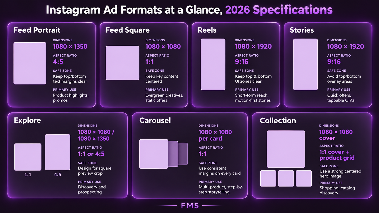
Instagram differs from Facebook, LinkedIn, and TikTok in four specific ways that directly influence how ad creative should be designed:
Difference 1: The visual quality threshold is significantly higher. Instagram was built as a photography and visual storytelling platform. Its users have been trained by a decade of high-quality visual content to distinguish between platform-quality creative and below-par creative with precision. An ad that would perform adequately on Facebook may be scrolled past on Instagram because it does not meet the implicit visual quality expectation of the feed context.
Difference 2: Saves and profile visits are commercially significant engagement signals. Instagram's algorithm assigns high weight to saves (a user saving the post for future reference) and profile visits (a user visiting the brand's profile after seeing the ad). These signals indicate genuine interest in the brand beyond the specific ad content. Content that earns saves, typically educational, informational, or visually outstanding content, receives compounding algorithmic amplification. This means Instagram ad creative has the potential to generate significant organic reach beyond the paid audience.
Difference 3: The demographic is younger and more aspirationally oriented. Instagram's primary Indian demographic is 18–35, with significant concentration in urban and semi-urban areas. This audience is more responsive to aspirational positioning, lifestyle association, and aesthetic quality than to direct-response, deal-based advertising. Ad creative that looks and feels like aspirational brand content consistently outperforms ad creative that looks like a promotion flyer on Instagram.
Difference 4: The feed is shared between friends, creators, and brands. Unlike Facebook, where the feed is heavily weighted toward friend content, Instagram's Feed and Explore are heavily weighted toward content from accounts the user does not follow. This means ads are regularly appearing in the same context as content from well-followed creators and brands, making the visual quality comparison immediate and direct.

All Instagram Ad Formats and Specifications

FormatDimensionsAspect RatioSafe ZonePrimary Use Case
Feed: Portrait (Recommended)1080×1350px4:5Avoid outer 40pxPrimary Feed placement, highest-performing Feed format; 33% more screen coverage than 1:1 square
Feed: Square1080×1080px1:1Avoid outer 40pxWhen the visual concept fundamentally requires a square composition; carousel ad cards
Reels1080×1920px9:16Central 1080×1420px only (avoid top 250px and bottom 250px)Highest reach and discovery potential; priority algorithmic distribution; most effective for cold audience acquisition
Stories1080×1920px9:16Central 1080×1420px only (avoid top 250px and bottom 250px)Full-screen immersive; highest direct-response conversion rate per impression; time-sensitive offers and retargeting
Explore (Static)1080×1080px (1:1) or 1080×1350px (4:5)1:1 or 4:5Avoid outer 40pxDiscovery context, audience is actively browsing for new content; higher intent signal; same creative as Feed
Carousel1080×1080px (1:1) per card1:1 per cardAvoid outer 40px and right edge (swipe zone)Multi-product e-commerce, service range, sequential storytelling, step-by-step demonstration
CollectionCover image: 1080×1080px; product images: 600×600px1:1Cover image: avoid outer 40pxE-commerce with product catalogue; links to Instant Experience (full-screen mobile shopping); high purchase intent placement

Visual Design Principles for Instagram Ads

Principle 1: Platform-Quality Photography and Visuals

The most fundamental Instagram ad design principle: the visual must meet the platform's quality standard. This does not mean every ad requires a professional photography session. It means the visual, whether a photograph, a graphic design, or a UGC video, must be free of the specific quality signals that cause Instagram users to subconsciously discount content: poor lighting (underexposed or harshly lit subjects), low resolution or visible compression artefacts, cluttered or visually noisy compositions, and mismatch between the visual quality level and the brand's implied price point.
The three most impactful visual quality improvements for Instagram ad creative: (1) lighting, natural light from a large window source or a basic LED panel dramatically improves any photography regardless of camera quality; (2) composition, applying the rule of thirds and ensuring a single clear focal point removes the clutter that reduces visual credibility; and (3) consistency, applying the brand's colour palette and visual style consistently creates the cohesion that signals professional production even for content that was not professionally produced.

Principle 2: Colour That Interrupts the Feed Aesthetic

Instagram's feed aesthetic in any given niche develops a dominant colour palette, the visual average of all the content being produced in that space. For beauty and lifestyle niches, this is typically warm, muted, and pastel. For business and professional services, it is typically navy, white, and grey. For food, it is typically warm amber and cream. Ad creative that uses the same colour palette as the dominant niche aesthetic blends in; ad creative that introduces a distinctly different colour creates the colour isolation that attracts involuntary pre-attentive attention.
The practical workflow: before launching any Instagram ad campaign, navigate to the Instagram Explore page using the relevant hashtags. Take a screenshot of the first 9–12 posts. Identify the dominant colour palette. Design the ad creative's primary background colour to contrast with this palette. For the complete colour psychology framework, see our colour theory in design guide.

Principle 3: The Single Clear Visual Message

Instagram's mobile-first feed moves fast. The average viewer spends 0.5–1.5 seconds on each piece of content during a typical scrolling session. A visual composition that tries to communicate three things communicates none of them clearly. Every Instagram ad must have one clear visual message, one primary element that dominates the composition and delivers the hook in the fraction of a second before the viewer's thumb moves again.
The squint test: reduce the ad to thumbnail size (or squint at it until details blur). The primary message should still be discernible, a face, a product, a bold typographic statement, or a clear before/after. If no single element dominates the blurred view, the composition is too complex for Instagram's scrolling context.

Reels Ad Design: The Highest-Reach Instagram Format

Instagram Reels are the platform's highest-priority algorithmic placement in 2026. Meta's significant investment in Reels as its competitive response to TikTok means the platform actively subsidises Reels reach, Reels ads consistently receive lower CPMs than equivalent Feed ads for comparable campaign objectives. Brands that are not investing in Reels creative are missing the most cost-efficient reach placement on the platform.
Designing for Instagram Reels requires understanding a fundamental difference from Feed content: the Reel viewer is in a continuous-play context, swiping upward rather than scrolling downward. The decision to stay or swipe is made faster than in the Feed, in approximately 0.3–0.5 seconds, and the visual that must earn that decision is the first frame. For the complete framework on scroll-stopping first-frame design, see our stop the scroll design guide.
Reels Design ElementSpecificationWhy It Matters
Opening frameDesign the opening frame as a standalone stop-scroll image, visually compelling without audio; hook must be immediately visible in the first 0.3–0.5 secondsThe decision to stay or swipe is made in 0.3–0.5 seconds; the opening frame is the entire creative challenge for this format
Safe zone complianceCentral 1080×1420px only; avoid top 250px (username, follow button, Reels audio label) and bottom 250px (like, comment, share, DM buttons, caption)UI elements permanently overlay the top and bottom areas; any content placed here is hidden from the viewer
Caption and on-screen textOpen captions: minimum 40pt Bold at 1080×1920px canvas; placed in lower-middle of safe zone (not bottom-most area); high-contrast background panel85% of Reels are watched without sound; captions are the primary copy delivery mechanism for the majority of viewers
Native aestheticReels content designed to look like native Instagram creator content significantly outperforms polished brand advertising in the Reels context; use natural lighting, mobile-shot aesthetic, and conversational deliveryAccording to Aspire, UGC-style content produces 4x higher CTR than branded creative; the Reels context specifically rewards native-looking content
Recommended length7–30 seconds for ad Reels; hook within first 2 seconds; CTA visible on-screen at 80% through and at closeCompletion rate is the primary quality signal for Reels; shorter Reels have higher completion rates; every second beyond the hook should be earning its right to remain in the ad

Stories Ad Design: The Direct-Response Powerhouse

Instagram Stories ads are the highest-converting ad format on Instagram for direct-response objectives (lead generation, purchase, appointment booking) when the creative is correctly designed. The full-screen vertical format eliminates all competing content from the viewer's visual field for the duration of the ad. The tap-forward interaction pattern means the viewer's thumb is already in position at the centre of the screen, making the "swipe up" or "tap the CTA" action physically easy and naturally integrated into the Stories consumption behaviour.
According to Later's Instagram research, Stories ads that feature the swipe-up CTA within the first 3 seconds (for video) or prominently in the primary visual (for static) consistently outperform Stories ads where the CTA appears only at the end. The practical implication: in the Stories format, the CTA is not the final element, it is a constant, present, visually accessible element throughout the ad's duration.
Stories ElementBest PracticeCommon Mistake
Opening visualFull-screen, high-contrast visual that immediately identifies the content as relevant and worth seeing; human face or dramatic visual preferred; hook visible in the first 1 secondOpening with a slow fade-in, a logo animation, or a visually quiet background, all of these fail the 1-second Stories decision window
CTA position and visibilityCTA button text or "Swipe Up" / "Learn More" label must be in the lower safe zone (below middle, above the bottom 250px boundary); visually prominent, high-contrast; repeated in on-screen text if the platform CTA button is smallCTA placed at the very bottom of the frame, within or near the engagement button overlay zone, making it physically inaccessible or visually hidden
Text volumeMaximum 7 words as primary text on screen simultaneously; Stories are consumed in 1–5 seconds per card; more text than the viewer can read in that time is invisible textPlacing 3–4 lines of body text on a Stories card expecting it to be read in the 5-second auto-advance window
Sound-off designSame sound-off requirements as Reels: complete communication through visuals and on-screen text; open captions at minimum 40pt Bold; key claim overlays; on-screen CTAStories video that relies on a voiceover hook to identify the audience or deliver the offer, invisible to the majority who tap through with sound off

UGC vs Branded Creative: The Performance Data for Instagram

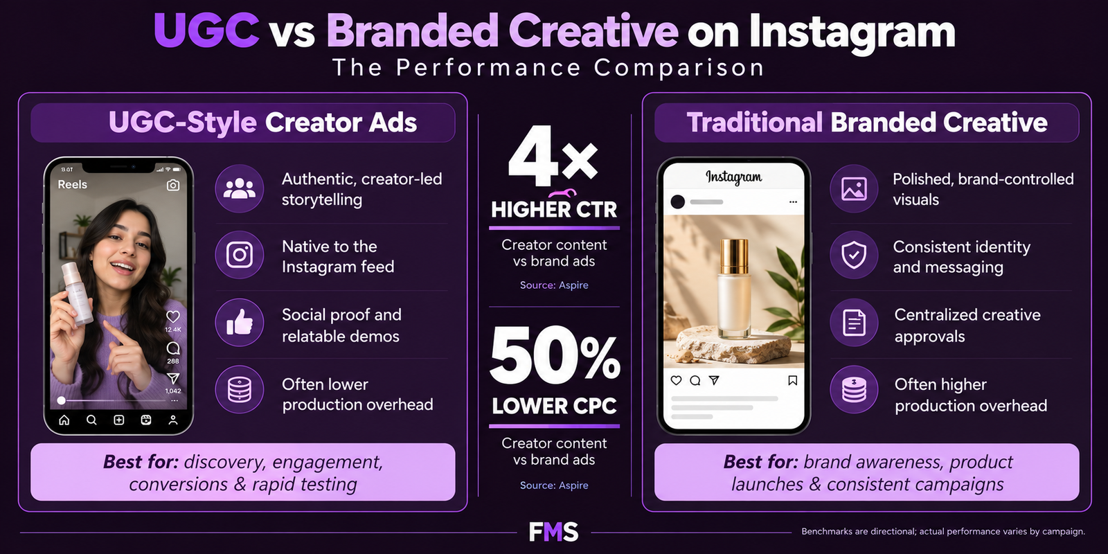
According to Aspire's creator vs brand ads performance data, UGC-style creator ads produce 4x higher CTR and 50% lower cost per click than traditionally produced brand creative on Instagram. On Instagram specifically (as opposed to other Meta placements), this performance differential is even more pronounced than the average because Instagram's content ecosystem is so dominated by creator-style content that brand-polished advertising is more visually jarring and more easily trigger the skip reflex.
This data is frequently misinterpreted as an instruction to produce all Instagram ads in a low-quality, undesigned format. The correct interpretation is that Instagram ads should feel native to the Instagram creator ecosystem, which is characterised by high photographic quality, strong aesthetic sense, authentic human presence, and a conversational, non-broadcast communication style. "Native" does not mean "undesigned"; it means "designed to feel like content, not advertising."
DimensionUGC-Style Creator AdTraditional Branded CreativeBest Use Case
CTR Performance4x higher than branded (Aspire)Baseline reference; lower CTR due to skip reflex triggerUGC for cold audience acquisition; branded for retargeting warm audiences who have already seen the brand
Cost Per Click50% lower (Aspire)Higher CPC due to lower CTR and potentially higher CPM from lower quality signalsFor budget-conscious Indian SME advertisers, UGC-style has the most favourable economics for cold traffic
Production CostLow to zero, founder-to-camera video requires only a smartphone and good lightingHigh for video; moderate for static; requires professional production resourcesUGC enables higher creative velocity (more variants per budget), which is more important than individual production quality
Brand RecognitionLower, requires a consistent brand element (logo, colour, watermark) to maintain brand attribution across multiple ad variantsHigher, consistent branded design system builds recognition with each impressionBranded creative for brand-building campaigns; UGC for conversion campaigns; combining both provides both recognition and CTR efficiency
Best PlacementsReels (most native-feeling context); Stories (authentic tone matches the personal context)Feed static (designed graphics work well in the Feed grid context); carousel (polished design benefits the multi-card format)Match the creative approach to the placement's native aesthetic

The 7 Instagram Ad Design Rules for 2026

Rule 1: Native vertical format only for Reels and Stories. Never adapt landscape or square content for Reels and Stories placements. 9:16 is the only format that fills the screen, and filling the screen is the only creative approach that uses the full-screen placement advantage. Letterboxed landscape content in a vertical placement is one of the most commercially costly technical errors in Instagram advertising.
Rule 2: Design for the safe zone, always. Every critical element of every Reels and Stories ad must be within the central 1080×1420px safe zone. Logo, CTA text, hook headline, face or key visual, all must be above the bottom 250px and below the top 250px. Any creative that was not designed with the safe zone marked is a creative that may have critical elements hidden by Instagram's UI overlays. Mark the safe zone in every design template before beginning any creative production.
Rule 3: Sound-off is the design standard, sound-on is the bonus. 85% of Instagram video ad viewing happens without sound. Design every video ad to communicate its complete message, hook, benefit, social proof, CTA, through visuals and on-screen text alone. Open captions in Bold font on a contrast-treated background are non-negotiable. Sound-on voiceover and music are an enhancement for the 15% who hear them.
Rule 4: The 4:5 portrait format is the default for Feed ads. Use 1080×1350px for all Instagram Feed ad creative unless there is a specific visual reason that requires a different aspect ratio. The 4:5 format occupies 33% more vertical screen real estate than 1:1 square, reducing the amount of competing content visible to the viewer simultaneously. This structural advantage is consistently measurable in engagement rate comparisons between the two formats.
Rule 5: First-line copy is the verbal hook, treat it accordingly. The first line of the caption field is the first text the viewer reads before the "More" truncation. This line must function as a standalone hook, identifying the audience by their situation or problem in 15 words or fewer, creating enough curiosity or relevance to earn the "More" tap. Most Instagram advertisers waste this line on a brand introduction or a generic product description. The first line is the most commercially valuable text real estate in the entire ad.
Rule 6: The CTA must match the funnel stage of the audience. Cold audiences (first-time brand exposure) respond to low-friction CTAs: "Get a Free Quote", "See Our Work", "Download the Free Guide". Warm audiences (have seen the brand before via retargeting) respond to higher-commitment CTAs: "Book Your Consultation", "Shop the Collection", "Start Your Project". Serving a purchase CTA to a cold audience who has never heard of the brand is the most common CTA-objective mismatch in Instagram advertising.
Rule 7: Brand consistency across every creative variant. According to Lucidpress's brand consistency research, consistent brand presentation increases revenue by 23%. Each Instagram ad impression is a brand impression, whether or not the viewer clicks. A brand whose ad creative looks different from its organic profile, its website, and its other marketing touchpoints misses the compounding recognition benefit of consistent cross-touchpoint visual identity. For the brand identity framework governing this consistency, see our brand identity design guide.

Typography and Colour for Instagram Ads

Instagram's visual aesthetic has specific typography and colour standards that differ from other platforms. Understanding these standards allows the ad creative to feel native to the platform's aesthetic context rather than imported from a less visually sophisticated environment.
Typography for Instagram ads follows the same mobile legibility requirements as all social media design: minimum 80px headline at 1080px canvas width, Bold or ExtraBold weight only for any text that appears on the image, and a contrast treatment (solid colour panel, text outline, or drop shadow) behind any text that appears on a photographic background. What is specific to Instagram: the typographic aesthetic leans toward clean, geometric sans-serif fonts (consistent with the platform's modern visual language) rather than the aggressive condensed fonts that dominate YouTube thumbnail design. Montserrat, Poppins, Inter, and DM Sans are consistently used in well-performing Instagram branded creative. For the complete typography framework, see our typography in design guide.
Colour for Instagram ads: the most effective colour strategy applies the brand's documented colour palette consistently (for brand building), while using the brand's highest-contrast accent colour as the primary tool for creating visual isolation against the niche's feed palette (for scroll-stopping). The one Instagram-specific consideration: Instagram's own interface is predominantly white and grey, ads with black or very dark backgrounds create strong contrast against the Instagram UI itself, which can improve visibility in the Feed context independent of the niche's competitive palette.

The Instagram Ad Creative Testing System

Testing Instagram ad creative follows the same fundamental methodology as all social media ad testing: one variable changed per test, equal budget per variant, minimum 7 days and 1,000 impressions per variant before drawing conclusions. The specific variables most worth testing for Instagram creative:
  • UGC-style vs branded creative: test founder-to-camera video against designed branded static; the performance gap is typically significant and informs where to concentrate production investment
  • Reels vs Feed placement: the same creative adapted for both Reels and Feed reveals which placement is more efficient for the specific offer and audience; Reels typically wins for cold traffic, Feed for retargeting
  • Face vs product-focused visual: for most service businesses and many product businesses, a genuine human face with a clear expression outperforms a product-only visual; test this assumption rather than assuming it
  • Hook approach: problem-aware hook vs aspiration hook vs social proof hook; Instagram's younger Indian demographic frequently responds differently to these three approaches than Facebook's older audience, test both platforms independently
  • Caption first line: the first line of the caption field has significant CTR impact; test two different hook sentences with identical image creative to isolate the caption's contribution to performance

Need Instagram Ad Creative That Meets the Platform's Visual Standard?

Futuristic Marketing Services designs Instagram ad creative for Indian businesses, native vertical format, platform-quality visuals, sound-off designed, brand-consistent, and built for the systematic testing that identifies what works for the specific audience and objective.

Start Your Instagram Ad Project

Frequently Asked Questions

Q. What size should Instagram ads be in 2026?

A. The three most important Instagram ad dimensions in 2026: (1) Feed ads, 1080×1350px (4:5 portrait) is the recommended format; it occupies 33% more screen space than square and is the highest-performing Feed format; (2) Reels and Stories ads, 1080×1920px (9:16 vertical), mandatory for these placements; adapting non-vertical content produces letterboxed output that wastes the full-screen advantage; (3) Carousel ad cards, 1080×1080px (1:1) per card; all cards in a carousel must be the same dimensions. For the complete Instagram and all-platform dimension guide, see our social media post sizes guide.

Q. What is the Instagram Stories ad safe zone?

A. The Instagram Stories (and Reels) safe zone is the central 1080×1420px area of the 1080×1920px frame. Avoid the top 250px, which is permanently covered by Instagram's profile UI (username, profile picture, follow button, Reels audio label) and avoid the bottom 250px, which is covered by engagement elements (like, comment, share, DM buttons, caption text). All critical content, faces, logo, headline text, CTA button, social proof, must be within the safe zone. Design all Stories and Reels templates with the safe zone marked as a boundary before adding any content.

Q. Do Instagram ads need captions?

A. Yes, all Instagram video ads (Reels, Stories, and Feed video) need captions. 85% of Instagram video content is consumed without sound on mobile devices. A video ad whose primary hook is delivered through a spoken voiceover without a corresponding caption delivers that hook to only 15% of its audience. Open captions (baked into the video file at the design stage, not relying on Instagram's auto-generated captions) are the most reliable approach: minimum 40pt Bold sans-serif font, on a solid or semi-transparent background panel, placed within the safe zone in the lower-middle area of the frame.

Q. Is UGC or branded creative better for Instagram ads?

A. According to Aspire's creator vs brand ads data, UGC-style creator ads produce 4x higher CTR and 50% lower cost per click than traditionally produced branded creative on Instagram. This is a significant performance differential, and for most Indian SME advertisers, UGC-style creative is the higher-ROI format for cold audience acquisition. However, branded creative remains important for retargeting warm audiences (who already know the brand and are evaluating rather than discovering), for brand-building campaigns where recognition accumulation is the objective, and in Feed placements where the curated aesthetic of well-designed branded creative can itself be a differentiator. Test both approaches with equal budget to identify the performance balance for the specific business, offer, and audience.

Q. How do I design Instagram Reels ads that get more views?

A. The five highest-impact design decisions for Instagram Reels ad views: (1) design the opening frame as a standalone stop-scroll image that hooks the viewer in 0.3–0.5 seconds before any audio is heard; (2) begin the Reel in the middle of action, mid-conversation, mid-demonstration, mid-transformation, rather than with a static opening; (3) add on-screen text in the first 2 seconds that identifies the audience or names the promise; (4) keep total length under 30 seconds to maximise completion rate; and (5) use native-looking, mobile-quality production rather than polished brand advertising aesthetic. The completion rate (percentage who watch to the end) is the primary algorithmic signal, every design decision should be evaluated by whether it improves completion rate for the specific audience. For the complete scroll-stopping framework, see our stop the scroll guide.

Q. What is the best Instagram ad format for lead generation?

A. Instagram Stories with a clear CTA and a Lead Form (Meta's native lead capture) consistently produces the lowest cost per lead for most Indian service business categories. The full-screen immersive format, the physical ease of swiping up or tapping the CTA, and the minimal friction of a pre-populated Meta lead form (which uses the user's existing Instagram profile data) together create the most efficient conversion pathway from impression to lead. For cold audiences, pair the Stories retargeting with Reels for discovery, Reels for reach, Stories for conversion, and design the creative continuity between the two placements deliberately: the Stories ad should feel like a natural continuation of the Reels hook rather than a completely separate creative.

Instagram Ad Creative Built to the 2026 Standard

Futuristic Marketing Services designs Instagram ad creative for Indian businesses that applies every 2026 best practice, native 9:16 vertical, platform-quality visuals, sound-off design, safe zone compliance, the correct CTA for each funnel stage, and systematic creative testing.

See Our Instagram Ad Services

Share this post :
Picture of Devyansh Tripathi
Devyansh Tripathi

Devyansh Tripathi is a digital marketing strategist with over 5 years of hands-on experience in helping brands achieve growth through tailored, data-driven marketing solutions. With a deep understanding of SEO, content strategy, and social media dynamics, Devyansh specializes in creating results-oriented campaigns that drive both brand awareness and conversion.

All Posts