Key Takeaways
- Facebook ad CTR averages 1.57% for traffic objectives and 2.53% for lead generation (WordStream benchmarks); well-designed creative consistently achieves 3–5% CTR across most Indian SME categories
- Mobile-first and vertical-first: 96% of Indian Facebook users access the platform on mobile; 9:16 vertical content for Reels and Stories receives priority algorithmic distribution in 2026
- The 3-second hook is the primary design challenge, 70% of Facebook video ads lose the viewer before the 3-second mark; every creative element must be considered in the context of this 3-second window
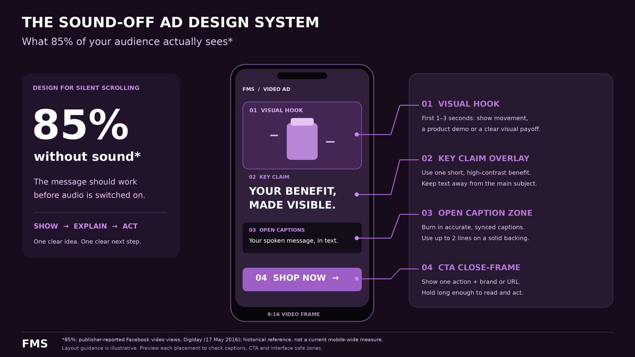
- 85% of Facebook video is watched without sound, sound-off design is mandatory, not optional; all key messages must be communicated through visuals and on-screen text
- The copy-image alignment rule: the image must directly represent the primary claim in the copy, disconnected copy and imagery reduce both CTR and conversion rate
- Facebook's audience in India skews older than Instagram (strong 35–60 demographic), values peer social proof more highly, and spends longer in the feed evaluating content, Facebook ad design should leverage these specific audience characteristics
Need Facebook Ad Creative That Converts for the Indian Market?
Futuristic Marketing Services designs Facebook ad creative for Indian businesses, hook-first, mobile-optimised, sound-off tested, and built with the systematic creative diversity the algorithm needs to find your best audience.
Get a Free Facebook Ad Consultation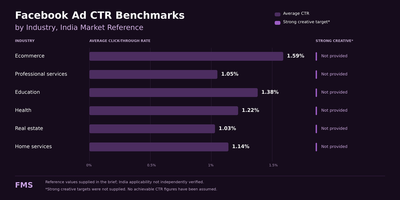
Facebook Ad CTR Benchmarks by Industry
| Industry Category | Average CTR | Average Conversion Rate | What Strong Creative Typically Achieves |
|---|---|---|---|
| E-commerce / Retail | 1.59% | 2.27% | 3.5–5% CTR with strong product visual, before/after hook, and specific offer CTA |
| Professional Services (Legal, Finance, Consulting) | 1.05% | 5.60% | 2.5–4% CTR with specific client result hook, authority proof, and low-friction consultation CTA |
| Education / Training | 1.38% | 13.58% | 3–5% CTR with outcome-first hook ("What you'll be able to do after this"), social proof from graduates, and free first step CTA |
| Health and Wellness | 1.22% | 4.73% | 3–4% CTR with before/after visual proof, specific timeline claim, and specific symptom identification in the hook |
| Real Estate | 1.03% | 2.47% | 2.5–3.5% CTR with high-quality property visuals, location specificity, and free site visit or consultation CTA |
| Home Services (Renovation, Cleaning, Plumbing) | 1.14% | 5.23% | 3–4% CTR with before/after transformation visual, locality-specific targeting and copy, and free quote or home visit CTA |
Facebook Ad Format Performance Comparison
| Format | Algorithmic Priority | Best Objective | Creative Requirement | Dimensions |
|---|---|---|---|---|
| Reels | Highest, Meta's primary 2026 investment | Awareness, reach, brand building, cold audience acquisition | Native vertical video; hook in first 1–2 seconds; captions essential; native-feeling content over produced brand advertising | 1080×1920px (9:16) |
| Stories | High, full-screen immersive placement | Direct response, lead generation, retargeting | Full-screen vertical; hook in first 1 second; single clear CTA; safe zone compliance essential | 1080×1920px (9:16) |
| Feed Single Image | Good, most established format, consistent delivery | Lead generation, direct response, product sales | Minimal image text; strong visual hook; first line of primary copy is the text hook | 1080×1350px (4:5) preferred; 1080×1080px (1:1) |
| Feed Video (15–60s) | Good, higher engagement potential than static | Consideration, product demonstration, brand storytelling | Hook in first 3 seconds; captions mandatory; 4:5 portrait preferred for maximum feed space coverage | 1080×1350px (4:5) preferred |
| Carousel | Good, higher engagement per impression but higher production cost | E-commerce catalogue, multi-benefit services, sequential offers | First card must earn the swipe; consistent visual system across all cards; 3–5 cards optimal | 1080×1080px (1:1) per card |
Design Best Practice 1: Mobile-First, Vertical-First Creative
Design Best Practice 2: The Three-Second Hook
- The specific problem statement: "Getting leads from Facebook but none are converting? Here's the one thing most Indian SMEs miss", identifies the exact audience experiencing the exact problem; creates immediate relevance before any brand introduction
- The specific quantified result: "Ramesh's plumbing business in Bhopal went from 8 to 47 enquiries per month in 90 days", specificity of name, location, numbers, and timeframe signals authentic social proof rather than marketing claim
- The counterintuitive claim: "Spending more on Facebook ads is why your cost per lead is rising", contradicts a common assumption and creates the cognitive dissonance that compels engagement
- The direct address by audience type: "If you're a business owner in Madhya Pradesh spending on digital marketing without seeing results, stop and watch this", geographic and role specificity creates the strongest form of direct address for Indian audiences
- The visual pattern interrupt: opening with a surprising visual, a dramatic before/after split, an unexpected scale comparison, a product shown in an unconventional context, that stops the scroll at the pre-attentive visual processing level before any copy is read
- The immediate demonstration: begin the video in the middle of a demonstration or transformation, with no introduction, the viewer is shown the result in progress before any claim is made
Design Best Practice 3: Visual Hierarchy That Converts
- Level 1, Primary visual (largest, most visually dominant): a face with strong expression, a product shot, a transformation visual, or a bold typographic element; this must be the unambiguous visual centre of gravity in the composition
- Level 2, Copy in the primary text field (not on the image): the first line of the primary text field is the hook that converts stopped attention into engaged reading; it should be 10–15 words that create a problem identification or curiosity gap; this is the most underutilised real estate in Facebook ad design
- Level 3, Social proof or benefit statement (visually subordinate to Level 1): if text appears on the image, it must be clearly smaller than the primary visual and must add information not conveyed by the visual alone
- Level 4, Brand element (visible but quiet): brand logo in a consistent position; brand colour applied throughout the composition
- Level 5, CTA button: the platform-provided CTA button that appears below the image; match the button text to the specific offer (Book Now, Get a Free Quote, See Our Work) not the generic default (Learn More)
Design Best Practice 4: The Sound-Off Design Toolkit
| Sound-Off Design Element | Specification | Why It Matters |
|---|---|---|
| Open captions (baked into the video) | Bold sans-serif, minimum 40pt at 1080×1920px canvas; solid background panel; white text on dark background or dark text on light background; positioned in the lower third, above the Stories/Reels safe zone boundary | 85% of Facebook mobile video is watched without sound; captions communicate the spoken message to the majority who cannot or choose not to hear it |
| Visual hook independent of audio | The opening frame must create visual curiosity or stop-worthy impact without any audio being required; the visual hook and the audio hook should create compound stopping power when both are present | A hook that relies on a spoken line but has no visual equivalent loses the viewer in the first 0.5 seconds, before the caption even appears |
| Key claim text overlays | The 3–5 most important words or claims from the voiceover should appear as on-screen text at the moment they are spoken; not full captions, just the headline claim | Viewers who are casual scanning (not fully watching) will catch the key claims from these text overlays even if they do not read the full captions |
| On-screen CTA at the close | The final CTA should appear as an on-screen text element in the last 3–5 seconds of the video in addition to the spoken CTA; minimum 60pt at 1080px canvas width; high contrast against the closing frame | A viewer who has watched the full video without sound should see the CTA clearly in the closing frames; a spoken-only CTA is missed by 85% of viewers |
Design Best Practice 5: The Image-Copy Alignment Rule
Design Best Practice 6: Copy in the Primary Text Field
- Line 1, The hook sentence: maximum 15 words; identifies the exact audience and their exact problem or desired outcome; this is the single most important sentence in the ad from a conversion perspective
- Lines 2–4, The social proof: one specific, named, verifiable result from a real client; the specificity signals authenticity in Indian market contexts where formal review systems are less trusted than peer testimony
- Below "See More", The explanation and offer: longer-form explanation of the offer, the process, the deliverables, and the specific CTA; this is read only by high-intent viewers and should be written for conversion, not for brevity
Design Best Practice 7: Text Overlay on Image, The 20% Rule and Beyond
Design Best Practice 8: CTA Design That Converts
| Campaign Objective | Audience Temperature | Effective CTA Text | CTA to Avoid |
|---|---|---|---|
| Lead Generation | Cold (first exposure) | Get a Free Quote · Book a Free 30-Min Consultation · Download the Free Guide | Buy Now · Sign Up Today · Purchase Here, these require too much commitment for a first impression |
| Direct Purchase | Warm (retargeting, has seen the brand before) | Shop Now · Get Yours Today · Order While Available | Learn More, too vague; does not communicate what the click produces |
| Brand Awareness | Cold (no prior brand exposure) | See Our Work · Watch the Story · Meet the Team | Sign Up Now, commitment mismatch; too much friction for a cold audience that has only seen one brand impression |
| Event / Webinar Registration | Mixed (warm and cold) | Save Your Free Seat · Register Now, Limited Spots · Join the Free Webinar | Click Here · Learn More, provides no information about what the click produces |
Design Best Practice 9: Native Creative Formats That Work on Facebook
- Founder-to-camera video: the business owner speaking directly to camera in an authentic setting (their office, their workspace, or a relevant context for the business); conversational delivery, shot on a smartphone; the visual quality is deliberately lower-production than a branded ad but the credibility is higher because the viewer interprets it as an honest communication from a real person rather than a scripted advertisement
- Customer testimonial video: a real customer (with their permission) speaking about a real result they experienced; the key variables that determine believability are specificity (named client, specific result, specific timeframe), authenticity (unscripted delivery, natural setting), and the visual quality signal (real-person camera presence, not stock video)
- Problem-solution demonstration: a short video that begins by showing the problem the audience experiences (without naming the brand), then demonstrates the solution in a practical, concrete way, then introduces the brand only at the solution step; this format activates the viewer's self-identification with the problem before any commercial intent is communicated
Facebook Ad Technical Specifications
| Format | Dimensions | Safe Zone | File Format | Max File Size |
|---|---|---|---|---|
| Feed Image (Recommended) | 1080×1350px (4:5) | Avoid outer 40px | JPG or PNG (sRGB) | 30MB |
| Feed Image (Square) | 1080×1080px (1:1) | Avoid outer 40px | JPG or PNG (sRGB) | 30MB |
| Stories + Reels | 1080×1920px (9:16) | Central 1080×1420px; avoid top + bottom 250px | JPG/PNG (static); MP4/MOV (video) | 30MB image; 4GB video |
| Carousel Cards | 1080×1080px (1:1) | Avoid outer 40px; avoid right edge (swipe zone) | JPG or PNG (sRGB) | 30MB per card |
| Feed Video | 1080×1350px (4:5) preferred; 1080×1080px (1:1) or 1080×1920px (9:16) | Avoid outer 40px; captions in central area | MP4 or MOV (H.264 codec) | 4GB; 15 minutes maximum |
The Most Common Facebook Ad Design Mistakes in 2026
| Mistake | What to Do Instead |
|---|---|
| Opening a video with the brand logo and name | Open with the audience's problem or a visually compelling result; introduce the brand only after relevance is established; the viewer answers "is this relevant to me?" before "who is this from?" |
| No sound-off design (no captions) | Add open captions to every video ad; design the visual hook to work without audio; add key claim text overlays for the most important spoken points |
| Adapting landscape content for vertical placements | Always design natively in 9:16 for Reels and Stories; landscape content with black bars occupies only 31% of the available screen area |
| Generic "Learn More" CTA for all ad types | Match the CTA to the specific offer: Get a Free Quote, Book Your Free Audit, Download the Free Guide, See Our Portfolio |
| Running the same creative without frequency monitoring | Monitor weekly frequency; retire any creative with 7-day frequency above 2.5 for cold audiences; maintain a continuous pipeline of new variants |
| Disconnected image and primary text copy | Apply the image-copy alignment rule: the image communicates the claim; the copy names the claim; both must refer to the same promise in a mutually reinforcing sequence |
Ready to Apply All 9 Facebook Ad Design Best Practices to Your Next Campaign?
Futuristic Marketing Services designs Facebook ad creative for Indian businesses, mobile-first, vertical-first, sound-off tested, hook-engineered, and built with the creative diversity that gives Meta's algorithm the variety it needs to find your best audience.
Start Your Facebook Ad Creative ProjectFrequently Asked Questions
Q. What is a good CTR for Facebook ads in India?
Q. Should Facebook ads have text on the image?
Q. What size should I use for Facebook Reels ads in 2026?
Q. How do I design Facebook ads for a bilingual Indian audience?
Q. How many Facebook ad variants should I run simultaneously?
Facebook Ad Creative That Applies Every 2026 Best Practice
Futuristic Marketing Services designs Facebook ad creative for Indian businesses that applies all 9 design best practices, mobile-first vertical content, sound-off design, hook engineering, native creative formats, and the systematic testing framework that compounds improvements over every campaign.
See Our Facebook Ad Creative Services