1. Why Your Reel Cover Is More Important Than You Think
Picture this: a potential client lands on your Instagram profile for the first time. Before they read your bio, before they watch a single video, they see your grid a mosaic of cover images representing weeks or months of content. In three seconds they make a judgment: does this brand look professional? Is this content worth my time? The cover of every Reel they see is the first visual impression your business makes on a stranger.
Most brands treat Reel covers as an afterthought they either let Instagram auto-select a blurry frame from the first second of footage, or they upload a hastily cropped screenshot. The result is a chaotic, inconsistent grid that undermines the quality of the content itself. By contrast, brands that invest in professionally designed Reel covers build a profile grid that functions as a curated content portfolio one that communicates authority, consistency, and brand identity before a single video plays.
Your Reel cover serves three strategic functions simultaneously: it is a visual hook that competes for attention in the Reels tab, a grid element that contributes to your profile’s overall aesthetic, and a navigational aid that helps returning visitors quickly find the content they want. Get it right, and your cover design can meaningfully increase both first-time and repeat views.
INSIGHT | The cover is the gatekeeper of engagement.According to a design strategy analysis from ReelMind, a well-framed cover acts as a high-fidelity signal of quality and relevance to Instagram’s algorithm not just to human viewers. Covers that clearly communicate content value drive higher click-through rates, which in turn signals to the algorithm that the Reel deserves broader distribution. |
2. Instagram Reels: The Dominant Content Format
To understand why Reel cover design matters, you first need to understand just how dominant Reels have become on Instagram. The numbers are striking.
200B+ Daily Reel Views Meta / Teleprompter, 2026 | 35% of Instagram Time on Reels Teleprompter.com, 2026 | 125% More Reach vs. Photos Vidico / Teleprompter, 2026 | 82% of Brands Use Reels Zebracat, 2026 |
Reels are played over 200 billion times daily across Instagram and Facebook, according to Meta’s published data. Currently, roughly 35% of all Instagram usage time is spent watching Reels – more than a third of the app’s entire attention economy, based on Teleprompter.com’s 2025 Instagram Reels statistics research.
For reach, Reels outperform every other content format. According to Vidico’s Instagram Reels statistics research, Reels generate 36% more reach than carousels and 125% more reach than single-image posts. With only 20.7% of Instagram creators posting Reels regularly each month, the opportunity remains significant the majority of the field is not competing for this reach.
For businesses specifically, the case is compelling. According to Zebracat’s analysis of 100+ Instagram Reels statistics, approximately 82% of brands on Instagram actively incorporate Reels into their content strategy, and around 61% of consumers report being more likely to purchase after watching a product demonstration Reel. The format has moved from a growth experiment to a commercial essential.
DATA | Reels are the primary discovery engine on Instagram.Instagram’s algorithm actively pushes Reels to non-followers via the Explore page and the dedicated Reels feed something it does not do for static images. Around 50% of users discover brands and products they did not previously know via Reels, according to Instagram’s own published data, corroborated by Socialinsider’s benchmarks study based on 35 million posts. This makes the Reels format uniquely powerful for customer acquisition, not just engagement with existing followers. |
For context on how these numbers translate into brand performance, Socialinsider’s 2026 Instagram engagement benchmarks study – based on analysis of 35 million posts – tracks Reel engagement rates, format performance trends, and how often leading brands post Reels each month. It is one of the most cited organic benchmark datasets currently available for Instagram content strategy.
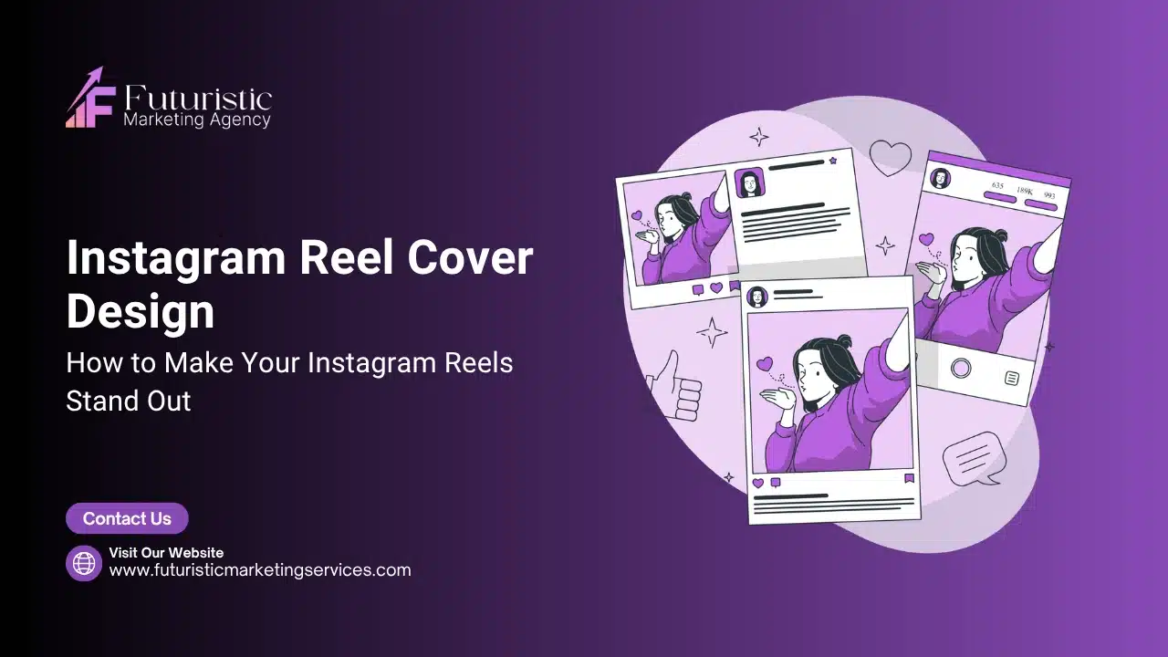
3. What Exactly Is an Instagram Reel Cover?
An Instagram Reel cover (also called a Reel thumbnail) is the static image that represents your Reel before a viewer taps to play it. It is what appears in your profile grid, in the dedicated Reels tab on your profile, and sometimes as a preview in the main feed as viewers scroll past your content.
Think of it as the book cover for your video. Just as a compelling book cover communicates the genre, tone, and promise of the content inside, your Reel cover communicates the topic, value, and brand personality of your video in a single image. The cover is what earns the tap.
Two Types of Reel Cover
The choice between these two types is not merely a production decision – it is a strategic one with measurable consequences for brand perception and click-through performance. For most business accounts, the custom-designed cover is the professional standard precisely because it gives the designer complete control over the message, the visual hierarchy, and the brand consistency that a randomly selected video frame can never reliably deliver.
- Video still: A single frame extracted directly from your Reel footage. Instagram lets you drag a slider to select any frame from the video timeline. This is the quickest option, but the quality depends entirely on how well-lit and composed your footage is. A randomly selected or blurry still is worse than no cover at all.
- Custom designed cover: A graphic created specifically as a cover image designed in Canva, Adobe Photoshop, Figma, or any similar tool and uploaded from your camera roll when posting. This is the professional standard for business accounts, and the approach this guide focuses on.
According to design expert Mimi Nguyen, founder of Cafely, using custom covers over random video frames had a transformative effect on her brand’s performance. As documented in Hootsuite’s ultimate Instagram Reels cover guide, auto-selected frames performed poorly earlier in her career – but after switching to custom-designed covers, engagement improved significantly. The extra design effort delivered measurable returns in click-through.
TIP | You can add or change a Reel cover at any time.You are not locked into the cover you choose at upload. You can edit the cover of any existing Reel by tapping the three-dot menu on the Reel, selecting Edit, and then updating the cover image. This means you can go back and apply branded covers to older Reels when refreshing your profile aesthetic. |
4. Technical Specifications: Dimensions, Formats and Safe Zones
Before you open your design tool, you need to understand the exact technical requirements for Instagram Reel covers. Getting these wrong is the most common cause of cropped text, blurry images, and broken grid aesthetics.
▸ Core Dimensions
Every specification in this table exists for a functional reason – not as an arbitrary platform rule. The 1080 × 1920 canvas matches the full-screen display of the Reels tab; the safe zone dimensions protect critical content from the grid crop; the PNG recommendation prevents Instagram’s compression algorithm from degrading text sharpness. Understanding why each specification exists makes it easier to apply them accurately and to adapt when platform requirements change.
Specification | Value | Notes |
|---|---|---|
Canvas size | 1080 × 1920 pixels | 9:16 aspect ratio same as the video itself |
Aspect ratio | 9:16 (vertical) | Full-screen portrait format for mobile |
Resolution / DPI | 72 DPI minimum, 150 DPI recommended | Higher resolution resists Instagram compression |
File format | JPG or PNG | PNG recommended for text-heavy designs |
Maximum file size | Under 8 MB | Compress without visible quality loss |
Colour mode | RGB | Never CMYK screens display RGB |
Grid safe zone (1:1) | Central 1080 × 1080 pixels | The area shown on the profile grid square |
Feed safe zone (4:5) | Central 1080 × 1350 pixels | The area shown as a feed post preview |
Top buffer | 250 pixels from top edge | Clear of Instagram header UI elements |
Bottom buffer | 420 pixels from bottom edge | Clear of captions, buttons, progress bar |
Side buffer | 35–60 pixels from each side | Clear of engagement icon overlay |
▸ The Safe Zone Explained
The most critical technical concept in Reel cover design is the safe zone the area of your 1080 x 1920 canvas that will be visible regardless of where the cover is displayed. Because Instagram shows your cover in multiple contexts at different crop ratios, anything outside the safe zone risks being cut off.
The rule is straightforward: design your full 9:16 canvas, but place all essential elements your headline, logo, key visual within the central 1080 x 1080 square. This central square is always visible, whether the cover appears in the full-height Reels tab, in the 3:4 profile grid, or in the 4:5 feed preview. The outer areas of the canvas can contain background elements, colour gradients, or decorative visuals that look great in full view but are not critical if cropped.
NOTE | The safe zone is not optional for business accounts.If your headline or brand name sits outside the central safe zone, it will be cut off on the profile grid the very place where new visitors form their first impression of your brand. Many businesses discover this error only after publishing, when they check their grid and see cropped text or missing logos. Build your safe zone into your design template from the start. |
5. The Three Viewing Contexts You Must Design For
Your Reel cover appears in three distinct locations on Instagram, each with different dimensions. Understanding how each context crops your image is essential for designing covers that work everywhere simultaneously.
Context | Crop Ratio | Where It Appears | Design Priority |
|---|---|---|---|
Reels Tab (Profile) | 9:16 (full height) | The Reels tab on your profile page | Full image visible background and visual depth matter here |
Profile Grid | 3:4 or 1:1 (square) | The main grid on your profile | CRITICAL this is where most new visitors form their impression |
Home Feed Preview | 4:5 (portrait) | Shown in followers’ main feed | Headline and primary visual must be in the upper-centre zone |
Designing for All Three at Once
The dual-purpose design approach is the professional standard: design one 1080 x 1920 image that communicates effectively at all three crop ratios. Place your most important elements the Reel title, key visual, and brand identifier within the central 1080 x 1080 area. Use the upper and lower thirds of the canvas for atmospheric background elements, brand colour gradients, or decorative graphics that enhance the full-view presentation in the Reels tab without being essential to comprehension.
As documented by PostFast’s Reel cover safe zone specifications guide and Orichi’s Instagram Reel size and dual safe zone guide, this approach means your cover delivers one compelling vertical narrative at full height and one immediate, punchy summary on the profile grid.
STRATEGY | Always preview before you publish.After designing your cover, check it in three views before uploading: crop the image to 1:1 to simulate the profile grid, to 4:5 to simulate the feed, and view the full 9:16 to see the Reels tab appearance. Canva’s preview tools or Instagram’s built-in crop adjuster make this easy. A cover that looks polished in all three views is ready to publish. |
6. Custom Cover vs. Video Still: Which Performs Better?
This is one of the most practical questions brands ask when building their Reels strategy. The data and expert consensus point in one direction: custom-designed covers consistently outperform auto-selected video stills for business accounts.
Why Video Stills Fall Short
The limitations below are not occasional edge cases – they occur predictably whenever an auto-selected or casually chosen video frame is used as a cover without intentional editing. On a grid where every other post is a thoughtfully designed static cover, a blurry or contextually ambiguous video still creates an immediate quality signal mismatch that no amount of well-edited video content can fully compensate for at the grid impression stage.
- Random frames look unprofessional: Instagram's auto-selected thumbnail is the first frame of your video often a transition, a blurry motion frame, or an unflattering moment of someone mid-sentence.
- Inconsistency damages your grid: Without a consistent design approach, your grid becomes a random collage of unrelated screenshots with no visual coherence.
- No text means lost context: A video still rarely communicates the topic or value of the Reel as clearly as a designed cover with a concise headline.
- Compression degrades quality: Instagram compresses video thumbnails during processing, often resulting in softer, lower-quality grid images compared to a properly exported PNG.
When a Video Still Works
There are situations where a high-quality video still can be effective: beauty brands that regularly capture polished, well-lit photography-style footage; food creators whose dishes photograph beautifully in every frame; or lifestyle brands whose video aesthetic is inherently consistent and cinematic. Even in these cases, professionals apply colour grading or light editing to the still before using it as a cover.
The Hybrid Approach
For a deeper look at content scheduling and Reel strategy workflows, Later’s Instagram Reels guide is a comprehensive starting point. The most scalable strategy for businesses is a templated hybrid: create a branded cover template in Canva with a fixed layout, background colour, and typography. For each new Reel, simply update the headline text and swap the featured image with either a custom graphic or a selected, edited still from the relevant video. This gives you brand consistency at the template level and content-specific visuals at the individual level without designing from scratch each time.
DATA | According to Fluidbuzz and data from Meta, supported further by HubSpot’s Instagram engagement research. Users are more likely to tap into a Reel if the cover is customized with strong visual cues, emotional hooks, or prompts that suggest value. The cover is no longer just a static image it is a strategic conversion asset for click-through rate optimisation. |
7. The 6 Design Principles of a High-Performing Reel Cover
Designing an effective Reel cover is not about making something that looks impressive on a large screen. It is about creating a thumbnail that earns a tap on a 6-inch mobile screen, often competing alongside dozens of other covers in a viewer’s grid or Reels feed. These six principles govern every high-performing Reel cover.
▸ Principle 1: Visual Clarity Above All
The single most important quality of a Reel cover is immediate legibility at small sizes. When viewed in a grid, each cover is roughly 130 pixels wide on a standard mobile screen. Every design decision font size, contrast, number of elements must be evaluated at this scale. A cover that looks detailed and sophisticated at full size but becomes illegible at thumbnail size fails at its primary purpose.
Stick to one focal point per cover: one key image, one headline, one brand element. Every additional element competes for the viewer’s attention and reduces the speed at which they understand the cover’s message.
▸ Principle 2: Headline-First Hierarchy
According to the Your Social Team’s Reel cover design principles and Vista Social design frameworks, the most effective Reel covers lead with a bold, concise headline of three to five words that communicates the specific value of the Reel. Not vague or clever specific and clear. Compare: ‘Let’s Talk Strategy’ (vague) versus ‘5 Canva Tips That Save Hours’ (specific). The second headline tells the viewer exactly what they will get, which dramatically increases click-through intent.
Text should occupy no more than 30% of the cover’s visual area to maintain readability and allow the imagery to create emotional impact alongside the words.
▸ Principle 3: Brand Consistency
Every Reel cover should be instantly recognisable as yours. This means applying the same colour palette, typography pairing, logo placement, and layout structure across all covers. When a viewer sees your grid, the cumulative visual consistency signals professionalism and intentionality. Brand recognition, as noted by Your Social Team, is built through consistent visual treatment not through the logo alone.
Build your brand kit in Canva with your exact brand hex codes, approved font pairings, and your logo. Apply this kit to every cover template. Resist the temptation to introduce new colours, experimental fonts, or off-brand layouts that ‘match the mood’ of a particular Reel consistency is more valuable than novelty.
▸ Principle 4: High Contrast
Reel covers must be visible in both light mode and dark mode, and across the full range of screen brightness levels that different users set on their devices. High contrast between the text and the background is non-negotiable. According to Vista Social’s Instagram Reels cover best practices guide, this means selecting colours that are visible in both interface modes, using solid or semi-transparent backgrounds behind text rather than placing text directly over complex imagery, and sticking to bold fonts rather than thin or delicate typefaces.
▸ Principle 5: Safe Zone Discipline
As established in Section 4, keeping all critical design elements within the central 1080 x 1080 safe zone is a technical requirement, not a stylistic choice. Place your headline, your logo or brand identifier, and your key visual within this zone. Use the areas above and below for decorative elements only.
▸ Principle 6: Emotional Trigger
The most effective Reel covers communicate an emotion or a promise, not just a topic. A cover that says ‘5 Logo Design Mistakes’ triggers curiosity and mild anxiety in a viewer who has recently had a logo designed. A cover showing a dramatic before-and-after transformation triggers aspiration. A cover featuring a confident, direct-to-camera face triggers connection and trust. Identify the emotional response you want your Reel to produce, and engineer your cover to prime that response before the video even begins.
8. Typography on Reel Covers: Rules That Drive Clicks
Typography is the most powerful design element on a Reel cover, because it communicates both the content of the Reel and the personality of the brand. Getting it wrong is the fastest way to make a professional brand look amateur. Getting it right is one of the highest-impact improvements you can make to your Instagram presence.
▸ Font Selection Principles
These principles exist because the thumbnail scale at which Reel covers are displayed on the profile grid – approximately 130 pixels wide on most mobile screens – is fundamentally different from the scale at which most designers evaluate their work. A font choice that looks sophisticated at full canvas size must also remain legible, distinct, and brand-consistent at a fraction of that size. Every principle below is grounded in that thumbnail-scale constraint, not in general typographic aesthetics.
- Use bold, legible fonts: Thin or decorative script fonts that look elegant at large sizes become unreadable at thumbnail scale. Sans-serif or bold serif fonts are the most reliable choices. Examples: Inter Bold, Montserrat ExtraBold, Playfair Display Bold, Poppins Bold.
- Limit to two font styles: One for the headline (bold, prominent) and one for supporting text such as a subtitle, category label, or call-to-action prompt. More than two fonts creates visual noise.
- Be consistent across all covers: Typography is a subtle but powerful branding element. When every cover uses the same two fonts in the same roles, your grid develops a visual identity even without the viewer consciously noticing the consistency.
- Text length: Headlines of three to five words perform best. Longer headlines require smaller text, which reduces legibility at thumbnail size. If you need more than five words, consider whether the excess words are earning their space.
▸ Text Placement Rules
The placement rules below are derived directly from the three viewing contexts in which your Reel cover appears – the full 9:16 Reels tab, the cropped profile grid, and the 4:5 feed preview. A text element placed correctly for the full-height Reels tab may be entirely invisible in the grid crop. These rules are the practical synthesis of all three crop contexts into a single placement system that survives every display environment your cover will encounter.
Placement Rule | Specification | Reason |
|---|---|---|
Vertical position | Keep headline in upper-centre 60% of canvas | Survives both the 3:4 grid crop and the 4:5 feed crop |
Horizontal position | Centre-aligned or left-aligned with 60px+ margin from edges | Avoids the right-side engagement icon overlay |
Bottom exclusion zone | No critical text below 75% of canvas height | Bottom 25% is covered by captions and UI buttons |
Top exclusion zone | No critical text above 15% of canvas height | Top 15% is covered by the Instagram header bar |
Background behind text | Use a solid fill, gradient, or semi-transparent overlay | Ensures text remains legible over any background image |
Font size minimum | Headline: 80pt+ at 1080px canvas width | Legible at thumbnail size on mobile devices |
▸ Adding Text Contrast
When placing text over a photographic background, always add a contrast mechanism between the image and the text. Options include: a solid colour block behind the text (most reliable), a semi-transparent dark or light overlay across the full image, a coloured gradient that deepens behind the text area, or a subtle drop shadow and outline stroke on the text characters themselves. Placing text directly over a complex, detailed background image with no contrast treatment will always result in reduced legibility.
9. Colour Strategy for Reel Covers
Colour is the fastest visual signal the human brain processes. Before a viewer reads your headline or recognises your logo, they have already made an unconscious assessment of your brand based on the colours they see. A strategic, consistent colour approach to Reel covers can make your profile grid recognisable from across a room and make every new Reel feel like it belongs to a coherent brand.
▸ Palette Principles for Reel Covers
Colour on a Reel cover operates on two timescales simultaneously: it creates an immediate visual response in the viewer encountering a single cover, and it builds a cumulative brand signal across the grid as all covers are viewed together. The principles below address both timescales – ensuring that each individual cover is visually compelling while each successive cover contributes to the coherent colour identity that makes the grid as a whole recognisable as distinctly yours.
- Use two to three core colours: A primary brand colour (used for backgrounds or dominant areas), a secondary colour (for accents, headlines, or graphic elements), and optionally a neutral (white, off-white, or dark) for text or breathing space.
- Maintain consistent ratios: The same proportional use of each colour across covers creates visual rhythm. If your primary colour occupies 60% of each cover, your audience's brain learns this pattern and begins associating that ratio with your brand.
- Consider seasonal variations: Brands that run seasonal campaigns can shift their secondary colour across seasons (a warm amber for autumn, a deep green for festival season, a vibrant coral for summer) while keeping the primary brand colour fixed. This keeps the grid feeling fresh while preserving brand recognition.
- Document your hex codes: Save your exact brand hex values in your Canva Brand Kit. Never approximate colours by eye even a small shift in hue makes covers look inconsistent when viewed side by side on the grid.
▸ Colour Psychology Reference
The associations in this table are not universal absolutes – they represent the dominant psychological response that each colour family produces in the Indian and global digital visual context, based on documented research and cross-cultural design practice. The most important application of this reference is not choosing a single ‘correct’ colour but ensuring that the emotional associations your palette triggers are genuinely aligned with the content category and the response you want your Reel to generate before it is tapped.
Colour Family | Psychological Association | Best For |
|---|---|---|
Deep violet / purple | Creativity, luxury, expertise, transformation | Design agencies, coaching, premium services, wellness |
Bright orange | Energy, enthusiasm, urgency, action | Sales content, CTAs, promotions, startup brands |
Navy / dark blue | Trust, professionalism, stability, depth | Finance, B2B services, legal, technology |
Emerald / forest green | Growth, health, calm, prosperity | Sustainability brands, finance, health, organic products |
Warm red | Passion, urgency, boldness, excitement | Food brands, entertainment, urgent offers |
Neutral white / off-white | Cleanliness, simplicity, openness, space | Minimalist brands, luxury, editorial aesthetics |
Black / near-black | Premium, authority, sophistication, drama | Luxury brands, fashion, high-end services |
Warm yellow / gold | Optimism, energy, warmth, success | Lifestyle brands, food, hospitality, youth-oriented |
TIP | Test your colour palette in Instagram’s dark mode as well as light mode. A background that looks clean and high-contrast on a white screen may lose legibility in dark mode if it is a mid-tone. Ensure sufficient contrast in both interface modes before publishing. |
10. Grid Aesthetics: Making Your Entire Profile Work as a System
Individual Reel covers matter, but the real competitive advantage comes from designing your covers as a system where each individual cover contributes to a cohesive overall grid aesthetic. Your Instagram profile grid is not just a collection of posts; it is a brand portfolio, and every element on it either builds or erodes the impression of professionalism and intentionality.
▸ Grid Aesthetic Strategies
Each strategy below operates at the grid level rather than the individual cover level – meaning its commercial value compounds over time as more covers are published and the pattern becomes visible to returning profile visitors. A single cover applying these strategies looks polished in isolation; twenty covers applying them consistently creates a profile that communicates professional intentionality at first glance, before a single video is watched.
- Consistent template system: The most scalable approach is to create one to three branded Canva templates that are used across all Reel covers. Each template has a fixed layout, background treatment, and typography. Only the headline text and featured image change per Reel. Viewed together on the grid, the covers create a visually unified brand presence.
- Consistent frame or border treatment: Apply a consistent frame, border, or corner element to all covers. This could be a coloured border in your brand colour, a consistent graphic element in one corner, or a subtle geometric shape. Even minor repeating elements create strong visual cohesion when seen across a grid.
- Colour-coded categories: Assign different background colours to different content categories. For example, a service business might use violet covers for educational content, orange for behind-the-scenes, and navy for case studies and testimonials. Each colour signals a content type to the viewer at a glance.
- Consistent logo placement: Place your logo or wordmark in the same position on every cover typically the bottom-right corner, above the bottom exclusion zone. This builds subconscious brand recognition. Viewers begin to identify your content by the corner element before they even read the headline.
- Uniform filter or colour grade: If you use photographic stills as background images, apply the same colour grading preset to all of them. This creates visual harmony even when the underlying photos are different subjects and environments.
▸ How Many Templates Do You Need?
For most business accounts, three to five cover template variations provide an optimal balance between visual variety and brand consistency. With fewer than three, the grid can start to feel repetitive. With more than five, the grid loses cohesion. Each template variation should share the same core brand elements (colours, fonts, logo placement) but differ in layout structure or background treatment.
GUIDE | The grid test.Before publishing any new Reel cover, use Planoly’s grid and cover design guide, Buffer’s Grid Preview, or Instagram’s own draft preview to see how the new cover will look alongside your existing covers. A cover that looks great in isolation can create a jarring visual disruption on the grid. Checking first prevents this and ensures every new post contributes positively to your overall profile aesthetic. |
11. Step-by-Step: How to Design a Reel Cover in Canva
Canva is the most widely used and recommended tool for designing Instagram Reel covers. Its template library, Brand Kit feature, and built-in safe zone guides make it the most practical choice for businesses without a dedicated in-house design team. Here is a complete workflow for creating your first branded Reel cover template from scratch.
▸ Phase 1: Set Up Your Canvas
The setup phase creates the structural foundation that every subsequent design decision in Phase 2 depends on. Completing these steps correctly once – particularly the safe zone guide – prevents the most common and commercially damaging Reel cover error: publishing a cover whose headline or logo is partially or fully cut off on the profile grid. A correctly established canvas takes five minutes to set up and eliminates an entire category of avoidable errors across every cover you subsequently design.
- 19. Create a new design: Open Canva and click 'Create a design'. Select 'Instagram Story' from the format options - this gives you the correct 1080 x 1920 pixel canvas.
- 20. Add your safe zone guide: Add a square element (1080 x 1080 pixels) and position it in the centre of the canvas. Set it to 50% transparency and a neutral colour. This serves as your visible safe zone guide during design. You will remove or hide it before exporting.
- 21. Lock the safe zone guide: Right-click the square element and lock it so it cannot be accidentally moved as you add other design elements on top.
▸ Phase 2: Design Your Template
Phase 2 is where the canvas structure established in Phase 1 becomes a functioning brand template. The design decisions made at this stage – background treatment, headline font and position, logo placement, supporting graphic elements – are the decisions that will apply to every subsequent Reel cover produced from this template. Invest the most design time here, because the quality of this template directly determines the quality and consistency of everything produced from it.
- 22. Set the background: Choose your primary brand colour as the background, or upload a high-quality background image and apply your colour overlay. If using an image, add a semi-transparent colour layer over it to ensure text contrast.
- 23. Add your headline text: Insert a text box and type a placeholder headline such as '[REEL TITLE HERE]'. Set the font to your primary brand headline font, at a size that fills approximately 60-70% of the safe zone width. Position the text box in the upper-centre zone within your safe zone guide.
- 24. Add a supporting text element: Below the headline, add a smaller text box for a subtitle, category label (e.g. 'Design Tips' or 'Tutorial'), or episode number. Use your secondary font at approximately half the headline size.
- 25. Add your logo: Upload your brand logo and position it in the lower portion of the safe zone typically bottom-right or bottom-centre. Ensure it sits above your bottom exclusion zone (above the 75% mark from the top of the canvas).
- 26. Add supporting graphic elements: Add any decorative brand elements geometric shapes, pattern overlays, icon graphics that enhance the visual design. These can extend beyond the safe zone as long as no critical information is placed in those outer areas.
▸ Phase 3: Save as a Reusable Template
The value of this phase is not in the individual cover it produces but in the production system it creates. A properly saved and structured template removes the creative decision-making overhead from every future cover – reducing each new Reel’s cover production to a five-minute duplication and update task rather than a design session. For businesses producing Reels at scale, this phase is what makes consistency sustainable rather than aspirational.
- 27. Save as a Canva template: Once your template design is complete, save it to your Canva folder. To create a new cover from this template, duplicate the file and update only the headline text and featured image for each new Reel.
- 28. Remove the safe zone guide: Hide or delete the placeholder square guide element before exporting. It served its purpose during design and should not appear in the final cover.
- 29. Export at full quality: Click 'Download' and select PNG as the file format. Ensure 'Compress file' is not selected. Export at the full 1080 x 1920 resolution. Avoid JPEG for text-heavy covers PNG preserves text sharpness better under Instagram's compression.
TIP | Batch-create your next 10 covers in one session. Duplicate your template 10 times, update the headline and image in each copy, and export all at once. This approach means you have covers ready for your next fortnight of Reels without returning to Canva each time. This is how professional social media managers maintain consistency at scale. |
12. How to Upload and Edit a Reel Cover on Instagram
Designing the cover is only half the process. You also need to know exactly how to add it to your Reel within the Instagram app, and how to adjust the crop for the grid view. Here is the complete upload workflow.
▸ Adding a Cover When Publishing a New Reel
The upload workflow below must be completed before tapping the final Share button – not as an afterthought after the Reel is already published. While Instagram does allow cover edits on existing Reels, publishing without a cover creates a window of time during which the Reel appears in the grid with either a default auto-selected frame or a blank representation, both of which create a poor first impression on anyone who visits the profile during that window.
- 30. Open Instagram and tap the + icon at the bottom centre of the screen.
- 31. Select 'Reel' from the content type options.
- 32. Select or record your video and proceed through the editing steps (audio, text, effects).
- 33. On the Share screen, tap the cover image preview at the top of the Reel.
- 34. In the cover selector, tap 'Add from Camera Roll' and select your pre-designed cover image from your device.
- 35. Instagram will show you a preview of how the cover crops in the grid. Tap 'Profile Grid' to toggle this view and use the crop adjuster to ensure your headline sits correctly within the square grid area.
- 36. Tap 'Done' to confirm the cover, then complete the remaining publish steps (caption, hashtags, location).
▸ Editing a Cover on an Existing Reel
The ability to edit covers on existing Reels is one of the most underused profile optimisation tools available to business accounts. Any Reel currently displaying an auto-selected or suboptimal cover is a grid element that is actively undermining the professionalism of the surrounding branded covers. Working through older Reels and applying properly designed covers is typically the fastest way to improve the overall quality signal of an established profile grid without producing new content.
- 37. Navigate to the Reel on your profile.
- 38. Tap the three-dot menu (…) in the bottom-right corner of the Reel.
- 39. Select 'Edit'.
- 40. Tap the cover area and follow the same steps above to select or upload a new cover.
- 41. Tap 'Done' and then 'Save' to apply the change.
NOTE | Cover changes can take time to propagate.After updating a cover, it may take several minutes to an hour for the change to appear across all views grid, Reels tab, and individual post view. This is normal Instagram caching behaviour. Wait at least 30 minutes and refresh your profile before concluding that the update has not applied. |
13. Tools for Designing Instagram Reel Covers
Multiple design tools can produce excellent Reel covers. The right choice depends on your team’s skill level, budget, and workflow. Here is a practical overview of the leading options.
Tool | Skill Level | Best For | Pricing (Approx.) |
|---|---|---|---|
Canva (Free) | Beginner | Quick templates, basic branding, social media teams | Free (limited features) |
Canva Pro | Beginner–Intermediate | Brand Kit, Magic Resize, batch creation, scheduling | ₹900/month or ₹9,000/year approx. |
Advanced | Pixel-perfect custom covers, complex composites, image editing | ₹1,675/month (Creative Cloud) | |
Adobe Express (free) | Beginner | Quick branded covers, integrated with Adobe fonts and stock | Free (limited assets) |
Figma | Intermediate | Design systems, team collaboration, component-based covers | Free (starter) / paid teams |
CapCut | Beginner | Cover frames from video, quick text overlays, mobile workflow | Free with in-app purchases |
InShot | Beginner | Mobile-first cover creation, quick edits on phone | Free / Pro version |
GIMP | Advanced | Free Photoshop alternative, full image manipulation | Free (open-source) |
▸ Our Recommendation
For most Indian small-to-medium businesses, Canva Pro is the clear professional standard. The Brand Kit feature alone which stores your hex colour codes, fonts, and logo for instant application across designs pays for the subscription within the first week of use. The Magic Resize tool allows you to convert a Reel cover to a Story, a post, or a WhatsApp Business image in seconds. At approximately Rs 9,000 per year for a Pro subscription, it is the most cost-effective professional design tool available for non-designers.
For businesses with in-house design capabilities or a dedicated graphic designer, Adobe Photoshop provides the greatest creative control, particularly for covers that incorporate complex composites, custom photography editing, or advanced typographic treatments.
14. Reel Cover Strategies by Business Type
Different types of businesses serve different audiences with different content priorities. Your Reel cover strategy should reflect your specific business context.
▸ Service Businesses (Agencies, Consultants, Freelancers)
Service businesses benefit most from educational, category-organised cover systems. Use colour-coded categories (one colour for tips, one for case studies, one for behind-the-scenes) to help potential clients quickly identify the type of content they are interested in. Include a clear, benefit-led headline on every cover: ‘3 Logo Mistakes Costing You Clients’ performs better than ‘Logo Design Tips’. The goal is to demonstrate expertise and make the viewer feel that watching this Reel will directly improve their business.
▸ Product Businesses and E-Commerce
Product brands should use high-quality product photography as the focal image on covers, with a concise text overlay that highlights the key benefit or the call to action. Seasonal and campaign-led colour variations work particularly well for product businesses changing the background colour of covers to match promotional themes (Diwali, New Year, sale season) while keeping the overall template structure consistent.
▸ Personal Brands and Creators
Personal brands can use on-camera frames effectively as their cover imagery, as long as the face and expression are well-lit, direct, and emotionally engaging. For personal brand Reels covers, the face is the brand it should be prominent, centred within the safe zone, and paired with a clear headline overlay. Consistency of visual treatment (same colour overlay, same font, same logo placement) is what elevates a collection of selfie-style covers into a professional brand presence.
▸ Local Businesses (Restaurants, Retail, Salons)
Local businesses in India targeting their immediate city market (Indore, Mumbai, Bengaluru, etc.) should design Reel covers that feel visually aligned with the neighbourhood premium aesthetic while remaining accessible. Use covers to showcase transformation (before-and-after), food presentation, event photography, or customer testimonial snippets. Include a subtle location identifier in the cover design a city name or neighbourhood tag to signal local relevance and support local SEO.
15. Instagram Reel Cover Trends
Design trends on Instagram evolve rapidly, and staying current keeps your content feeling fresh and modern rather than dated. These trends reflect what is currently performing well in the Reels ecosystem.
- Maximalist text covers: Bold, oversized headline text that fills the entire safe zone, often with a solid brand-colour background. Minimal imagery, maximum typographic impact. This style communicates confidence and makes covers extremely readable at small sizes.
- Gradient backgrounds: Smooth colour gradients particularly dark-to-light vertical or diagonal gradients as cover backgrounds. These create visual depth, pair well with white or light text, and feel contemporary without being distracting.
- 3D and depth effects: Covers that simulate three-dimensional depth through layered elements, perspective shadows, or pseudo-3D typography. These stand out from flat 2D designs and attract the eye through their visual complexity.
- Cinematic letterbox format: The emerging ultra-wide 5120 x 1080 pixel format that creates a cinematic widescreen effect in the Reels feed. While non-standard, it is generating significant engagement for early adopters. Note: this is a trend to monitor, not necessarily adopt immediately for business accounts.
- Minimal editorial: Clean, white or neutral backgrounds with refined serif typography and minimal graphic elements. This style communicates premium positioning and appeals to audiences who associate minimalism with quality.
- Illustrated covers: Custom illustration or icon-based covers that give each category of content a distinct visual identity. Particularly effective for educational or series-based content where the illustration becomes a content category identifier.
- Behind-the-scenes aesthetic: Deliberately raw, less-polished covers often hand-written-style typography or film-grain treatments that signal authentic, unfiltered content. This works for personal brands but requires careful execution to avoid looking simply unprofessional rather than intentionally raw.
STRATEGY | Adapt trends to your brand never copy them wholesale.A trend that works brilliantly for a streetwear brand may be entirely wrong for a legal services firm. Before adopting any visual trend, ask: does this reflect the values and visual identity my audience already associates with my brand? Incorporate trending elements selectively a trending colour, a contemporary typography treatment within your existing brand framework. Your consistency should always outweigh your trendiness. |
16. Do's and Don'ts of Instagram Reel Cover Design
The pairs below distil the full technical, strategic, and aesthetic guidance of this guide into the specific decision points where errors most commonly occur. Each pairing addresses a documented failure pattern with a direct consequence for brand perception, grid quality, or click-through performance – not a theoretical risk but a mistake that actively costs business accounts visibility, credibility, and audience engagement every time it is repeated.
DO THIS | DO NOT DO THIS |
Design your canvas at 1080 x 1920 pixels. This is the correct full-resolution size for a Reel cover and ensures it remains sharp in all contexts. | Use a smaller canvas size or upscale a low-resolution image. Anything below 1080 x 1920 will appear blurry or pixelated in the Reels tab. |
Keep all critical elements headline, logo, key visual within the central 1080 x 1080 safe zone. This zone is visible in every display context. | Place your headline or brand name near the top or bottom edges of the canvas. These areas are consistently cropped or covered by Instagram’s UI. |
Export covers as PNG files for maximum text sharpness. PNG resists Instagram’s compression algorithm better than JPEG for text-heavy designs. | Use heavily compressed JPEG files or export at reduced resolution. Compression artefacts and soft text look unprofessional and damage brand perception. |
Design a consistent template system and apply it to all covers. Consistency builds brand recognition across your entire grid. | Start each cover from scratch with a different layout, font, or colour scheme. Inconsistent covers create a disorganised, amateur-looking grid. |
Include a concise, specific headline of three to five words on every cover. Tell the viewer exactly what value they will get from watching. | Leave the cover text-free or use vague, clever wording. Viewers make split-second decisions about whether to tap clarity always beats cleverness. |
Apply high contrast between your text and the background at all times. Test your cover at thumbnail size on a mobile screen before publishing. | Place text directly over complex photographic backgrounds without a contrast overlay. Illegible text is worse than no text it signals poor design quality. |
Batch-create and pre-schedule your Reel covers alongside your Reel content calendar. Preparation prevents last-minute, low-quality cover choices. | Rush the cover design process at the moment of posting. Rushed covers are the leading cause of inconsistency and missed optimisation opportunities. |
Preview how your cover will look in the 1:1 grid crop before publishing. Use Instagram’s built-in crop preview or a third-party grid preview tool. | Publish without checking the grid crop. A cover that looks perfect at full size may have its headline completely cut off in the grid view. |
Update old Reel covers when refreshing your brand identity. You can edit covers on existing Reels at any time via the three-dot menu. | Ignore old Reels with default auto-selected covers. Every low-quality cover on your grid dilutes the professionalism of your newer, well-designed covers. |
Use your exact brand hex colour codes (stored in your Canva Brand Kit) for every cover. Precision colour consistency is a hallmark of professional design. | Approximate colours by eye or use similar-looking shades. Even small colour shifts are visible when multiple covers are viewed side by side on the grid. |
17. Frequently Asked Questions
The questions below address the decisions and uncertainties that come up most consistently when businesses and creators are building or refining their Instagram Reel cover strategy. Each answer draws directly from the technical specifications, design principles, and platform behaviour documented in the sections above, providing the most accurate and actionable response to each question without requiring a full re-read of the guide.